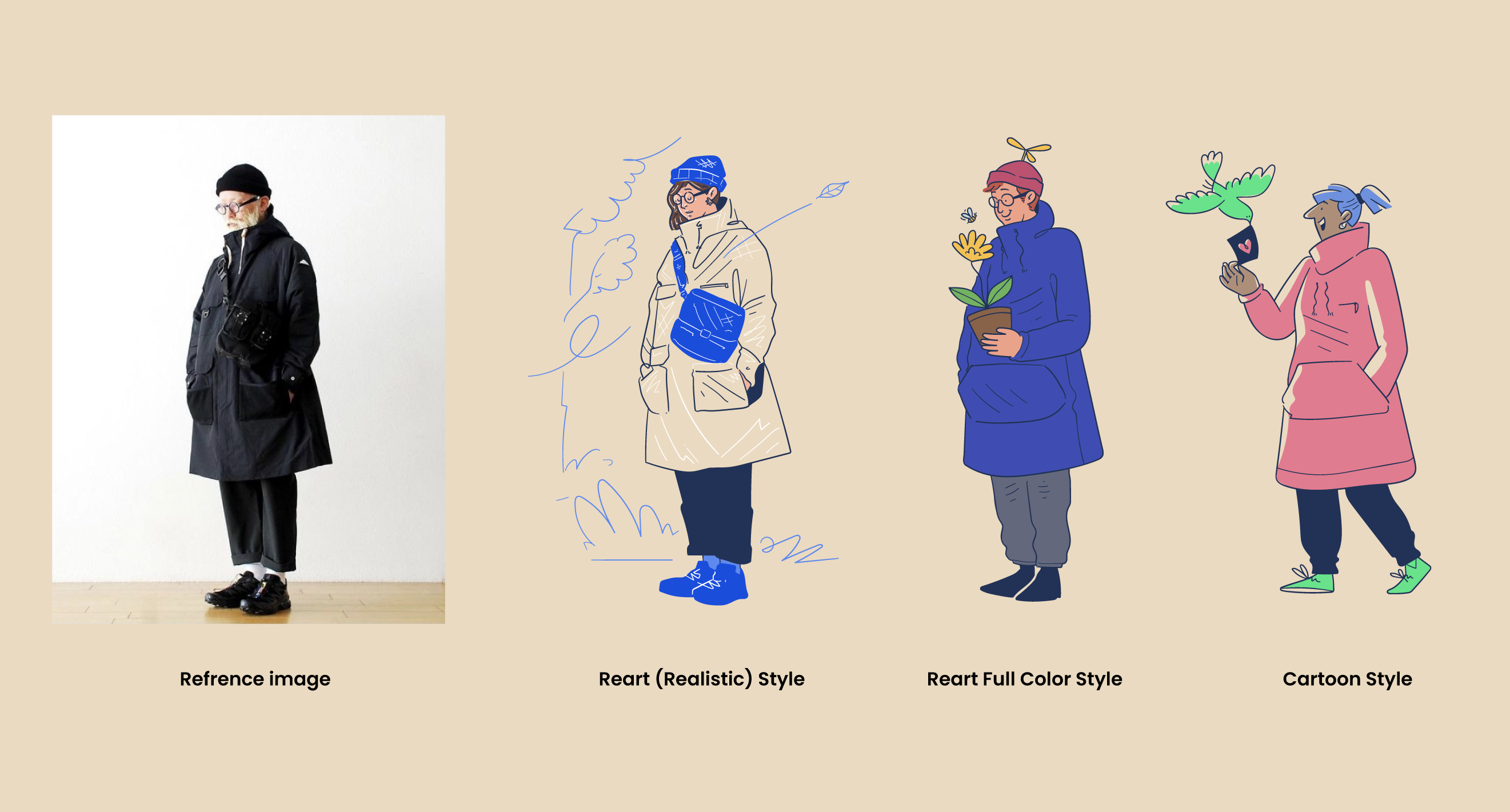
How to Draw a Character from a Photo Reference (Step by Step Guide)
Tutorial on how to draw a character from a photo reference and come up with different styles. We’ll show every click, every line, and every brushstroke along the way. Let's dive in, and by the end, you'll walk away with not just one, but multiple approaches to character design using a single source.

Welcome to the Illustrations Playbook, the behind-the-scenes look at how we actually draw stuff here at Getillustrations. In today’s walkthrough, we’re doing something every illustrator should master: taking a real-world photo and turning it into three different illustrated styles.
Whether you're a UI designer who wants to include custom avatars in your product, or an illustrator looking to expand your creative flexibility, this tutorial is for you.
We’ll go step-by-step from photo to:
- Reart-style illustration (realistic)
- Cartoon character
- Freestyle redraw (creative reinterpretation)
We’ll show every click, every line, and every brushstroke along the way. Let's dive in, and by the end, you'll walk away with not just one, but multiple approaches to character design using a single source.
📷 Step 1: Choose a Strong Photo Reference
Before even opening Illustrator or Procreate, we needed a great reference image. Here's what we looked for:
- Clear lighting
- Good silhouette
- Minimal background distractions
- Personality in posture
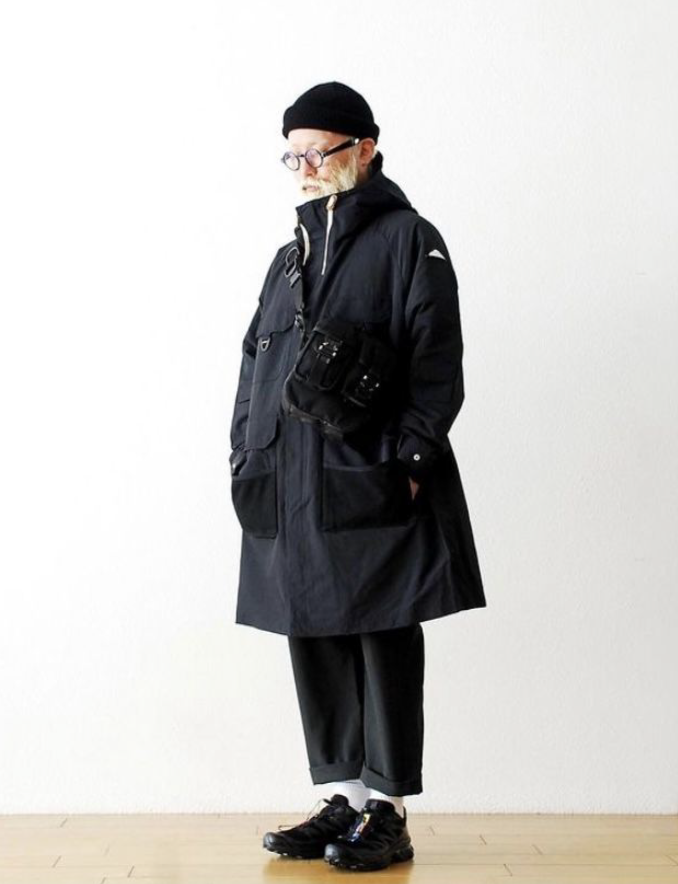
We landed on this excellent side-facing portrait of an older man in an oversized coat. He had style, attitude, and enough uniqueness to inspire three entirely different character types.
The reference photo isn’t just a visual. It’s a spark—something that gives you posture, gesture, clothing flow, balance, and even personality. But what matters most is that you don’t stay stuck copying it. Think of it like scaffolding. Build on it, then move beyond.
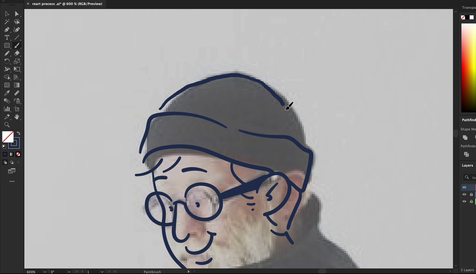
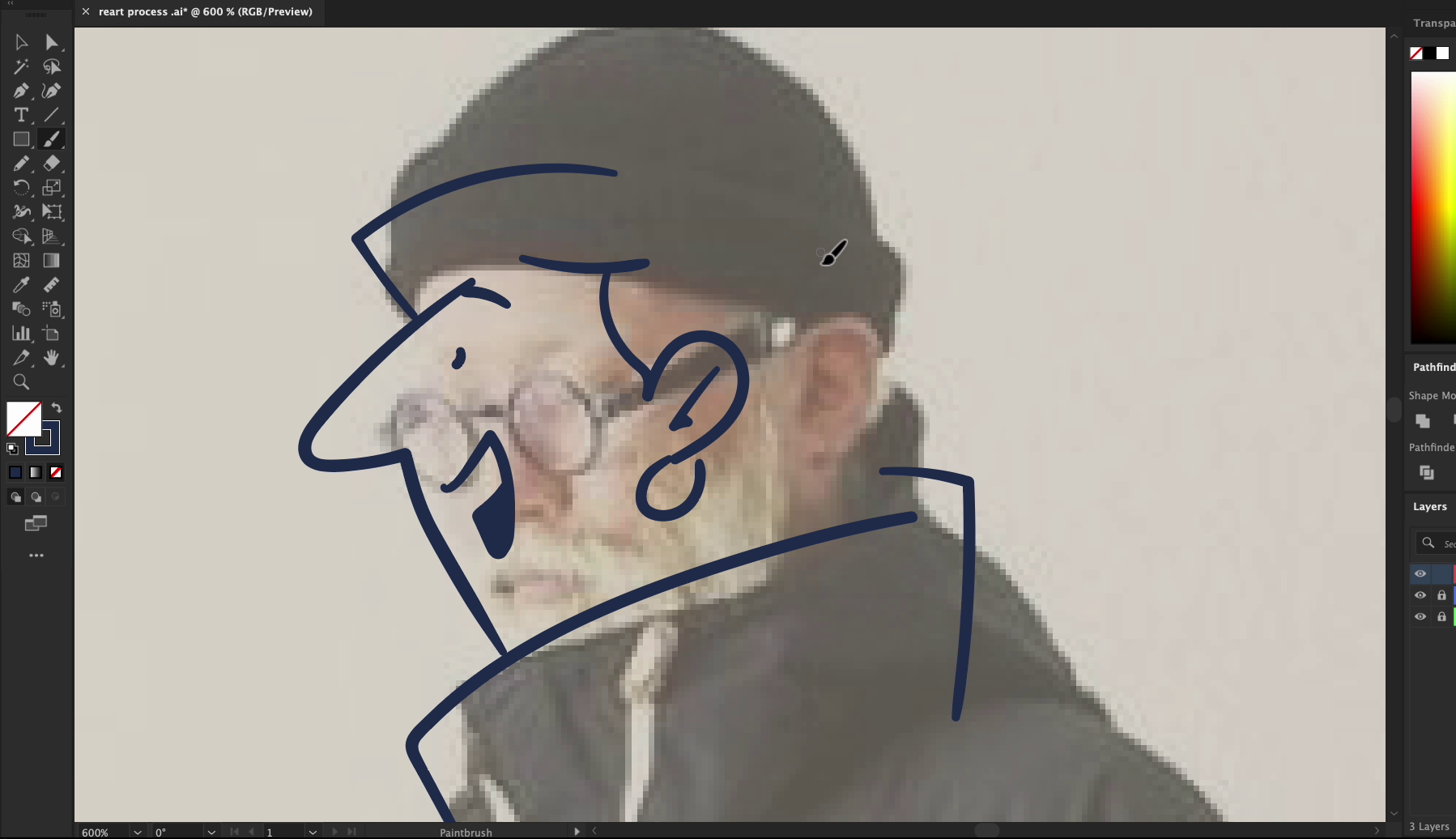
✏️ Step 2: Start Sketching — Outline the Structure
We pulled the image into Adobe Illustrator and lowered the opacity. That way, our new layer sits on top clearly without losing the guidance from underneath.
This phase is simple, but foundational. We sketch out:
- The general body structure (head, shoulders, arms, torso, legs)
- The outline of the coat and shoes
- Big visual blocks — not details yet
We used a vector brush with some pressure sensitivity to keep the lines light and natural. This helped give the sketch a more human feel right from the beginning.
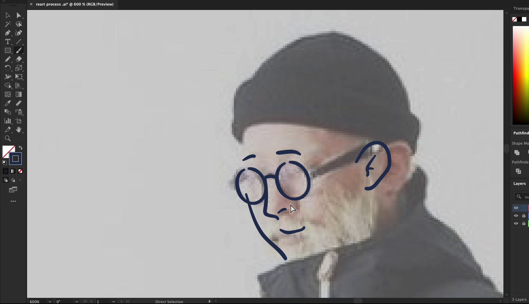
Pro Tip: Don’t obsess over the lines. You’re building a structure, not creating the final ink pass. Movement is better than precision at this stage.
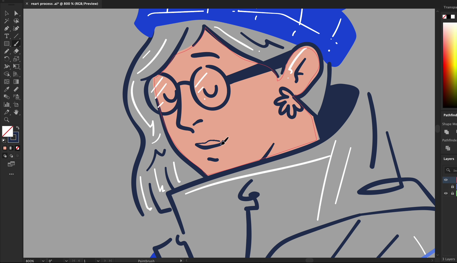
🙂 Step 3: Add Facial Features Freestyle
Next up, we started working on the face. Here’s where we added creative flair:
- Simplified round glasses
- Gentle, curved smile
- Clean eyebrows and nose
- Cartoon-friendly ear shapes
Instead of sticking closely to realism, we leaned into a slightly stylized look. The face gives your character attitude. It sets the tone for the entire piece.
Even though we used the original photo, we started editing and modifying the expression early to keep the process flexible.
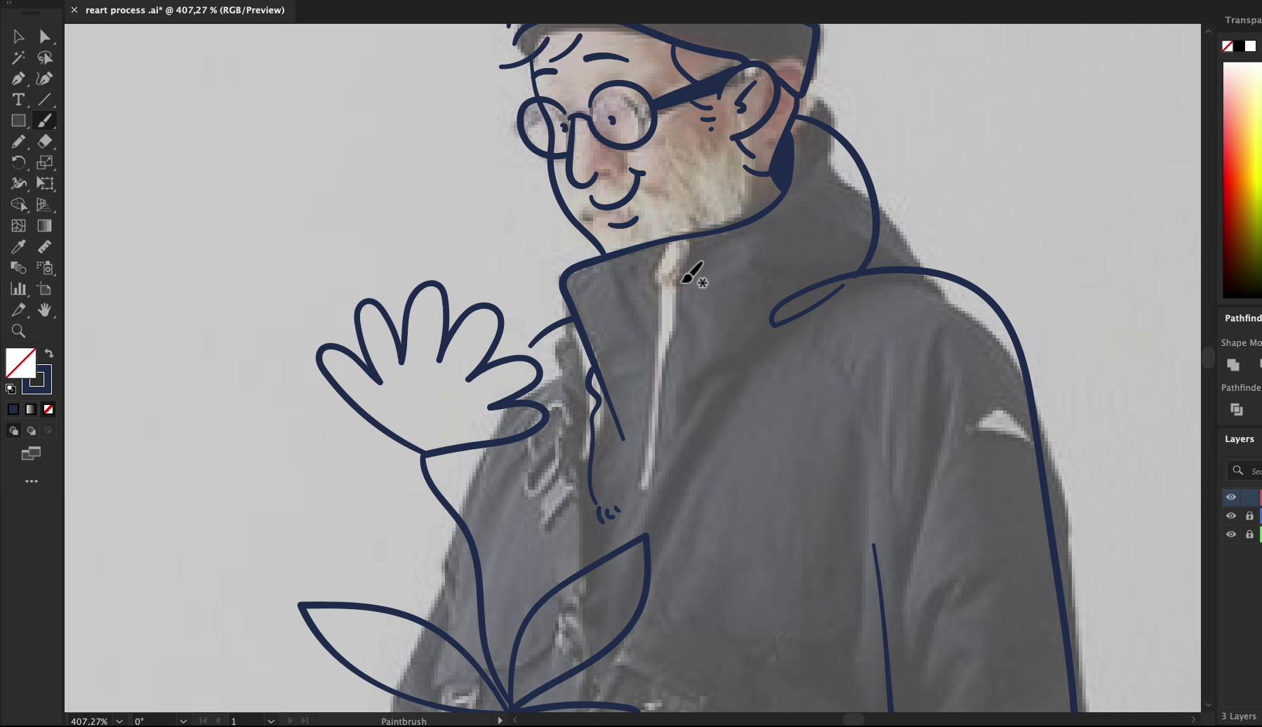
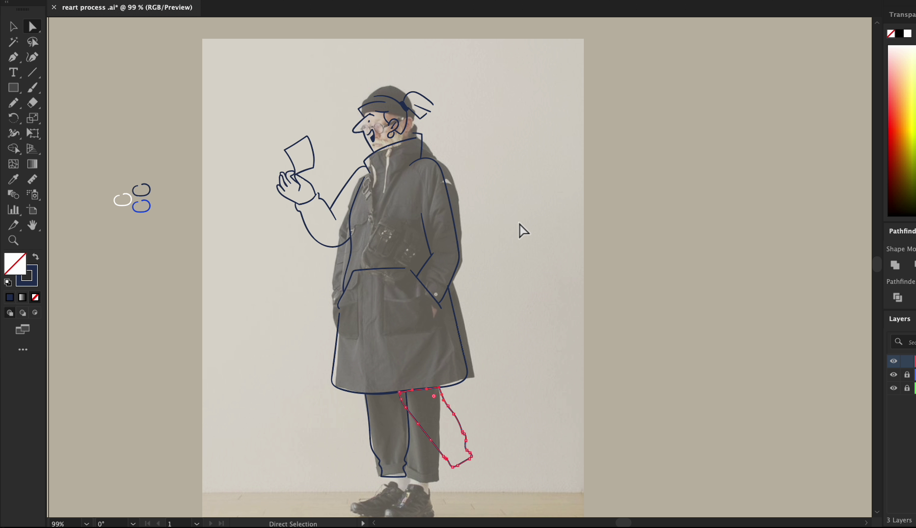
🧕 Step 4: Draw the Body
We moved on to the torso, arms, and legs. Using bold lines, we:
- Blocked the entire coat and sleeves
- Sketched simple legs and shoe forms
- Kept everything proportional but stylized
Don’t be afraid to adjust! The photo is just a guide. We thickened lines, changed angles, and adjusted the length of arms and legs to get the right balance.
Quick Hack: Draw the limbs even if they’re partially hidden in the photo. It gives you more flexibility to change the pose later.
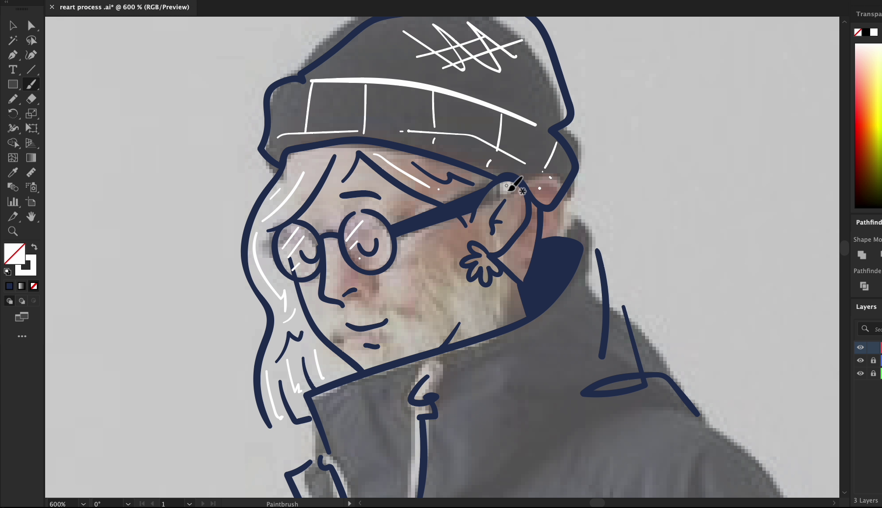
🪜 Step 5: Finish the Primary Outline
With the body fully drawn, we refined the outer shape:
- Tweaked the coat shape to feel more structured
- Redrew curves and corners
- Added folds and creases
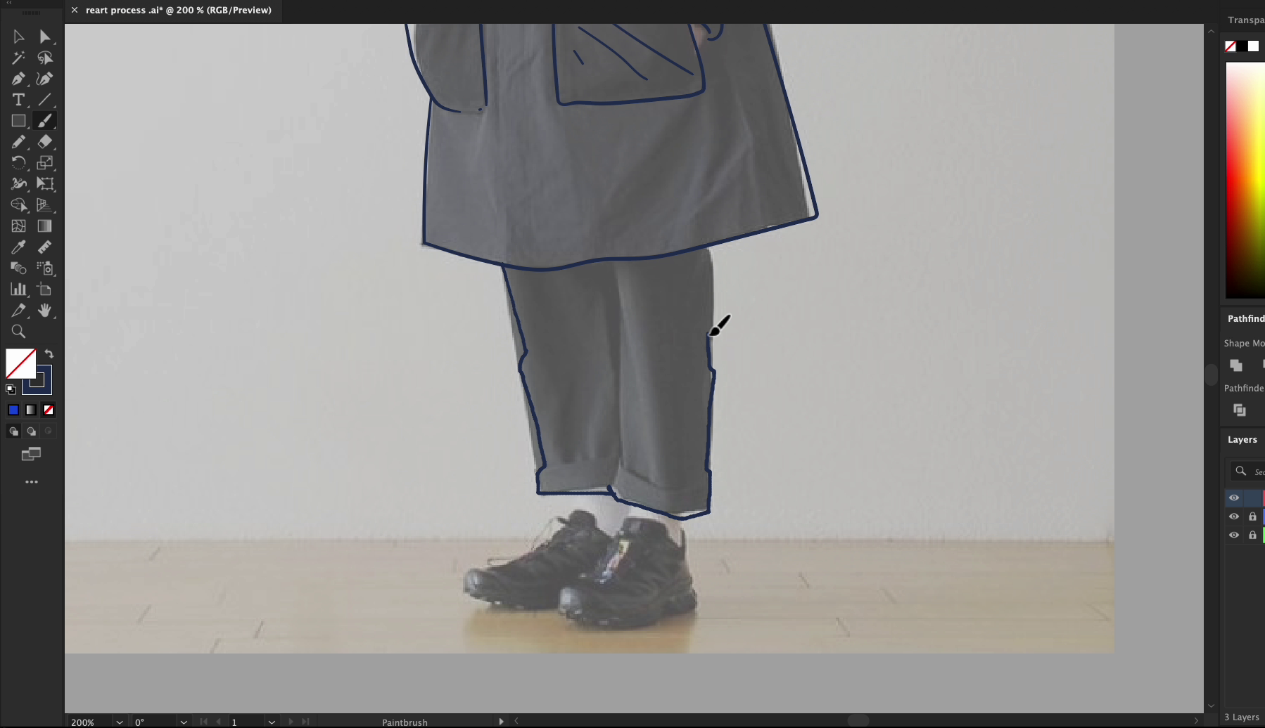
This final shape acts like the "container" for your character. You can use it in different color or stylistic treatments.
At this point, the base is ready. You could already imagine dropping this illustration into a layout.
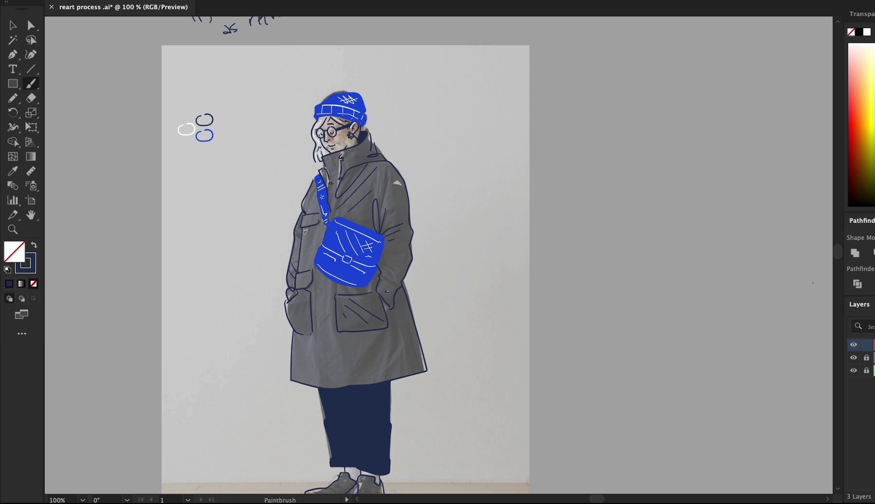
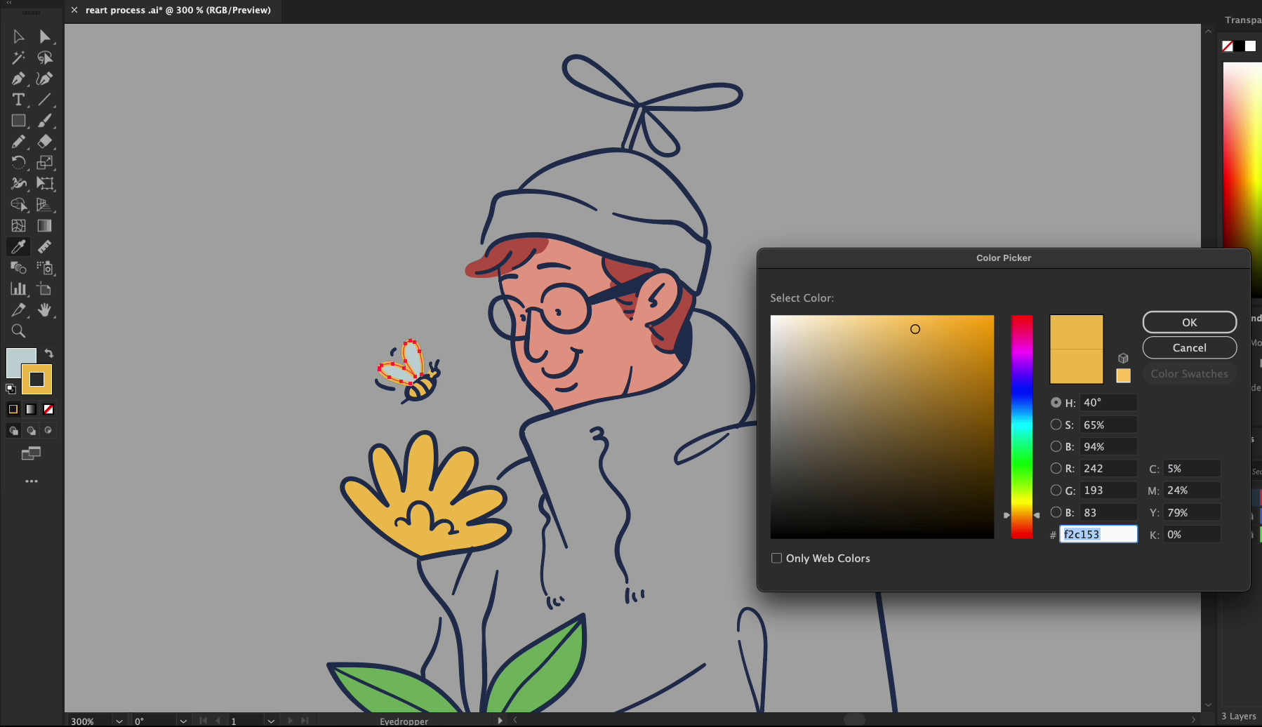
🎨 Step 6: Add Color and Character
Now the real fun begins.
Block in Fill Zones
We started with flat colors. Using vector paths, we drew closed shapes and filled them:
- Hat = solid blue
- Bag = lighter blue
- Coat = gray
- Shoes = matching tone
This creates structure and makes the shapes pop from the background.
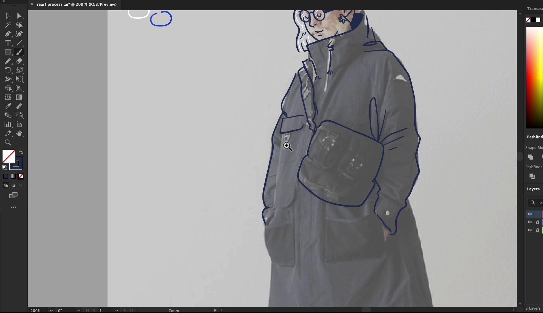
Add Highlights and Depth
To make it feel dimensional, we added:
- White strokes for light and dark definition
- Simple highlights on the hair, shoes, and folds
- Subtle line overlap to simulate layering
This is where the character starts to breathe.
Leave Breathing Room:
Here’s a trick most beginners overlook: You don’t need to color everything. Leaving parts of the illustration transparent can help the artwork feel integrated into a website, UI section, or brand color theme.
In our case:
- We left parts of the coat and background open.
- This lets the grey background come through and adds visual rest spots.
So instead of overloading the viewer with saturation, we gave the eye some breathing room.
By the end of this process, we went from a plain photo to a personality-rich character illustration. From basic tracing to stylized finishing, every step helped us develop structure, balance, and style.
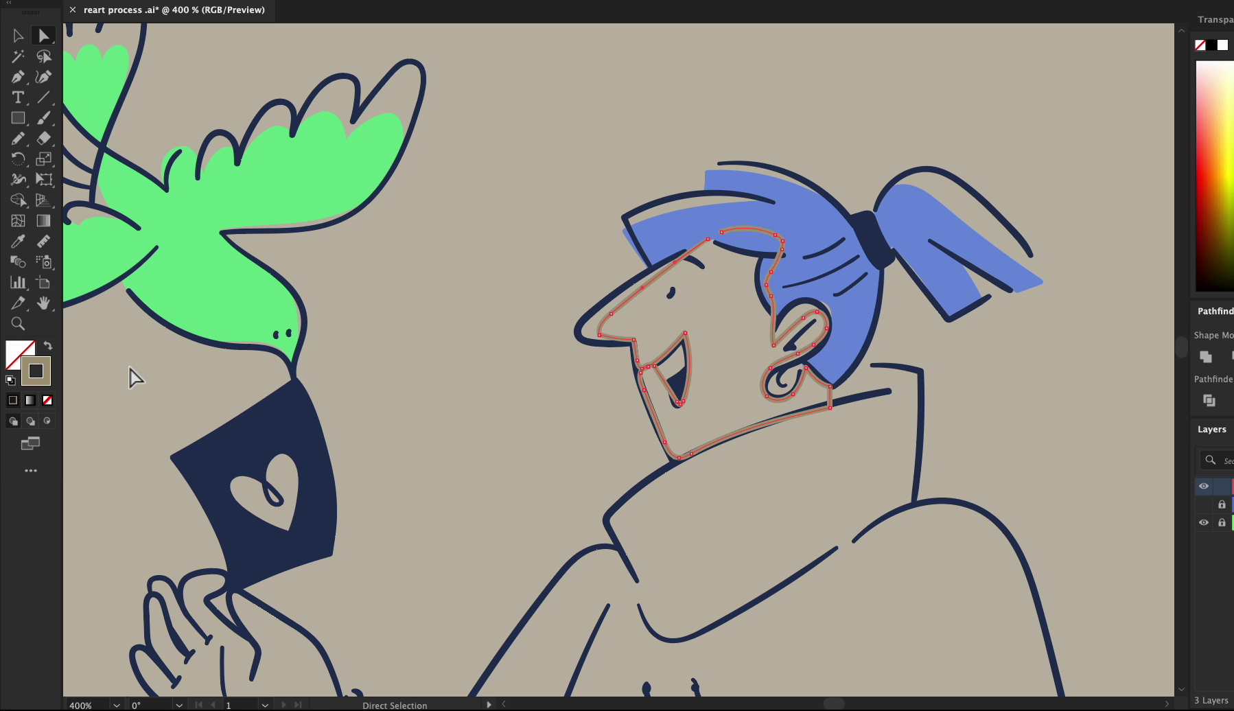
🧩 Step 7: Turning the Same Pose Into a Cartoon Character
This is where the pose becomes a new story.
Stylize Everything
Alright — here’s the magic part of illustration: you can use the same reference image to tell totally different stories, just by changing the style.
After finishing our Reart (realistic) illustration, we challenged ourselves to create something totally different — a cartoon version of the same character.
Why? Because cartoons bring:
- More expression and exaggeration
- A friendlier, casual tone
- Space for playfulness and storytelling
Let’s walk through how we reimagined this character in cartoon form — same body, totally different vibe.
🧠 Start with the Same Reference — But Loosen Up
We placed the original photo underneath again — just like before — but this time, we weren’t trying to match the coat’s folds or the silhouette precisely.
Instead, we simplified everything:
- Rounder lines
- Smoother curves
- Big shapes instead of tiny details
Cartooning is about exaggerating essentials, not copying reality.
🎩 Change the Details to Match the Mood
To make this version more fun, we:
- Gave the character a propeller hat 🎩
- Added a potted flower and a bee 🐝
- Used thicker, more fluid outlines
- Enlarged the face features for charm
This isn’t about realism. It’s about personality. Cartoons let us crank up the creativity and inventiveness.
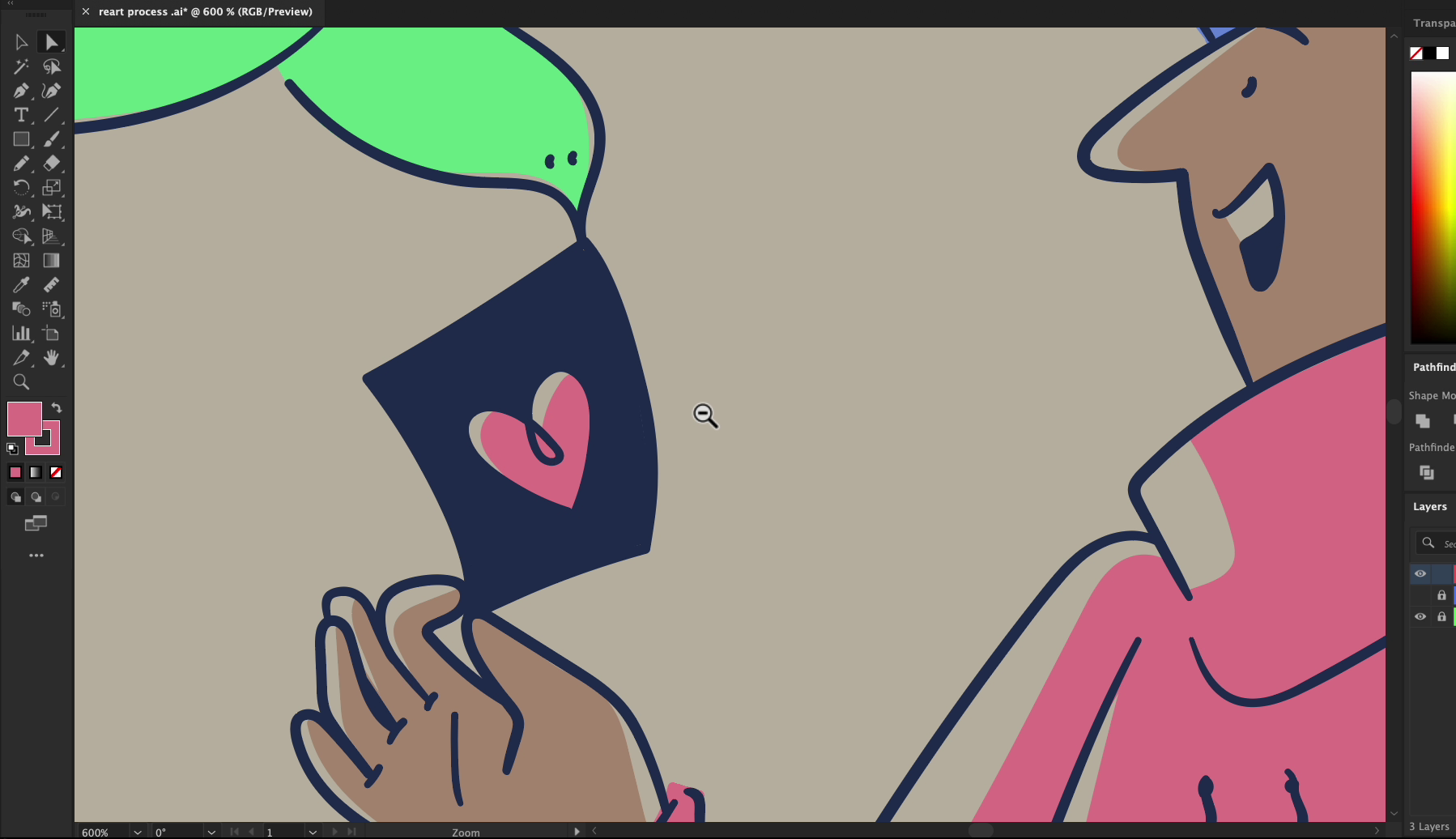
🎨 Choose Bright, Cheerful Colors
Here, we intentionally picked:
- Warm pinks and purples for the coat and hat
- Light skin tones and saturated accessories
- Contrasting green leaves and yellow petals
The color palette is playful, bright, and confident — perfect for children's content, web mascots, or editorial graphics.
🖍️ Contrast Without Clutter
Lastly, we added contrast with minimal effort:
- Flat colors on large zones
- Soft inner lines for sleeves, folds, and props
- No shadows or highlights — just clean separation between elements
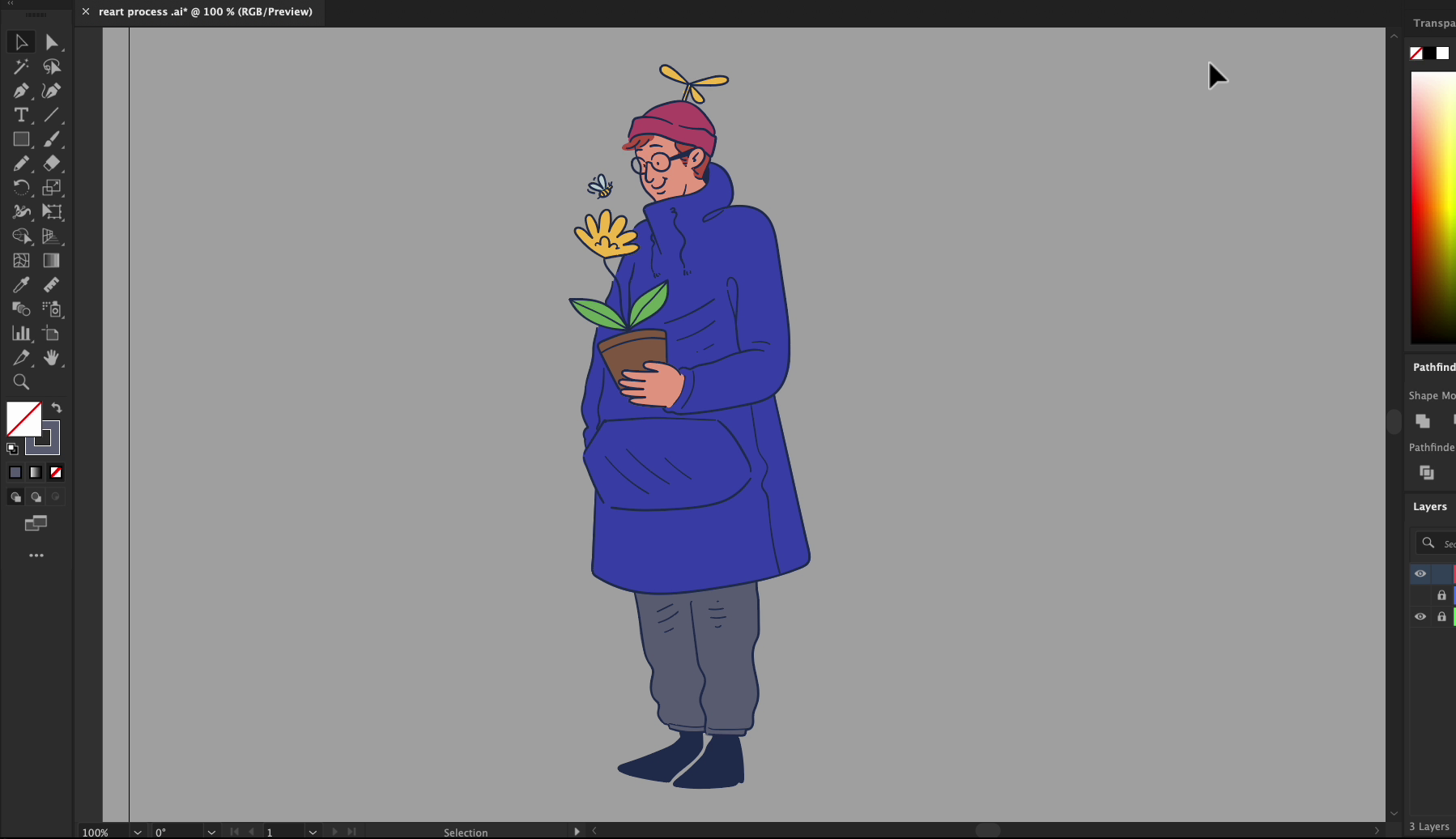
Cartoons don’t need realism to pop — they just need clarity and bold shape decisions.
🧠 Step 8: Go Full Creative Mode — Reimagining the Character from Memory & Style
Here’s the real flex for any illustrator: once you’ve drawn a character two or three times, you don’t need the reference anymore.
At this point, you’ve absorbed:
- The posture
- The silhouette
- The proportions
- The feel of the outfit
And now? You’re ready to invent something entirely new — but still grounded in the source.
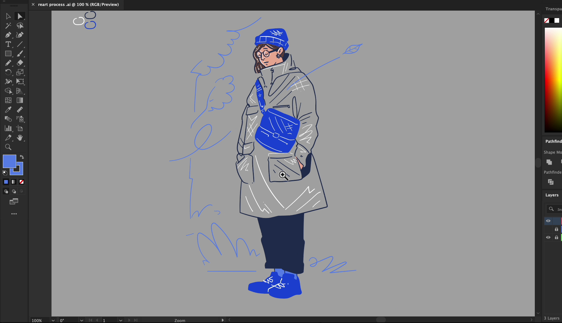
🔄 Start with the Same Photo, But Forget Precision
We dropped the photo in again — but this time, we barely traced anything.We just used the overall gesture as a soft guide, then cranked the stylization to the max.
Look at that nose, those exaggerated lines, and the new head shape. The goal is to create something fresh that still “feels” like it came from the same pose.
🚶♀️ Break the Rules: Change the Pose & Mood
Instead of standing still, we moved the hand out of the pocket. We bent the leg forward. The character’s posture now feels like they’re walking or striding, not just standing.
This is a great exercise in:
- Composition control
- Body language design
- Energy in characters
💌 Create a Story — Not Just a Drawing
Now we added emotion and story.The character holds a floating letter with a heart on it being delivered by a bird — this turned into a whole new visual moment.
No longer an old man standing alone — now it's a woman receiving a message. A character from a comic. A frame in a narrative.
This is how you go from illustration to visual storytelling.
🎨 Try Alternative Coloring Techniques
Instead of solid fills, we experimented with soft overlays:
- The face has a semi-transparent gradient
- The color doesn't completely fill the outlines
- There's a relaxed, painterly feel without becoming chaotic
This method works beautifully for editorial illustrations or subtle branding art.
🧪 Final Advice: Break Stuff, Rebuild, Discover
Our last tip: Don’t hold back.Try weird angles. Stretch shapes. Add birds, hearts, symbols.Make the same reference feel like 3 completely different characters.
Doing this builds confidence, fluency, and style. It helps you move beyond tutorials — into original, expressive art.
🧠 Recap: From Reference to Mastery
Let’s wrap it up:
- Version 1 = Reart-style realism — focus on structure, details, precision.
- Version 2 = Cartoon illustration — embrace fun, exaggeration, personality.
- Version 3 = Freestyle reinterpretation — let go of the photo, and invent something new.
✍️ This whole flow is one of the best exercises to practice as an illustrator. It teaches style control, proportion awareness, shape language, and storytelling — all in one go.
🎓 Try It Yourself!
- Pick a real person photo (could be you, a model, or even a statue!)
- Trace it with care and realism.
- Redraw it cartoon-style with props and playfulness.
- Then, let loose, and redraw it purely from memory or vibe.
🎁 Want pre-built illustrations and poses to remix?
Check out Getillustrations.com for 31,000+ ready-to-use illustrations you can adapt and experiment with.
Download the source vector files for this tutorial in .Ai
Artwork by Krishanda Adipurba
Co-founder & Art Director at Getillustrations.com