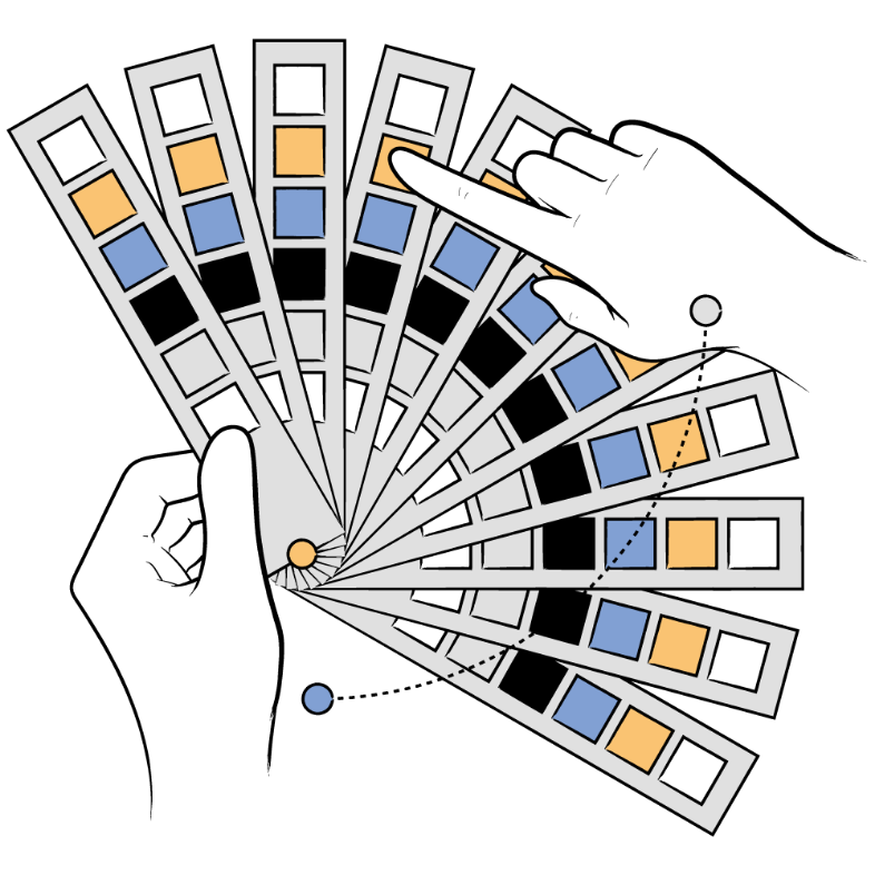
Interactive Color Wheel Tool
Generate beautiful color harmonies, build professional palettes, and ensure WCAG accessibility. Export to CSS, JSON, or Tailwind.
Shades & Tints
Harmony Type
Generated Palette
Export
Current Palette (0 colors)
Export Current Palette
Saved Palettes
The quick brown fox jumps over the lazy dog.
Large Bold Text
AA is the minimum standard for most projects. AAA is enhanced accessibility. Large text is 18pt+ (or 14pt+ bold).
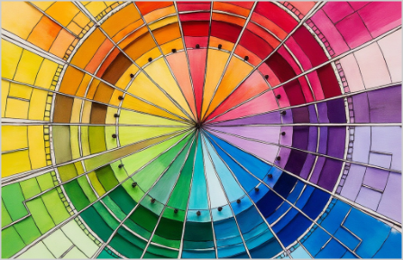
Best Illustrations Showcasing
the Correct Use of Colors
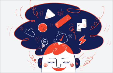
Illustrations have the power to bring any design to life, and when colors are used thoughtfully, they can make an even bigger impact. Great illustration packs don't just look beautiful. They help tell a story and make designs more engaging. Below, we've picked five standout packs that use color in creative and inspiring ways to help you craft stunning visuals effortlessly.
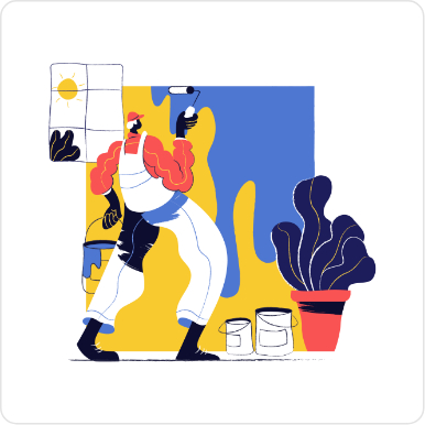
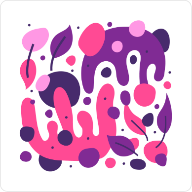
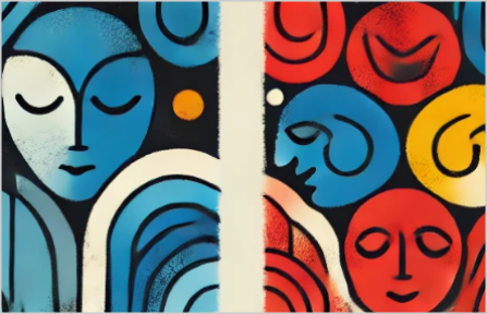
With intense colors and interesting hand drawn characters and elements, the Paint Illustrations are an awesome addition to your collection of illustrations adding a really unique touch to any project you use it in.

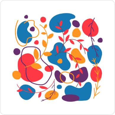
One of our most extensive illustration packs, featuring beautiful colorful illustrations for web and apps. This pack focuses on the Fin-tech and startup scene with an additional library of avatars in the same style.


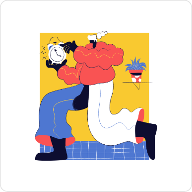
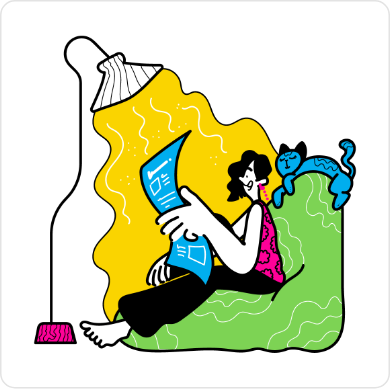
This is our masterpiece! Hand-drawn with simple black brush outlines and spot colors that highlight the scene's elements and environment, our quirky characters are eager to tell stories in these colorful dynamic illustrations.


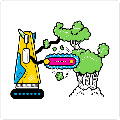
Introducing the CMYK Illustrations pack, a unique blend of hand-drawn artistry and vibrant color palettes designed for maximum versatility. This pack features loads of creative illustrations, with more coming updates as it expands.

Explore 100 vibrant, hand-drawn Talavera inspired patterns in fully editable vector formats. Perfect for websites, apps, and print projects.

The Ultimate Guide to
Understanding the Color Wheel
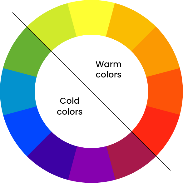
The color wheel is more than just a circle of hues. It's your roadmap to
creating
visually striking and
emotionally resonant designs. Whether you're a
designer, artist, or someone
exploring the fascinating
world of colors,
understanding the color wheel will elevate your creativity.
Let's dive in and
break it all down into digestible insights.
What is the Color Wheel?
The color wheel is a visual representation of how colors relate to one another. It organizes colors in a circular format, blending science and art to showcase the relationships between primary, secondary, and tertiary colors. Think of it as the DNA of design. It reveals how colors interact and how you can combine them for harmony or contrast.
The Basics of the Color Wheel
1. Primary Colors
At the heart of the wheel are the primary colors: red, yellow, and blue. These are the foundation; they cannot be made by mixing other colors. Every other hue stems from these three.
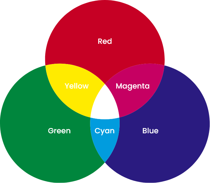
2. Secondary Colors
Mix two primary colors, and you'll get secondary colors:
Red + Yellow = Orange
Yellow + Blue = Green
Blue + Red = Purple
These colors create the first layer of complexity in the wheel and the drawing here shows how they are created.
3. Tertiary Colors
Take a primary color and blend it with a neighboring secondary color, and you'll create tertiary colors like red-orange, yellow-green, and blue-violet. These hues add depth and flexibility, filling out the gaps between primary and secondary colors.
The Science of Color Harmony
Color harmony is the magic that makes designs feel "just right." The color wheel is
your tool for unlocking this harmony. Here are the key ways to use it:
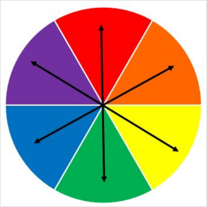
Complementary Colors
These colors sit directly opposite each other on the wheel, like blue and orange or red and green. They create high contrast, making designs pop. Use this pairing sparingly to add energy and drama to your work.
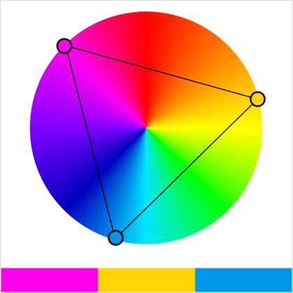
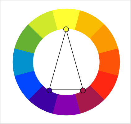
Triadic Colors
Triadic color schemes are formed by picking three colors evenly spaced on the wheel. This combination is vibrant and balanced. It also adds a visual interest without overwhelming the viewer with distractions.
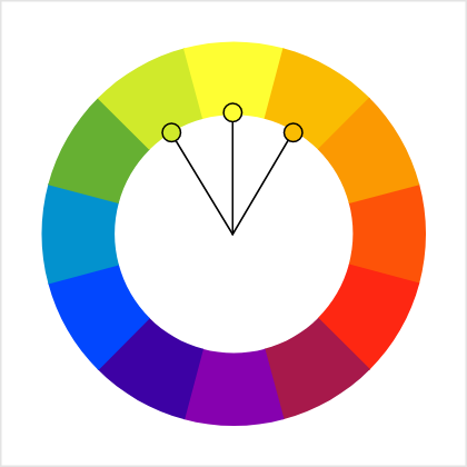
Analogous Colors
These are neighbors on the color wheel, such as yellow, yellow-green, and green. Analogous palettes are soothing and natural. They're perfect for designs that need to feel harmonious and comfortable.
Split Complementary Colors
Take one base color and pair it with the two colors adjacent to its complement. Instead of pairing blue with orange, we pair blue with yellow-orange & red-orange. This method provides contrast with less tension.
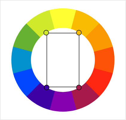
Tetradic (Rectangle) Colors
Using four colors that form a rectangle on the wheel, such as red, green, blue, and orange, gives you a rich palette with plenty of variety. This scheme is great for more complex designs where diversity is key.
Choosing Illustration Colors for
Your Brand Design
Applying Color Theory to Illustrations for a Cohesive Brand Identity
Color theory helps transform illustrations into powerful storytelling tools. By
understanding how
colors work together, you can evoke the right emotions and
communicate your
brand's message
effectively. Learn how to apply these
principles to make your illustrations
visually engaging and
harmonious.
Define Brand Colors
Define your brand's identity by selecting core colors that reflect its values and personality. Use primary, secondary, and accent colors to create a consistent visual language that resonates with your audience.

Choose Color Schemes
Try with complementary colors to add contrast and energy to your illustrations or use analogous colors for a softer, more cohesive look. This ensures that your designs capture attention while staying true to your branding.
Evoke Brand Emotions
Every color conveys a specific emotion: blue for trust, yellow for positivity and red for excitement. Incorporate these emotions into your illustrations to reinforce your message and create a stronger connection with your users.
Refine Color Balance
Recolor illustrations to perfectly match your branding. Adjust hues, saturation and brightness to ensure your visuals are balanced and avoid overwhelming your design with too many competing tones and hues.
Tell a Visual Story
Illustrations are a powerful tool to tell your brand's story. By using color strategically, you can evoke emotions, guide attention, and create a cohesive visual experience that resonates with your audience
Maintain Color Harmony
When resizing or scaling illustrations, ensure that your color relationships remain intact. Consistency across different design formats from web design to print, reinforces brand vision , image and trust.

Enhance with Illustration
Illustrations bring your brand to life, blending creative visuals with color theory to ensure your designs stand out. They're versatile and impactful, helping you communicate ideas clearly and effectively.
Create Lasting Impact
With the right use of color, illustrations can make your designs unforgettable. They not only enhance the aesthetic appeal but also strengthen your brand identity and leave a meaningful impression.
Want to explore amazing illustrations that uses colors correctly?
Just search in the community Plugins for "Getillustrations Icons,
Illustrations and 3D Design
Assets" Or simply Click this link to get it
Why Getillustrations?
It's that simple..
Illustrations
 Unlock All Access
270
Collections
8
Styles

Testimonials and reviews

Ana Martínez
Translator
Getillustrations helped me with a illustration for my future website and I am really happy with the result! They were nice and helpful from the beginning, and captured what I had in mind for the design.
I will be using Getillustrations for future projects!

Clau Marin
Co-founder & CEO @ Festivawl
I've worked with Getillustrations on a really big project - like, 180 illustrations big! I had all these specific ideas about how things should look, from characters to items, and even some tricky subjects to get just right. And guess what? Everything turned out perfect.
I only needed 2 items revised. Seriously, just 2! Can you believe it? I'm a designer too, so I know how crazy it is to have only two rounds of revisions. Highly recommend for any company, big or small - they deliver top-notch work every time.

Ankur Sinha
Content at Thrillax Private LTD
I have always been a fan of using illustrations. Get illustrations is one of the many packs that I am fond of. It's a nice product. Kudos to the developers.

Selecting the Right Color Pallet and
Theme for Your Illustrations
Choosing the perfect colors for your illustrations doesn't have to be overwhelming. The color wheel is your ultimate tool to craft harmonious, impactful designs that resonate with your audience. Whether you're looking for energy, calm, or sophistication, understanding how colors work together will guide you in creating the perfect palette.
Start by defining the mood of your illustration. Do you want vibrant energy? Use complementary colors like blue and orange. Need harmony? Try analogous shades like yellow, yellow-green, and green. Tools like the color wheel make it simple to experiment and find combinations that align with your vision.
Don't forget the emotional power of color. Red feels passionate, while blue evokes trust. Yellow brings optimism, and green signifies balance. Tailor your palette to the message you want to communicate.
Keep accessibility in mind, ensuring enough contrast for all viewers. With thoughtful choices, your illustrations will stand out and tell a compelling story. Start experimenting with color today using Getillustrations
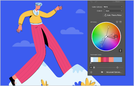
How to Easily Edit Colors in selected
Illustrations and Icons
Customizing illustration and icon colors is simple with the right tools. Open your file in a vector editor like Figma or Adobe Illustrator. Select the element to change and use the color picker to adjust the fill or stroke. You can add gradients for depth or transparency for unique effects.
You can also use any free vector editing software available online. For branding precision, apply specific hex codes or RGB values. Once satisfied, save and export your file in the format you need.
Personalizing colors ensures your illustrations align perfectly with your design vision and stand out.
Professional Color Tool Features
Everything you need to build production-ready color systems and accessible palettes.
HSV Color Model
Intuitive hue, saturation, and value controls for precise color selection. The most designer-friendly color model for picking the exact shade you need.
Color Harmonies
Complementary, analogous, triadic, tetradic, monochromatic, and split-complementary schemes generated automatically from your chosen base color.
Palette Builder
Build and manage palettes from your harmony selections. Colors are stored in local storage and persist between browser sessions automatically.
WCAG Contrast
Check contrast ratios for accessibility compliance. Get instant feedback on whether your color pairs meet AA (4.5:1) or AAA (7:1) WCAG standards.
Multiple Exports
Export palettes as CSS custom properties, SCSS variables, JSON, a Tailwind config snippet, JASC PAL, GIMP GPL, Paint.net TXT, or a plain HEX list.
Live Preview
See color combinations in real-time with text and UI component previews. Immediately understand how your palette looks applied to actual interface elements.
Need Professional Illustrations?
Get access to 169K+ premium illustrations and icons with customizable colors, all included in our Ultimate Bundle. Match any palette you build with this tool.
Explore Ultimate BundleFrequently Asked Questions
Is this color wheel tool really free?
What color model does the wheel use?
How do color harmonies work?
What is WCAG contrast checking?
Can I save my palettes?
How do I use the exported CSS variables?
color: var(--palette-100); or background: var(--palette-500);. The variable names follow a numbered scale (100–900) similar to Tailwind's color system.