How to Draw Blueprint-Style Illustrations (From Sketch to Vector)
Step by step guide, we’re diving into the world of blueprint-style illustrations, a huge pack of vector illustrations that we invested months to create and perfect.

In this Step by step guide, we’re diving into the world of blueprint-style illustrations, a huge pack that we invested months to create and perfect. Main characteristics is clean, technical, schematic style (similar to isometric illustrations) that fuses freehand drawing with clever visual storytelling in a modern and minimal look.
It is not only about the technique of creating good looking icons and illustrations, the aim is to have a successful design that relates to what users feel and link with them.
This tutorial includes the Original file artworks in vector format + Videos of the entire drawing process. Don't skip that!
We’ll walk you through:
- Creating concept sketches
- Turning ideas into vector blueprint illustrations
- Using dual stroke weights for shaping and depth
- And how to build a full icon system that looks sharp in any tech brand
Whether you're designing for SaaS, AI, or just want to draw cool diagrams, this style will sharpen your thinking and elevate your illustrations.
🔬 Step 1: Sketch Your Concept (even if it’s not perfect)
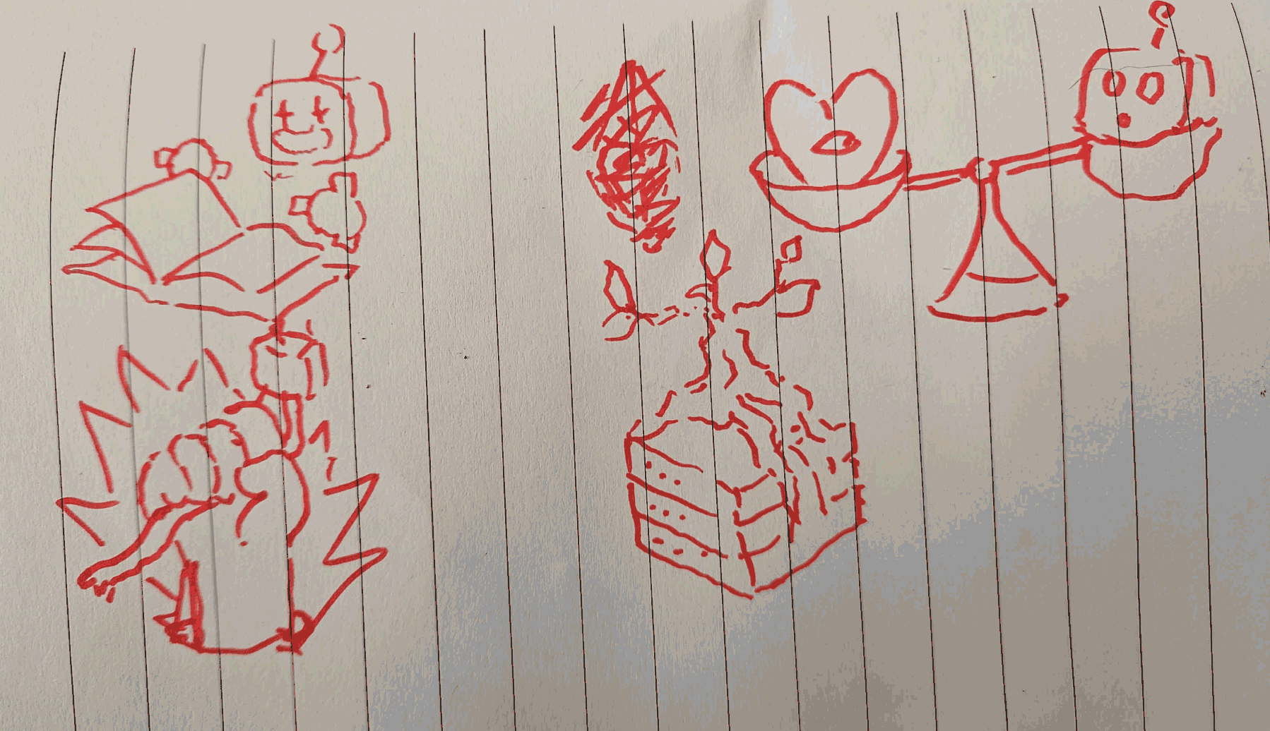
Start loose. Scribble your ideas with a pen and paper. We aren’t trying to get perfect anatomy or flawless curves here. This step is about capturing the story.
We sketched four concepts:
- A robot reading a book
- A heart vs a dead robot on a scale
- A bonsai tree growing from a server
- A broken plug being held like a trophy
The goal? Symbolic scenes, strong shapes, and tons of potential for depth.
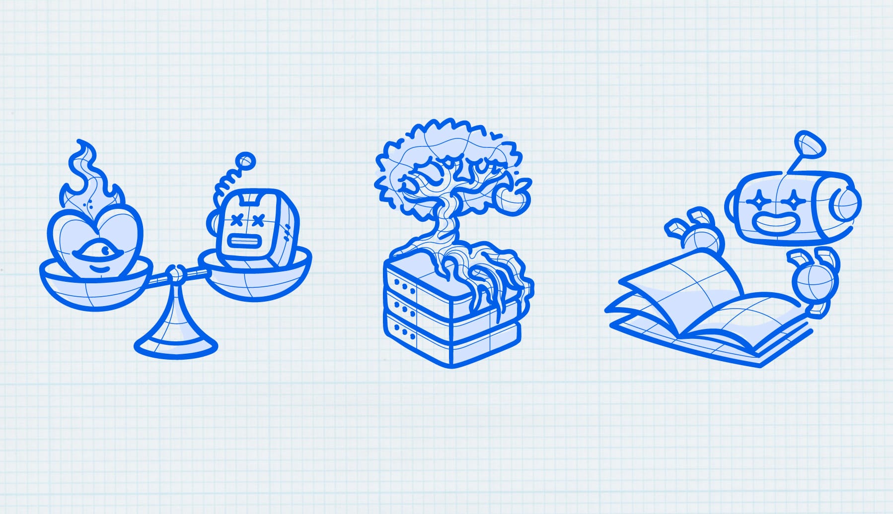
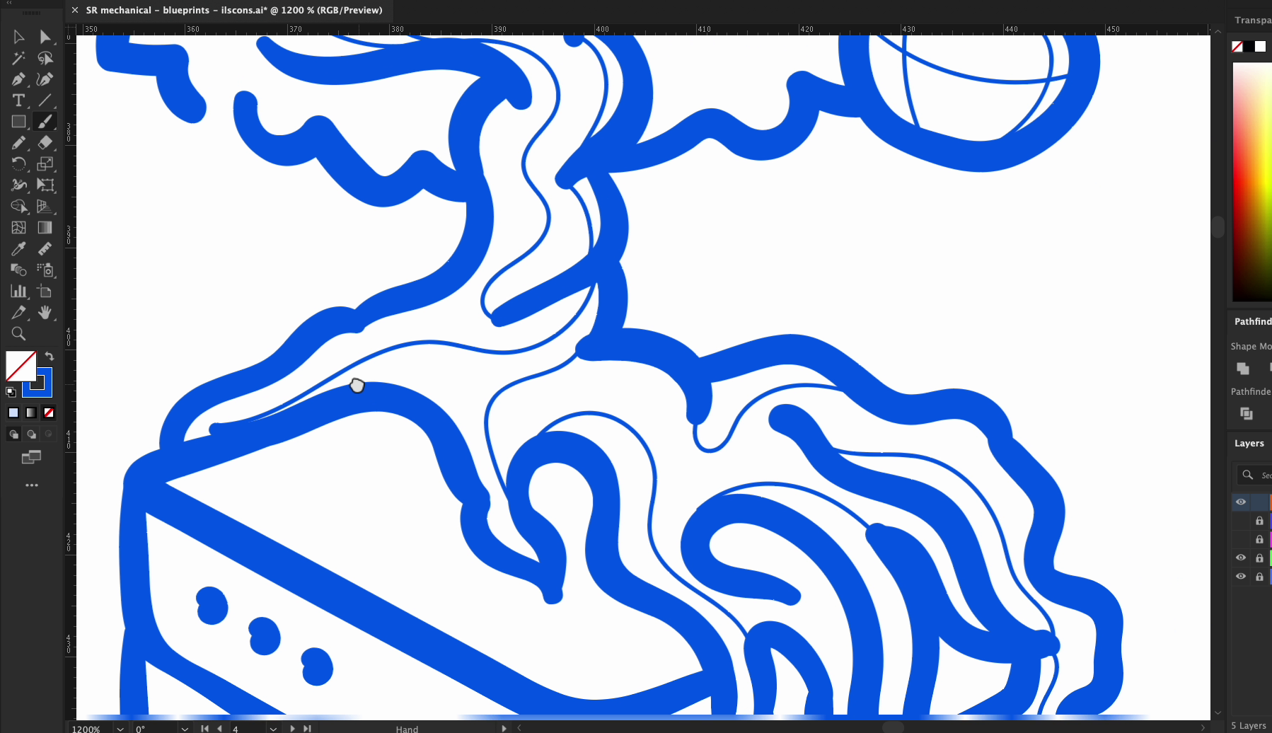
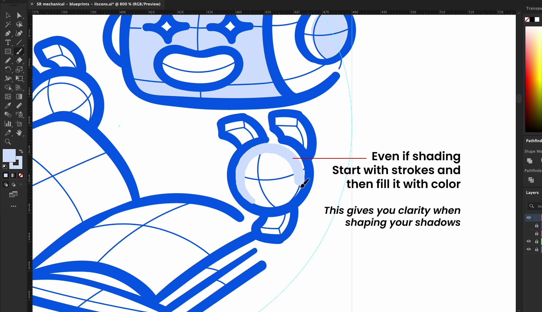
💡 Step 2: Vectorize with Blueprint Principles
Bring your ideas into vector land, this is where we jump into Illustrator. But instead of full-color drawing, we lean into a blueprint aesthetic:
- Monochromatic lines (usually blueprint blue or slate gray)
- Two line weights: one for outlines, one for detail
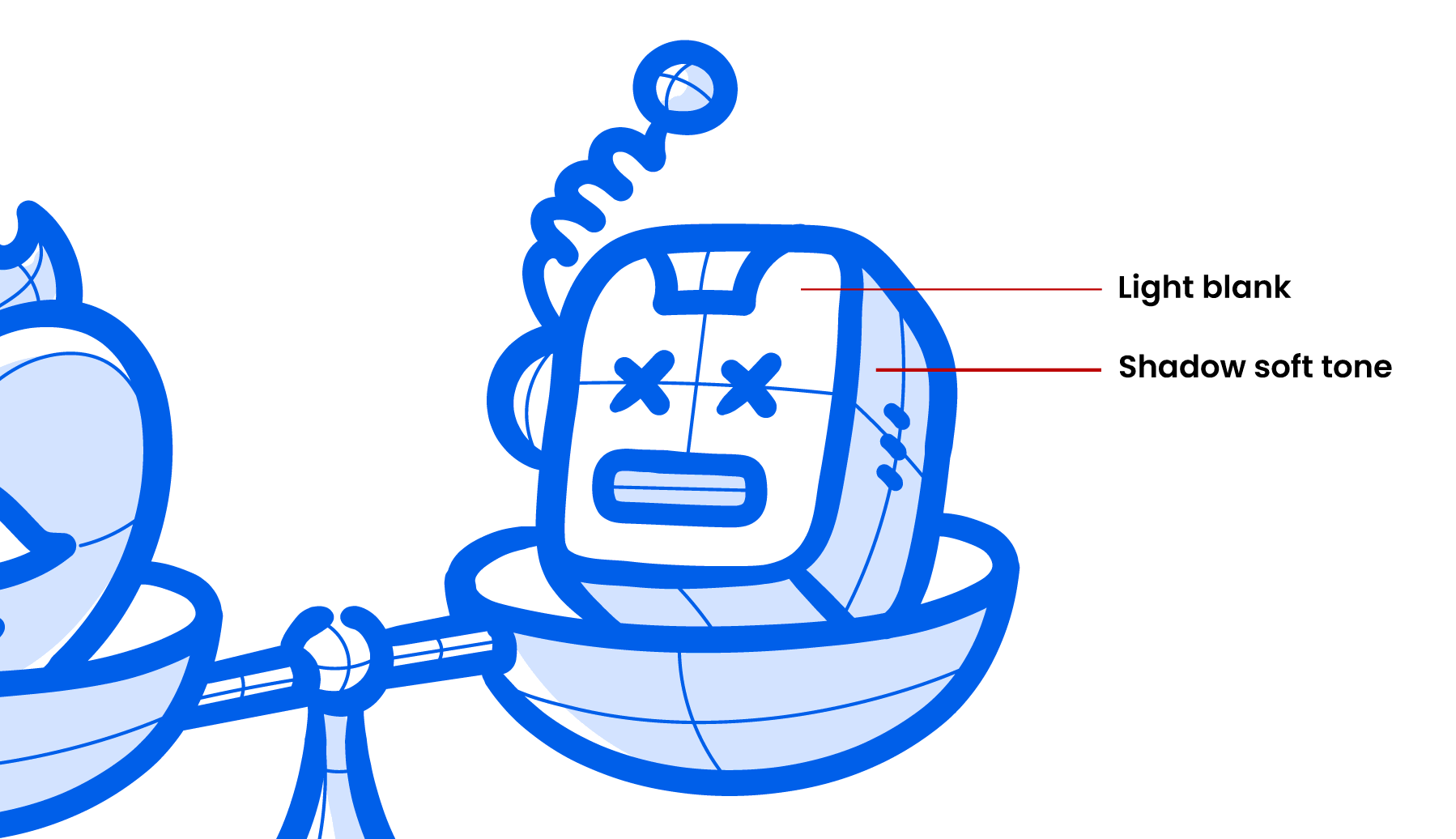
- Minimal or no fill (just a soft fill for shadow and light)
- All depth from line placement
Pro Tip: Blueprint illustrations work best when the idea is clever and the rendering is clean. It’s a thinking-person’s style — almost diagrammatic.
Think like an architect: structure and elegance.
🔄 Step-by-Step Breakdown
1st Illustrations Process - 💔 Human Patience wins over Ai
Concept: A heart versus a broken robot. Balancing on a scale. Raw, symbolic and packed with contrast. Also inspired from real life.
- Start with the Core Silhouette We sketched the two bowls of the scale and placed the heart on one side and the robot head on the other. These are your “anchor shapes” — always start with them to lock the composition.
- Line Weight Pass 1 – Primary Outline Using a thicker stroke, we drew:
- The scale structure (triangle base, balance bar)
- Bowl outlines
- Heart and robot shapes This weight helps separate the subject from the detail.
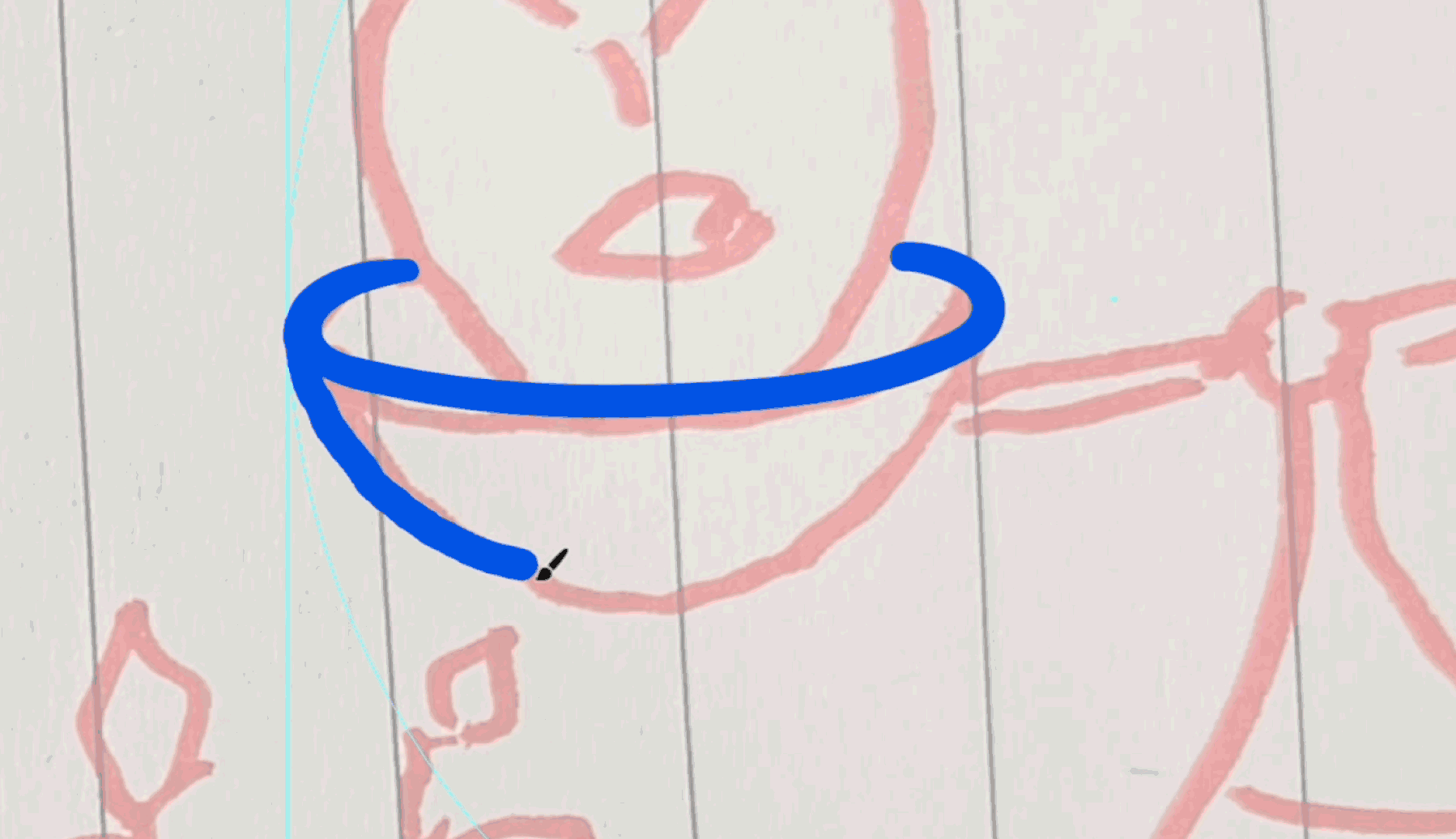
- Line Weight Pass 2 – Detailing & Depth Now the fun part: we used a secondary, thinner stroke to:
- Add curved depth lines on the heart (to suggest form)
- Draw broken wires and eyes on the robot
- Give the bowls a slight 3D lip
- The trick here is to use short curves, tapered arcs, and inner contour lines to imply volume — without using shading.
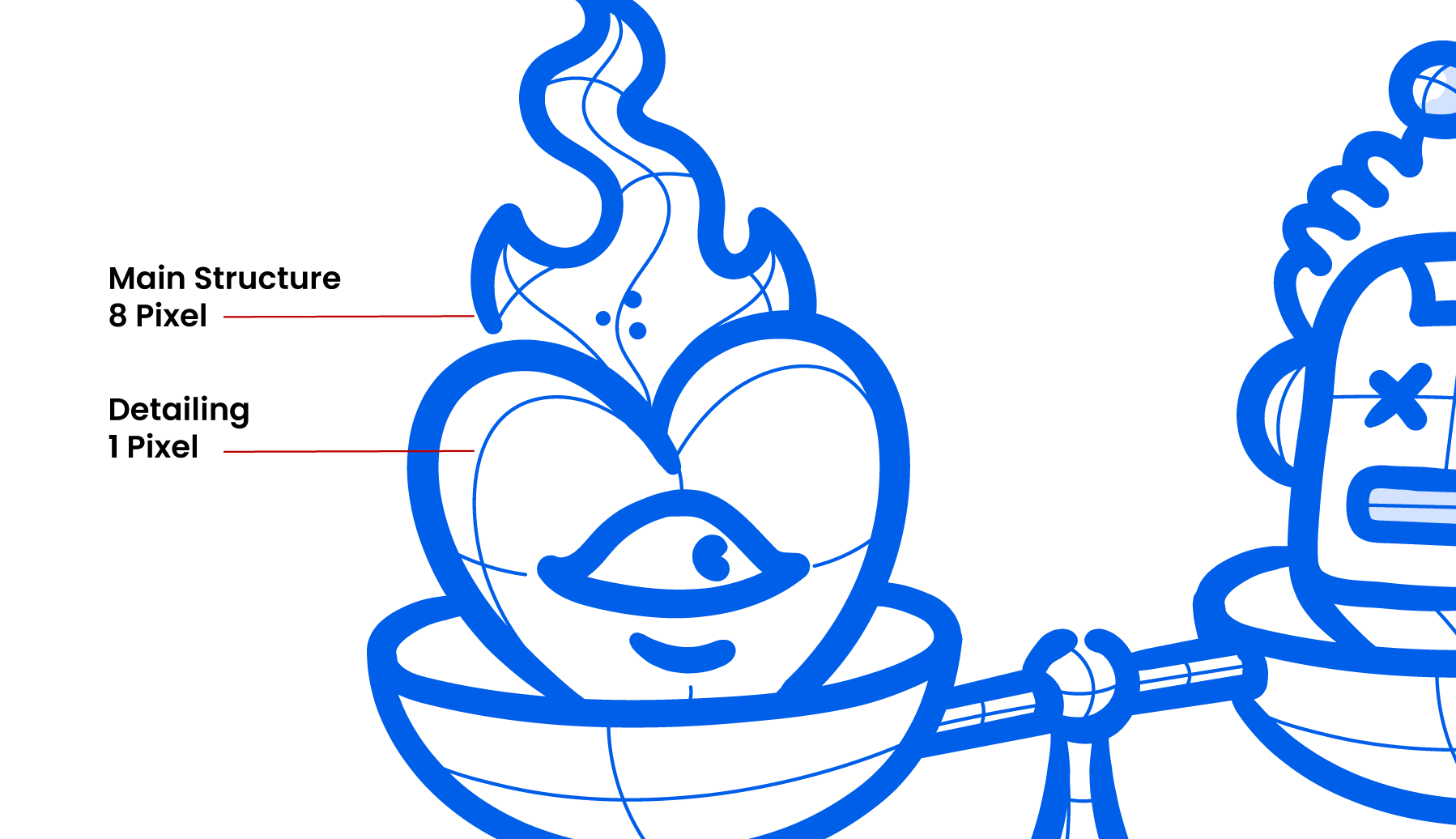
- Emotion Through Angles The heart is upright, curved, and elegant: soft and “alive.” The robot is tilted, with X eyes and stiff curves: angular and “dead.”
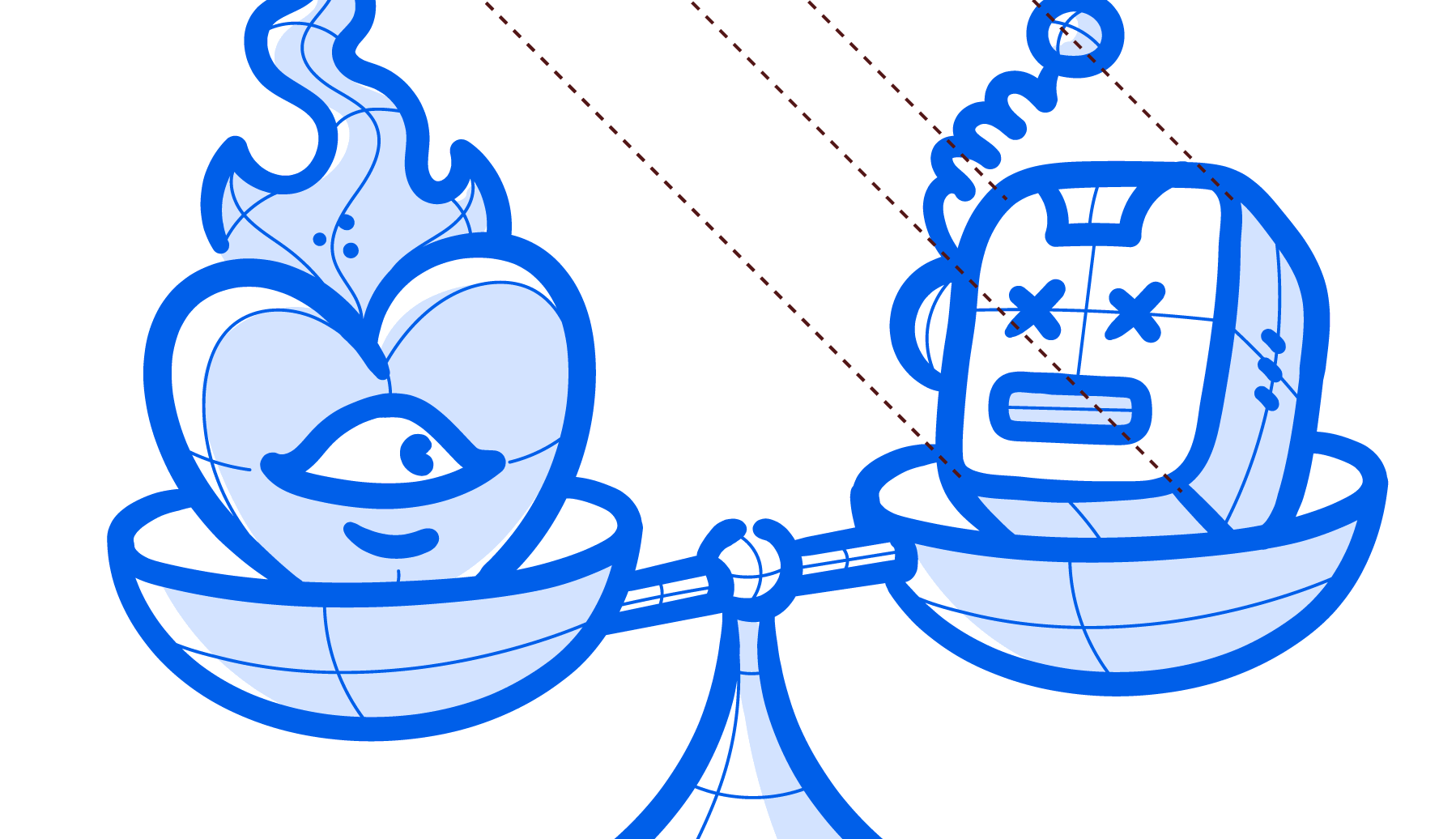
- Balance Through Asymmetry Even though the shape is symmetrical (a scale), the tension comes from contrast. One side is alive. The other’s burnt out. That visual imbalance feels like a story.
🌱 2nd Illustration process - Nature Always Wins
Concept: A bonsai tree growing out of a server rack. Symbolic of organic systems taking over digital spaces - tech vs. nature.
🛠️ Step-by-Step:
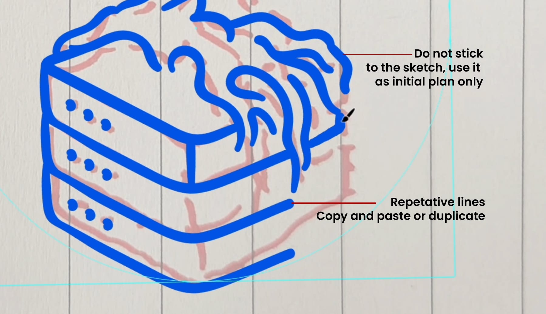
- Build the Base First We started with the server box, notice that we duplicated parts of the box. It is easier and dont waste your time redrawing ..the other elements will make up for the publication's repetitive tone.
- Clean cubes
- Consistent stroke weight
- Rounded edges for a friendly feel
Get your geometry right first, that’s your grounding layer.
- Draw the Tree Trunk with Energy Now the contrast: the trunk. We switched to a more organic stroke:
- Slight curves with variation in direction
- Roots wrapping around the tech hardware
The tree “breaks the box.” Let your organic lines invade the clean shape underneath.
- Use Detailing Lines for Shape This is where the second stroke width shines:
- Add curved “tube-like” lines on the trunk
- Suggest roots, creases, and bumps
- Define volume without using gradients
Think like a sculptor here. Your line direction should follow the surface you’re imagining (a bump, a knot, a curve)
The trick here is organic vs. engineered. Everything above the base flows, everything below it holds weight.
- Draw the Canopy with Clarity Instead of a single leafy blob, we added:
- Modular cloud shapes
- Small apples (to tell the “life” story)
- Subtle leaf clusters using curves and spacing
Unify It with RhythmNotice how the roots mirror the flow of the branches. There’s harmony and fluidity that guides your eyes to move across the design.
🤖3rd Illustration - Drawing The Machine is always learning
Concept: A robot calmly reading a book or machine learning - symbolizing knowledge, curiosity or AI learning from humanity.
What We Did:
- Block the Base Geometry
We started with a basic oval for the head and rectangles for the book. These are your “chassis.”
- Outline with Primary Stroke
Using the thick stroke:
- Robot’s round head, arms, and book
- Exaggerated shoulders for posture
- Framed book between robotic hands
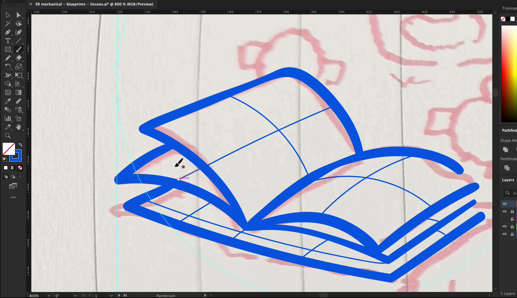
- Add Personality with Details
Using the thinner stroke:
- Antenna lines and soft smile
- Contours around the head/arms for volume
- Book pages for light structure
- Posture = Peaceful
Arms hug the book. Head slightly tilted. Shape language suggests calm, thoughtfulness, the robot is taking it all in.
- Frame the Scene
Added motion lines to show attention/glow. All without leaving the blueprint aesthetic.
NOTE: This icon tells a story, pick ideas that you know it relates to what people are thinking about, everyone nowadays is talking about machine learning and Ai.
🔌4th Illustration - Unplug to Live Your Life
Concept: A victorious character holding up a severed power plug, a bold metaphor for disconnecting from tech to reclaim your time and life! Symbolizing the idea of reclaiming your life and escaping burnout
🛠️ Step-by-Step illustrations guide:
- Start with the Hand Silhouette We began with a powerful upward-facing fist — not a realistic one, but a stylized, geometric hand:
- Rounded thumb wrapping the fingers
- Strong knuckles implied with simple curves
- Wrist connected to a short arm segment to ground it
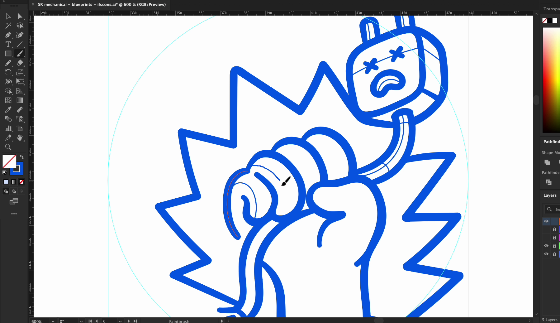
- Draw the Severed Cable Coming out from the grip is a clean, cut cable:
- Two prongs broken or slightly separated
- A little bend in the cord for motion
- One side droops naturally to add gravity
- Use Stroke Weight for Drama
- Thick stroke: for the hand structure and cable body
- Thin stroke: for line accents around the knuckles, cable highlights, and base edge
- Imply Shape with Curved Lines The curved internal strokes in the hand give it 3D shape — especially on the palm and thumb crease. These details help the hand feel clenched, not flat.
- No Symbols Needed, It Speaks Visually This design doesn’t rely on facial expressions or text. The gesture says it all. It’s a universal pose of defiance and freedom, done with minimal linework and pure blueprint style.
This one’s bold, iconic, and versatile. It could live in a digital wellness or detox campaign poster. And it’s built entirely from editable strokes.
🖌️ Drawing Technique Tips:
- Always use 2 strokes: One for primary shapes, one for detail and depth.
- Use curves to define form: Curved internal strokes can give the illusion of 3D without gradients.
- Don’t be afraid of negative space: It helps the style to breathe.
- Add symbolic motion: Like action lines or floating elements, without losing clarity.
Keep it modular: Each blueprint element should be reusable and remixable. Also easy to edit for later use.
🚀 Wrap-Up: Why Blueprint Style Wins
- ✅ Clean and timeless
- ✅ Emphasizes concept over decoration
- ✅ Easy to scale, color swap, and animate
- ✅ Works across product, dev, and branding spaces
This style forces you to think like a designer and draw like an engineer. It’s a great skill to add to your toolkit.
Try it, remix it, and tag us at @getillustrations. when you post your version. See you in the next tutorial!
Download the source vector files for this tutorial in .Ai

Artwork by Krishanda Adipurba
Co-founder & Art Director at Getillustrations.com