Notion Style Illustrations: How to Use Them in Templates, Websites and SaaS Products
The 'Notion look' isn't just a trend—it's a solution to UI clutter. Learn why top brands are switching to 'doc-style' art to reduce cognitive load, and how you can scale this aesthetic without relying on generic emojis
Everything you need to know about the minimalist illustration style that's reshaping modern design—plus practical tips for using it in your own projects.
You've seen it everywhere.
That clean, hand-drawn, black-and-white style that feels somehow both playful and professional. It started inside Notion documents and wikis, but now it's taken over SaaS landing pages, pitch decks, mobile apps, and even physical billboards.
If you're building a Notion template, designing a website, or creating marketing materials for a tech product, you've probably wondered: How do I get this look right? Where do I find these illustrations? And how do I use them without making my brand look like every other startup on Product Hunt?
This guide answers all of that. Whether you're a Notion template creator, a SaaS founder, or a designer looking to nail this aesthetic, you'll walk away knowing exactly how to use Notion-style illustrations effectively.
What Makes "Notion-Style" Illustrations Different
Let's start with the obvious question: What actually defines this style?
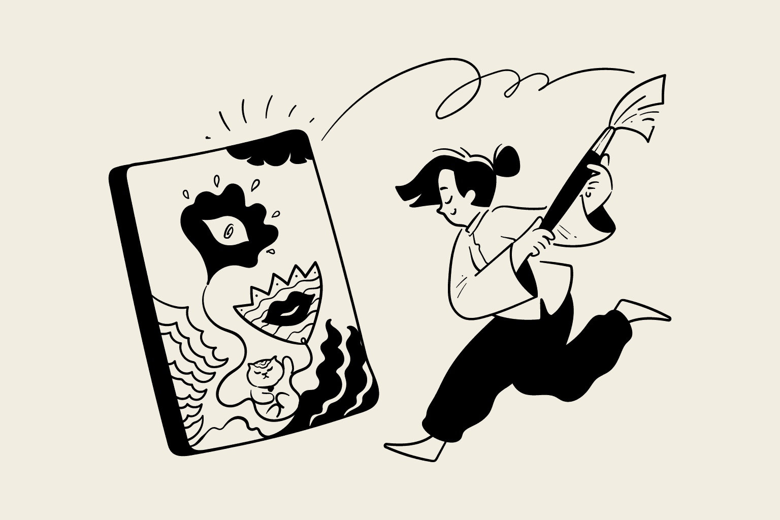
You might describe it as "minimalist outline" or "hand-drawn" but that doesn't capture the full picture. Plenty of illustration styles are minimalist. What makes Notion-style illustrations unique is their purpose.
Most illustrations are designed to grab attention. They're meant to be eye-catching, colorful, and memorable. Think of the 3D renders you see on fintech landing pages or the gradient-heavy illustrations on enterprise software sites. These are designed to say, "Look at me!"
Notion-style illustrations take the opposite approach. They're designed to get out of the way.
Inside a Notion document or a productivity app, the last thing you want is visual elements competing with your actual content. You need illustrations that provide context without demanding attention. That's why this style uses:
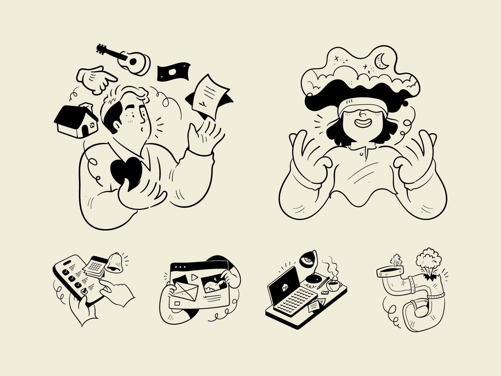
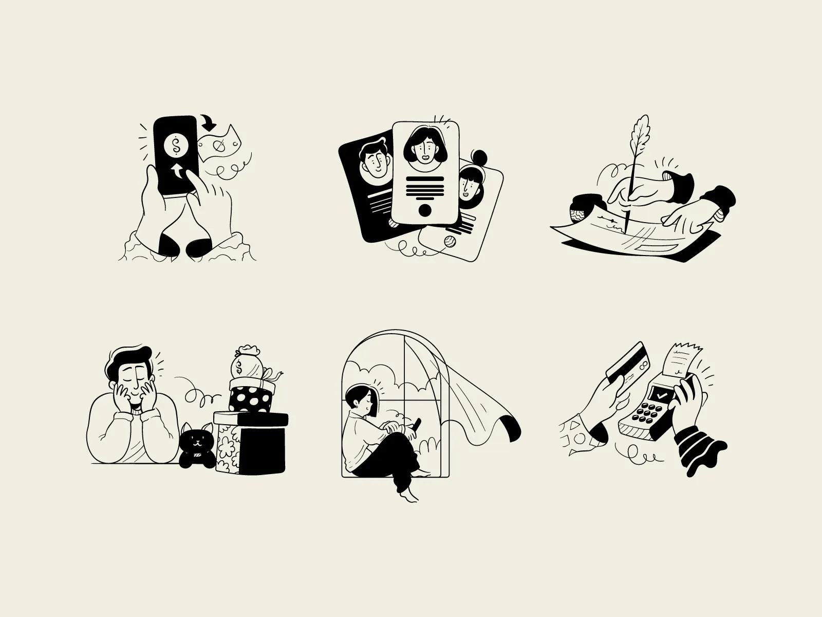
- Monochrome palettes. Black lines on white backgrounds (or inverted for dark mode). No competing colors to distract from your text or interface.
- No fills. Unlike traditional illustrations with solid shapes and gradients, these are pure linework. This keeps them lightweight and unobtrusive.
- Consistent stroke weight. Every line in the illustration uses the same thickness, creating visual harmony whether the image is 16 pixels or 500 pixels wide.
- Generous white space. About 80% of the illustration is empty space, allowing it to breathe and blend seamlessly into clean interfaces.
The result is an illustration style that functions like visual punctuation. It adds meaning without adding noise.
Why This Style Works So Well (The Psychology Behind It)
There's a reason this aesthetic has exploded in popularity, and it goes deeper than "it looks nice."
When users see colorful, polished 3D illustrations, their brain automatically categorizes them as marketing material. They put up their mental defenses. "Someone's trying to sell me something."
But when they see simple line drawings, the brain categorizes them as content. It feels more like a helpful diagram in a textbook than an advertisement. The user's guard comes down.
This is especially powerful in contexts where trust matters:
- Documentation and help centers. Users are looking for answers, not sales pitches. Clean illustrations signal "we're here to help."
- Productivity tools. When someone is trying to focus on their work, aggressive visuals are actively annoying. Subtle illustrations feel respectful of their attention.
- Notion templates. Template users want a clean starting point they can customize, not a heavily branded experience that clashes with their own content.
- Onboarding flows. New users are already overwhelmed with information. Illustrations that feel calm and approachable reduce cognitive load.
There's also a subtle human element at play. In an era of AI-generated content and hyper-polished corporate design, hand-drawn linework feels authentically human. The slight wobble in the lines, the imperfect curves—these imperfections subconsciously communicate that real people built this product.
Where to Use Notion Style Illustrations
This style is incredibly versatile. Here are the most effective use cases:
In Notion Templates
If you're selling or sharing Notion templates, illustrations can transform a basic layout into something that feels polished and premium. Here's where they work best:
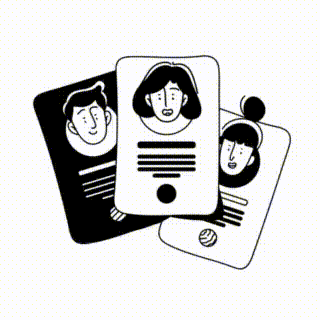
- Cover images. The first thing users see. A custom illustration immediately sets your template apart from the thousands using generic stock photos.
- Section headers. Small illustrations next to each section ("Tasks," "Goals," "Notes") add personality without cluttering the workspace.
- Empty states. When a database or section is empty, a friendly illustration with a message like "Nothing here yet" makes the template feel complete rather than unfinished.
- Callout boxes. Pair an illustration with important instructions or tips. It draws the eye without being obnoxious.
- Welcome pages. A hero illustration on your template's intro page instantly communicates the template's purpose and personality.
Pro tip: Consistency matters more than quantity. Pick 5-10 illustrations from the same set and use them throughout your template. Mixing styles makes everything look thrown together.
On Websites and Landing Pages
Notion-style illustrations shine on websites where you want to communicate professionalism without feeling corporate:
- Hero sections. A large, conceptual illustration next to your headline can communicate your value proposition faster than words alone.
- Feature sections. Instead of generic icons, use specific illustrations that actually represent what each feature does.
- Pricing pages. Illustrations for each tier (starter, pro, enterprise) help users quickly understand the differences.
- 404 and error pages. Turn frustrating moments into charming ones with a playful "page not found" illustration.
Blog posts. Featured images and in-article illustrations make content more engaging and shareable.
In SaaS Products and Apps
Inside your actual product, illustrations serve a functional purpose:
- Empty states. The most common use case. When a user hasn't created any projects yet, an illustration makes the interface feel welcoming instead of broken.
- Onboarding screens. Walk users through your product with illustrations that explain each step visually.
- Success and error states. "Your payment was successful" hits different with a cheerful illustration.
- Loading screens. Turn wait times into micro moments of delight.
Settings and account pages. These often feel boring and utilitarian. A few well-placed illustrations add personality.
The Most Common Mistakes (And How to Avoid Them)
After seeing thousands of websites, templates, and products use this style, certain mistakes come up again and again:
Mistake #1: Using Generic Icons Instead of Specific Illustrations
There's a difference between an icon library and an illustration system. Icons are symbols (a checkmark, a house, a gear). Illustrations are concepts (a team collaborating, data being analyzed, a customer receiving support).
If you're using the same lightbulb icon as every other "ideas" section on the internet, you're not creating a memorable brand—you're blending in.
The fix: Invest in illustrations that represent specific concepts relevant to your product. "API integration," "team conflict," "data migration," "customer feedback"—these specific metaphors are what differentiate premium products from generic ones.
Mistake #2: Mixing Illustration Styles
This is the fastest way to make a professional project look amateur. Your hero section uses thick, playful linework. Your feature icons are thin and geometric. Your empty states use something with fills and gradients.
The result is visual chaos. The user can't tell what your brand actually looks like.
The fix: Pick one illustration system and stick with it religiously. Every illustration on your site or in your product should look like it was drawn by the same artist.
Mistake #3: Overusing Illustrations
Yes, there's such a thing as too much of a good thing. When every single element has an accompanying illustration, none of them stand out. The style that's supposed to reduce cognitive load ends up adding to it.
The fix: Be strategic. Use illustrations to emphasize your most important moments: the hero section, empty states, major feature explanations, and key conversion points. Let the rest of your interface breathe.
Mistake #4: Ignoring Dark Mode
Black lines on white backgrounds look great... until someone switches to dark mode and your illustrations become invisible blobs.
The fix: Either use SVG files that can be styled with CSS (so lines automatically invert), or make sure your illustration library includes both light and dark variants.
How to Choose the Right Illustrations for Your Project
Not all Notion-style illustrations are created equal. Here's a framework for picking the right ones:
1. Match the complexity to the context. A complex scene with multiple characters makes sense for a hero section. A simple object works better for a small icon or empty state. Using a busy illustration in a tight space creates visual clutter.
2. Consider the emotional tone. Some Notion-style illustrations feel warm and friendly (curved lines, organic shapes, people). Others feel technical and precise (straight lines, geometric shapes, objects). Choose based on your brand personality.
3. Think about scalability. Will this illustration look good at 50px AND 500px? True Notion-style illustrations maintain their integrity across sizes because of their consistent stroke weight.
4. Check for conceptual relevance. Don't just pick something that "looks nice." Pick something that actually communicates the concept you're trying to convey. A generic plant illustration doesn't help explain your billing feature.


Where to Find Notion-Style Illustrations
You have three options, each with trade-offs:
Option 1: Free Icon Libraries
There are several open-source libraries with Notion-style icons (Streamline, Lucide, etc.). These work for basic needs, but you'll run into limitations quickly:
- Limited selection (usually just basic icons, not complex scenes)
- Everyone else uses them too, so you don't stand out
- Inconsistent quality across different packs
- Often missing specific business and SaaS concepts
Best for: Side projects, MVPs, or situations where budget is truly zero.
Option 2: Custom Illustrations
Hiring an illustrator to create custom assets gives you complete control and uniqueness. But the costs add up:
- $50-200+ per illustration (more for complex scenes)
- Days or weeks of turnaround time
- Need to commission new illustrations every time your product evolves
- Difficult to maintain consistency if you work with different artists
Best for: Funded startups with design budgets and specific brand requirements that can't be met with existing libraries.
Option 3: Premium Illustration Libraries
This is the middle ground that works for most teams. A comprehensive illustration library gives you:
- Hundreds or thousands of professionally designed illustrations
- Consistent style across the entire set
- Specific concepts for SaaS, business, and productivity use cases
- Commercial licenses included
- Instant access (no waiting for a designer)
Best for: Notion template creators, indie hackers, SaaS companies, and designers who need professional results without custom illustration budgets.
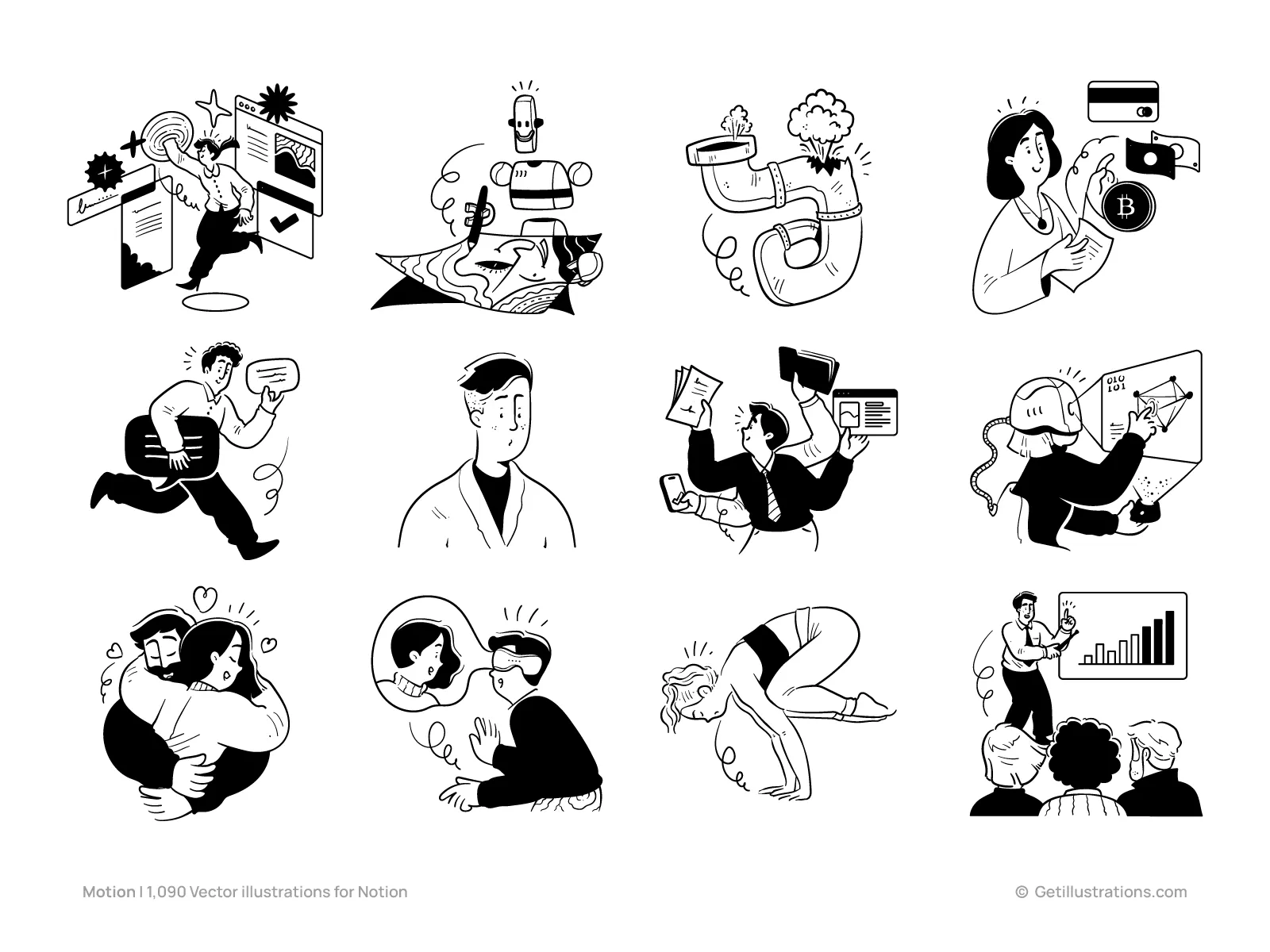
A Library Built for This Exact Use Case
At GetIllustrations, we've spent years perfecting Notion-style illustrations. Our Motion Notion library includes over 1,000 vector illustrations designed specifically for this aesthetic.
Every illustration follows the principles covered in this guide:
- Single-weight strokes for visual consistency at any size
- Subtle organic curves that feel human, not robotic
- Generous white space that integrates seamlessly with clean interfaces
- Specific concepts for business, SaaS, productivity, and creative work
The library covers everything from complex scenes (team collaboration, data analysis, customer support) to simple objects and icons. All files are provided as editable SVGs and high-resolution PNGs.
We also know that designers and creators hate counting credits. That's why we offer an All-Access Pass ($195/year) that includes:
- The complete Motion Notion pack (1,000+ illustrations)
- Access to our entire library of 38,960+ illustrations across all styles
- Commercial license for all downloads
- Lifetime access to everything you download
No credit limits, no counting downloads, no restrictions. Just download what you need, when you need it.
Practical Tips for Implementation
Before you go, here are some quick implementation tips:
For Notion templates: Upload illustrations as images, not embeds. This ensures they display correctly when users duplicate your template. Keep file sizes reasonable (under 500KB per illustration) to avoid slow loading.
For websites: Use SVG format whenever possible. SVGs scale perfectly, load fast, and can be styled with CSS for dark mode support. If you must use PNGs, export them at 2x resolution for crisp display on retina screens.
For SaaS products: Create a component library with your most-used illustrations. This ensures consistency across your product and makes it easy for your whole team to use the same assets.
For presentations: Notion-style illustrations work beautifully in pitch decks and internal presentations. They make slides feel more approachable than corporate stock photos or complex diagrams.
Final Thoughts
The Notion-style aesthetic has become the default visual language of modern productivity tools for a reason. It respects the user's attention, communicates trust, and ages gracefully as design trends come and go.
But like any design style, it's only as good as its execution. Generic icons won't differentiate your brand. Mixing styles will undermine your credibility. And skimping on quality will make your otherwise great product feel cheap.
Whether you're building Notion templates, designing a SaaS landing page, or creating marketing materials, take the time to get your illustrations right. Find (or create) a consistent system. Use them strategically. And always prioritize clarity over decoration.
Your users—and your conversion rates—will thank you.