About Colorful illustration
What Is Colorful Illustration Style? Origin & Design Theory
Color as information, not decoration
Color is not decoration. It is information. Color communicates emotion, signals category, establishes hierarchy, and triggers memory associations before conscious processing begins. Red raises heart rate. Blue lowers it. Yellow activates attention. Green signals safety and nature. These are deeply embedded psychophysiological responses, and they fire faster than language: a viewer feels the palette of a scene before reading a single word of the page it sits on. The colorful illustration style is built on the deliberate use of this psychological power at full intensity rather than holding it in reserve.
Structure keeps colorful illustration coherent
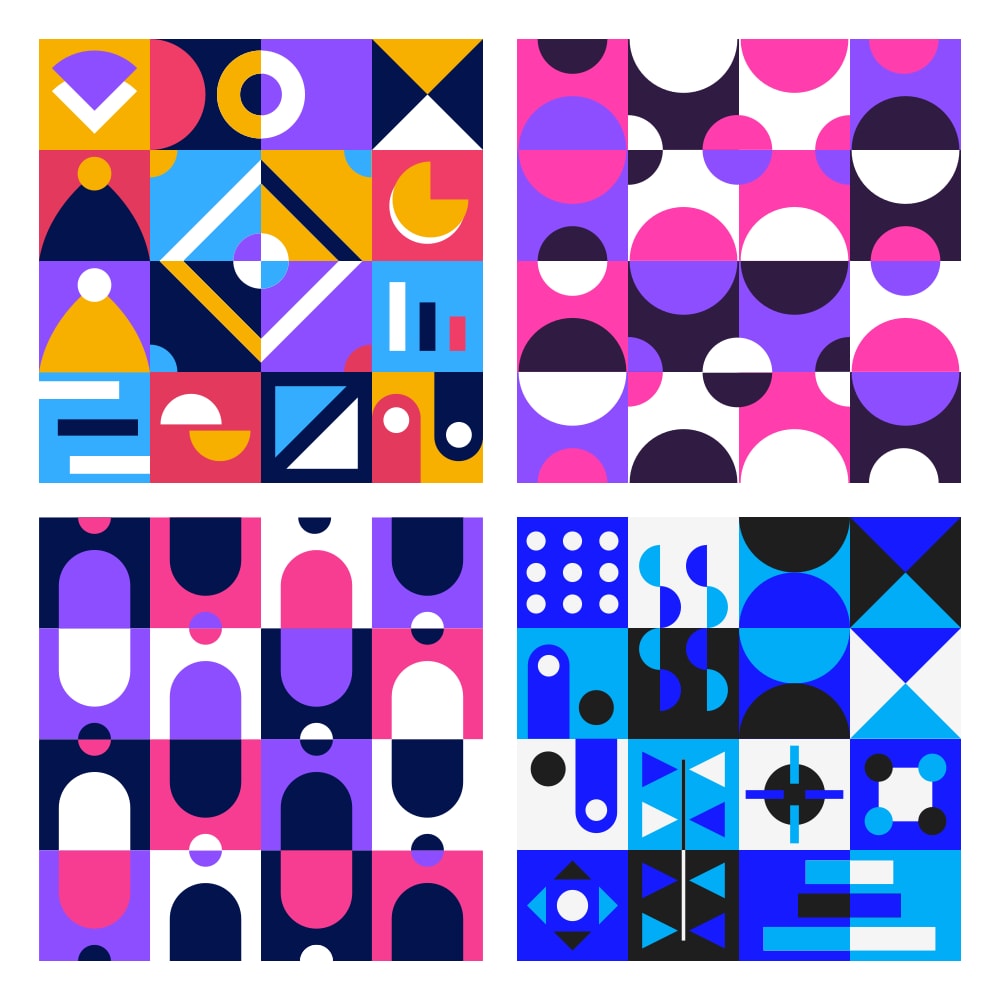
What separates skilled colorful work from noise is structure. High saturation across an entire image can fatigue the eye, so the strongest colorful systems lean on color theory to stay coherent: complementary pairs for tension, analogous ranges for harmony, and a controlled value contrast so the composition still reads at a glance. Limiting a piece to a defined palette, then pushing those few hues to full strength, is what makes the result feel energetic and intentional instead of merely loud.
Fine-art roots of the colorful style
Colorful illustration sits at the intersection of two traditions: the maximalist color theory of fine art (Matisse's fauvist color planes, Mondrian's primary geometry, Kandinsky's color-emotion correspondence) and the pragmatic color psychology of commercial illustration. From the Fauves onward, artists argued that color could carry meaning on its own, independent of accurate representation, and that idea flows directly into how a brand uses a saturated illustration to set a tone.
Colorful illustration versus the minimalism wave
In digital design specifically, the colorful style is the deliberate counter-position to the 2010s minimalism wave. As flat, near-monochrome interfaces became the default, vibrant illustration reclaimed color as a design principle rather than a decorative afterthought. On a page full of white space and gray text, a fully saturated scene becomes the focal point the eye is drawn to first, which is exactly why the style works as hard for attention as it does for mood.
GetIllustrations' colorful library spans 55 packs and 4,609 illustrations. Simple illustrations (217 pieces) combines hand-drawn black brush outlines with spot colors. POP illustrations (300 pieces) brings this to fintech and startup contexts. Downtown (200 pieces) creates cheerful character scenes. Vibrance (260 pieces) and GeoShape (250 pieces) bring geometric minimalism to vibrant color. Stipple (200 pieces) applies halftone technique. Bloomie (110 pieces) and Bloomie Life (200 pieces) bring children's book warmth to modern web design. The library also includes sticker packs and pattern collections.
Why Choose Colorful Illustrations
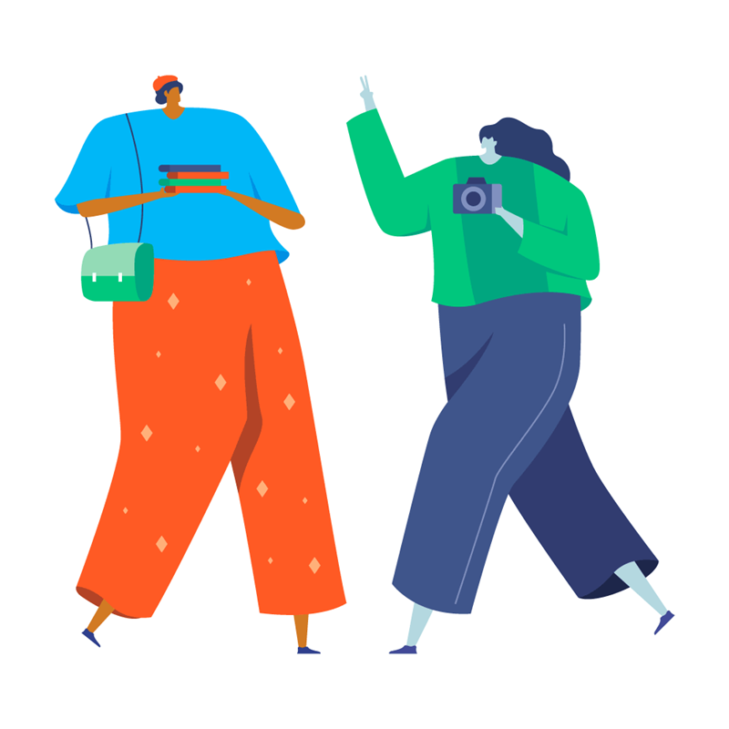
- Immediate emotional engagement. Colorful illustrations create a positive response before any verbal processing occurs, because the brain registers vibrant, harmonious color as energizing and approachable.
- Attention and scroll-stopping. In an environment dominated by white backgrounds and minimal color, a saturated illustration is a visual anomaly the eye is wired to notice and land on first.
- Communicates inclusivity. Bold, multi-color palettes read as a democratic, welcoming aesthetic, the visual language of markets, celebrations, playgrounds, and community spaces.
- Children and young audiences. Research on color preference consistently shows that children and young adults respond more strongly to vibrant, multi-color environments than to muted ones.
- Builds a memorable brand signature. A distinctive, fully saturated palette is easier to recall than a neutral one, so consistent colorful work strengthens recognition over time.
- Energizes flat, text-heavy layouts. Dropped into an otherwise minimal interface, colorful illustration adds warmth and personality without requiring a full visual redesign.
Best For
- Consumer e-commerce & retail. The vibrant, eye-catching quality creates the sense of excitement and abundance associated with shopping.
- Food, restaurant & lifestyle brands. Food is color: richness, freshness, and variety are all communicated through hue before taste enters the picture.
- Social media & stickers. Sticker packs (Sambal, Taco, Happy, Neon, Kaleido) are built for high-velocity content environments where a bright, instant read wins.
- Diversity & inclusion communication. The Diversity MX pack celebrates inclusivity through welcoming, vibrant aesthetics that feel open to everyone.
- Children's products & EdTech. The Bloomie system (310 pieces) brings children's book warmth to modern web design for learning and family-facing products.
- Events, campaigns & community brands. Festivals, nonprofits, and local initiatives use full-saturation color to feel celebratory, energetic, and human.
Pro Tips
- Establish a dominant color and let it lead. Identify one dominant color in your chosen pack and make it the primary color in your surrounding UI for visual coherence.
- Use white space as a buffer. Colorful illustrations at full saturation need breathing room, and white space prevents the visual energy from becoming overwhelming.
- Match color temperature throughout. Warm-palette illustrations pair with warm-toned typography; cool-palette illustrations pair with cool or neutral backgrounds.
Colorful illustration packs


Colorful icon packs 3 icon packs
Everything you need
Figma plugin
Browse all Colorful illustrations, preview them in your colour system, and insert them straight into your file, without leaving Figma.
Install the Figma plugin →All Access
Every Colorful illustration. Every style. One subscription: 42K+ assets for $195/year.
Get All Access →Custom illustrations
Need Colorful illustrations built for your exact brand? Our team creates custom sets matched to your design language.
Explore custom services →Get all 159 Colorful illustrations
One subscription. Every pack. Every style. Updated weekly.