The Complete Guide to Website Illustrations: A 2026 Strategic Toolkit
Stop using illustrations as decoration. Our 2026 guide details the 6 types of website illustrations (Hero, Spot, Icons) and how to use them as a strategic toolkit to boost conversions and brand.
As we head into 2026, the rules of web design are changing—fast. A generic website is no longer just ineffective; it's invisible. Users now expect hyper-personalized, immersive, and tactile experiences. AI is no longer a gimmick; it's a core design partner.
In this new landscape, your website illustrations are your most critical asset for future-proofing your brand.
But a common mistake is to treat them like static "art." This is wrong. To succeed in 2026, you must treat your illustrations for a website as a functional, high-performance toolkit. Every graphic, from a massive 3D hero to a tiny animated icon, has a specific, measurable "job."
This guide will teach you what those jobs are and how to deploy your "visual toolkit" to build a website that feels modern, human, and ready for 2026.
The 6 Core Illustration Types (And Their Jobs)
Your website's visual system is composed of six main illustration types. Here’s what they are, what their real goal is, and how to use them.
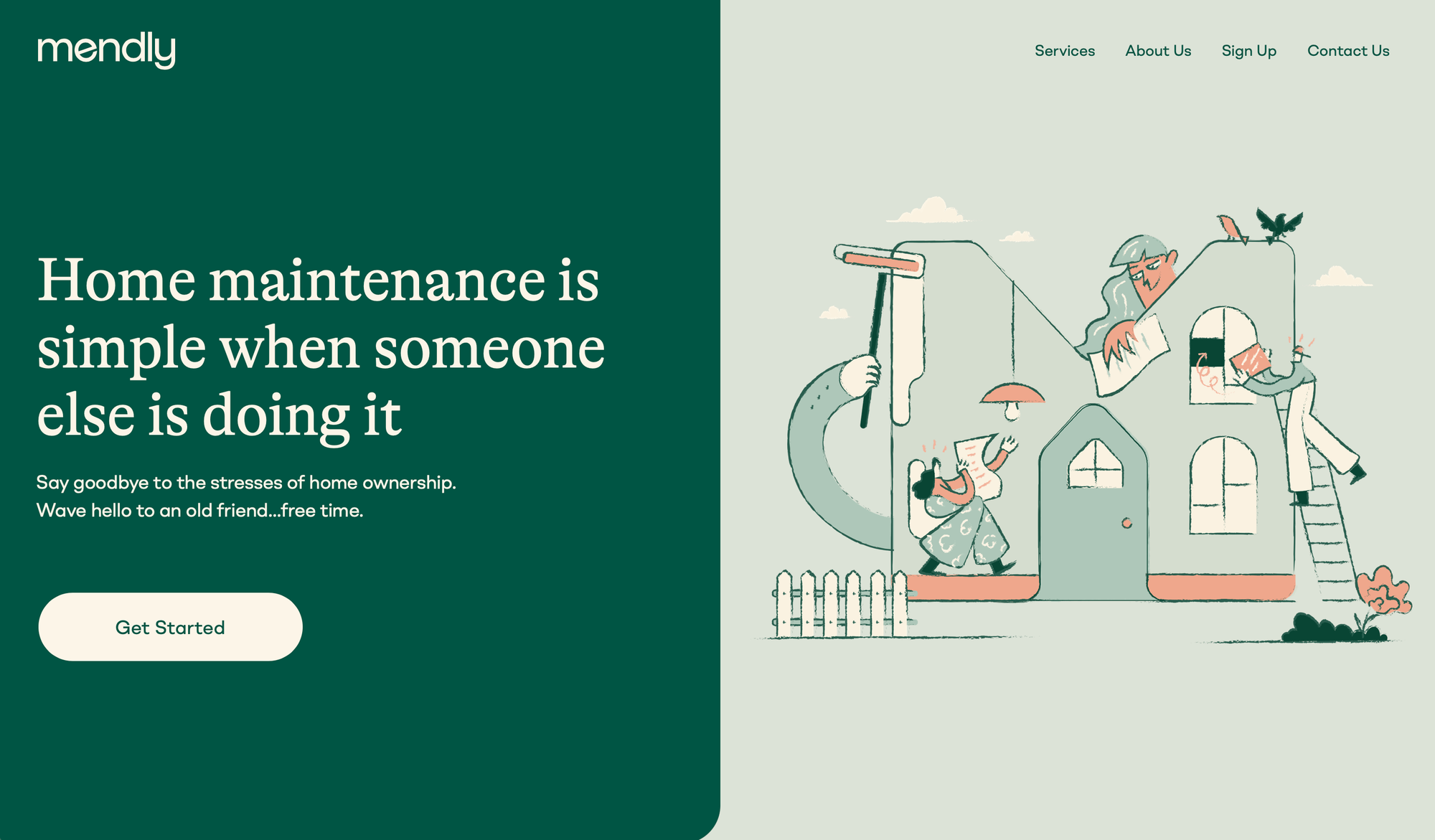
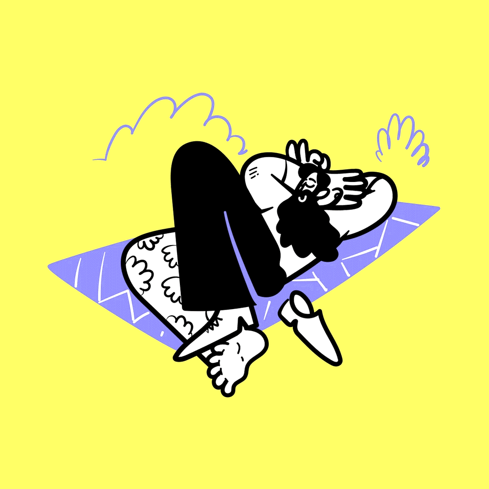
1. Hero Illustrations
- What It Is: The large, high-impact graphic at the top of your homepage or a key landing page.
- Primary Job:
Value Proposition Clarity. Its job is to visually explain your entire business concept in the 3 seconds you have a user's attention. It's not just a banner; it's your visual elevator pitch.
- How to Use It:
- Show the "After": Don't show your product; show the outcome of using your product. If you sell project management software, show a calm, organized team celebrating a launch—not a screenshot of your dashboard.
- Match the Headline: The illustration and the main headline must tell the same story. If the headline says "Effortless Team Collaboration," the illustration must show effortless collaboration.
- Guide the Eye: Use the composition of the illustration (e.g., a character's gaze, a pointing line) to subtly direct the user's eye toward your main Call-to-Action (CTA) button.
- 2026 Future-Proof Tip: Embrace Colorful Hand-Drawn Illustrations with Motion. As AI masters slick 3D, the new "premium" is authentic, human-centric design. A future-proof hero is a vibrant, colorful hand-drawing that isn't static. Use "scroll-telling" motion or Lottie animations to make the hand-drawn elements come alive as the user scrolls. This combines a tactile, personal, hand-drawn feel with a high-performance, technologically advanced experience, making your brand feel both premium and trustworthy.
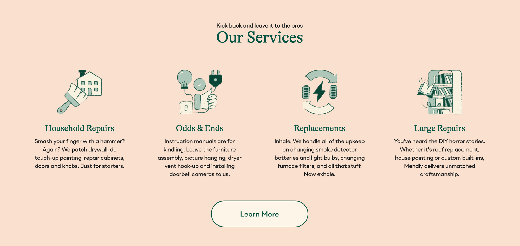
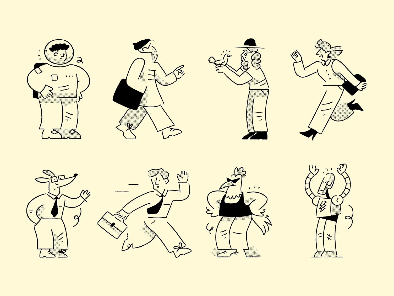
2. Spot Illustrations
- What It Is: Small, simple illustrations used next to blocks of text, typically to break up feature lists, "How It Works" sections, or service blurbs.
- Primary Job:
Feature Scannability. Their job is to make a wall of text easy to scan and understand. They act as visual "anchors" that let a user grasp a feature's benefit without reading the full paragraph.
- How to Use It:
- One Concept, One Graphic: A spot illustration should be dead simple. If the feature is "24/7 Support," show a clock or a headset. Don't overcomplicate it.
- Ensure Visual Consistency: This is where most sites fail. All your spot illustrations must look like they are part of the same "set." This is why buying complete illustration packs is so effective.
- Replace Bullet Points: Instead of a boring
<ul>list, use a 3-column layout with a spot illustration, a sub-headline, and a short description for each feature. This is far more engaging.
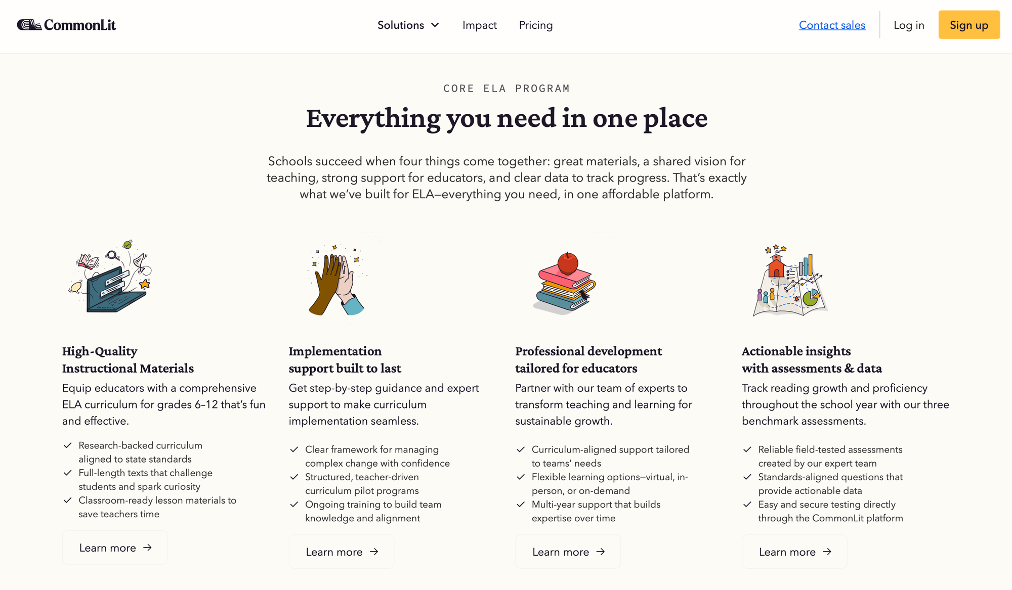
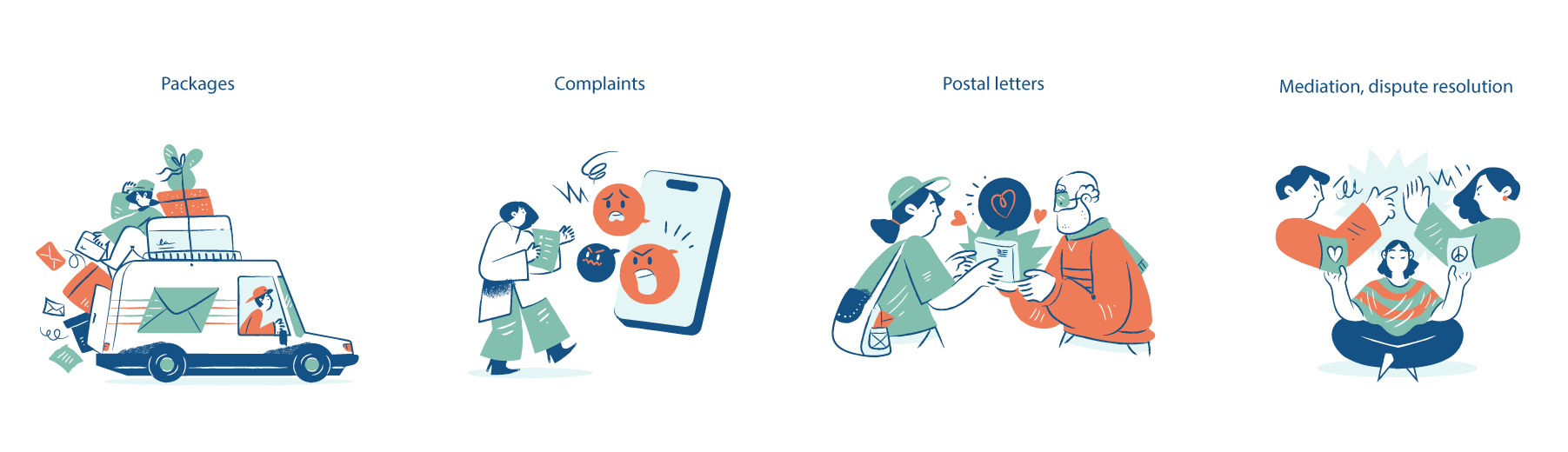
- 2026 Future-Proof Tip: Embrace minimal outline or hand-drawn styles for personality. As AI-generated content becomes more common, users crave an authentic human touch. Use spot illustrations to inject this personality. A clean, minimal outline style feels elegant and efficient, while a hand-drawn style with organic textures feels personal and trustworthy. Both styles make your features pop and stand out from generic, AI-perfect designs.
Error 404 Animated Illustration
3. Empty State Illustrations
- What It Is: The illustration shown when a page or component has no content (e.g., "Inbox Zero," "No Search Results," "404 Page Not Found").
- Primary Job:
User Retention & Frustration Bypassing. Its job is to turn a moment of friction or failure into a moment of brand delight and guidance. - How to Use It:
- Be Helpful, Not Just Witty: A "404" page with a sad robot is a dead end. A good 404 illustration is paired with a helpful message: "Oops! This page is gone. But you might like..." and includes links to your blog or top products.
- Prompt the "First Action": For an empty "Projects" dashboard, the illustration should visually hint at the one action the user needs to take, supporting the "Create Your First Project" button.
- Stay On-Brand: This is your best opportunity to show your brand's personality—be it humorous, encouraging, or professional.
Loading animations by Getillustrations
- 2026 Future-Proof Tip: Make them Humorous and Interactive. An empty state is your best opportunity to make a user smile. Instead of a boring "404," create a happy illustration that adds a sense of wonder. For example, show a playful character who looks comically lost, or an illustration of a UFO beaming up your content. The best empty states are interactive: make the character's eyes follow the user's cursor, or add a subtle animation that triggers on hover. This turns a moment of failure into a humorous and delightful brand experience that builds real connection.
4. Editorial Illustrations
- What It Is: A custom-made illustration for a specific blog post, article, or case study.
- Primary Job:
Conceptual Understanding & Shareability. A great editorial illustration is a visual thesis for your article. It dramatically increases the chance your content will be shared and clicked on social media. - How to Use It:
- Visualize the Core Concept: Read the article. What is the one abstract idea it's trying to communicate? Illustrate that. If the post is "How to Fix Low-Hanging SEO Fruit," you could illustrate a person easily picking an apple from a tree.
- Create Branded "Social Cards": This is the "new knowledge" hack. The main purpose of your blog's editorial illustration is to be the image that appears as your "social card" on X (Twitter), LinkedIn, and Facebook. A compelling, on-brand image is the #1 driver of click-through from social.
- 2026 Future-Proof Tip: Use the AI "Co-Pilot" Workflow. Don't have a 5-hour budget for every blog post. Use an AI image generator (like Midjourney or Firefly) to brainstorm 10-15 concepts in 5 minutes. Then, have your human designer take the best concept, refine it, and "brand it" with your style and color palette. This is the 2026 workflow: AI for ideation, human for the final polish.
5. Guiding Illustrations (Onboarding & Steps)
- What It Is: A series of illustrations used to walk a user through a multi-step process, like a setup wizard, checkout flow, or new-user onboarding.
- Primary Job:
Friction Reduction & Completion Rate. Their job is to make a complex process feel simple and to motivate the user to finish. - How to Use It:
- Show Progression: Use illustrations to visually "gamify" the process. Show a character climbing a set of stairs, a rocket ship moving from one planet to the next, or a simple progress bar filling up.
- Explain Why: In an onboarding flow, don't just ask for data. Use a small illustration to show why you need it. For "Connect your calendar," show an illustration of a clock and a "sync" icon to imply automation.
- Reduce Intimidation: A long form (like on a pricing plans page) is scary. A 3-step process, each with a friendly illustration, feels manageable.
- 2026 Future-Proof Tip: Combine them with AI-driven adaptive onboarding. Don't show every user the same 5-step tutorial. Based on their sign-up data (e.g., "designer" vs. "marketer"), use guiding illustrations to show them a personalized path that only features the tools they care about.
6. Icons
- What It Is: The smallest, most functional type of illustration. Used for navigation, buttons, and as simple visual cues (e.g., a "save" disk, a "user" profile icon).
- Primary Job:
Universal Navigation & Space Efficiency. Icons are a universal visual language that conveys a concept or action in a tiny, space-saving footprint. - How to Use It:
- Absolute Consistency: This is the #1 rule. All icons in your set must share the same line weight, corner radius (sharp vs. rounded), and style (outline vs. solid fill). Any deviation looks unprofessional.
- Test for Recognition: Don't get too "creative." An icon's job is to be recognized instantly. Your "Search" icon should be a magnifying glass. Your "Settings" icon should be a cog.
- Never Mix Styles: Do not pull one icon from a free library and another from a different set. Commit to one single, comprehensive set.
- 2026 Future-Proof Tip: Animated Icons & Micro-interactions are now standard. An icon shouldn't just sit there; it should provide feedback. On hover or click, the icon should animate: a "like" heart that fills, a "download" arrow that bounces, or a "menu" hamburger that transforms into an "X." This functional motion makes your site feel alive and responsive.
How to Find Your Illustrations in 2026
- The AI Route (For Brainstorming): Use AI image generators to explore styles and concepts quickly. Do not use raw AI output for your final site—it lacks the consistency and brand uniqueness required for a professional toolkit.
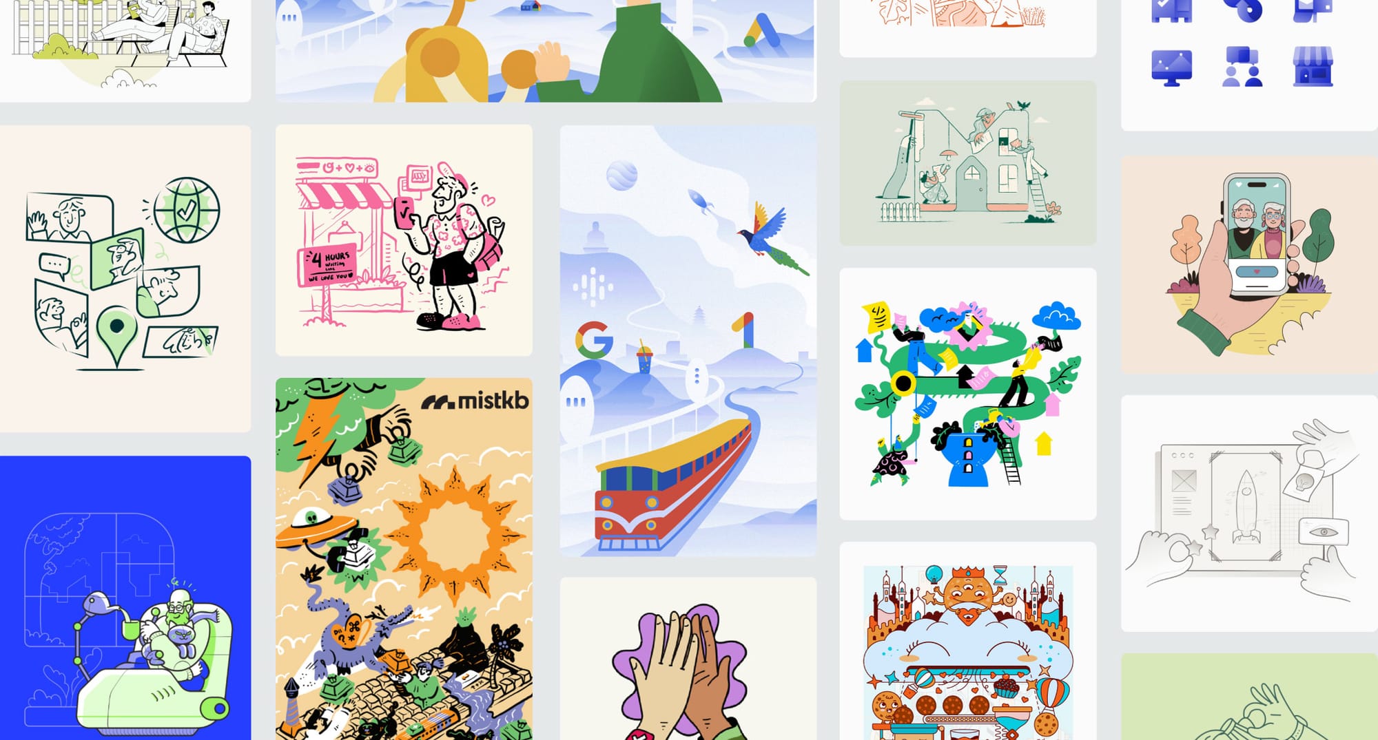
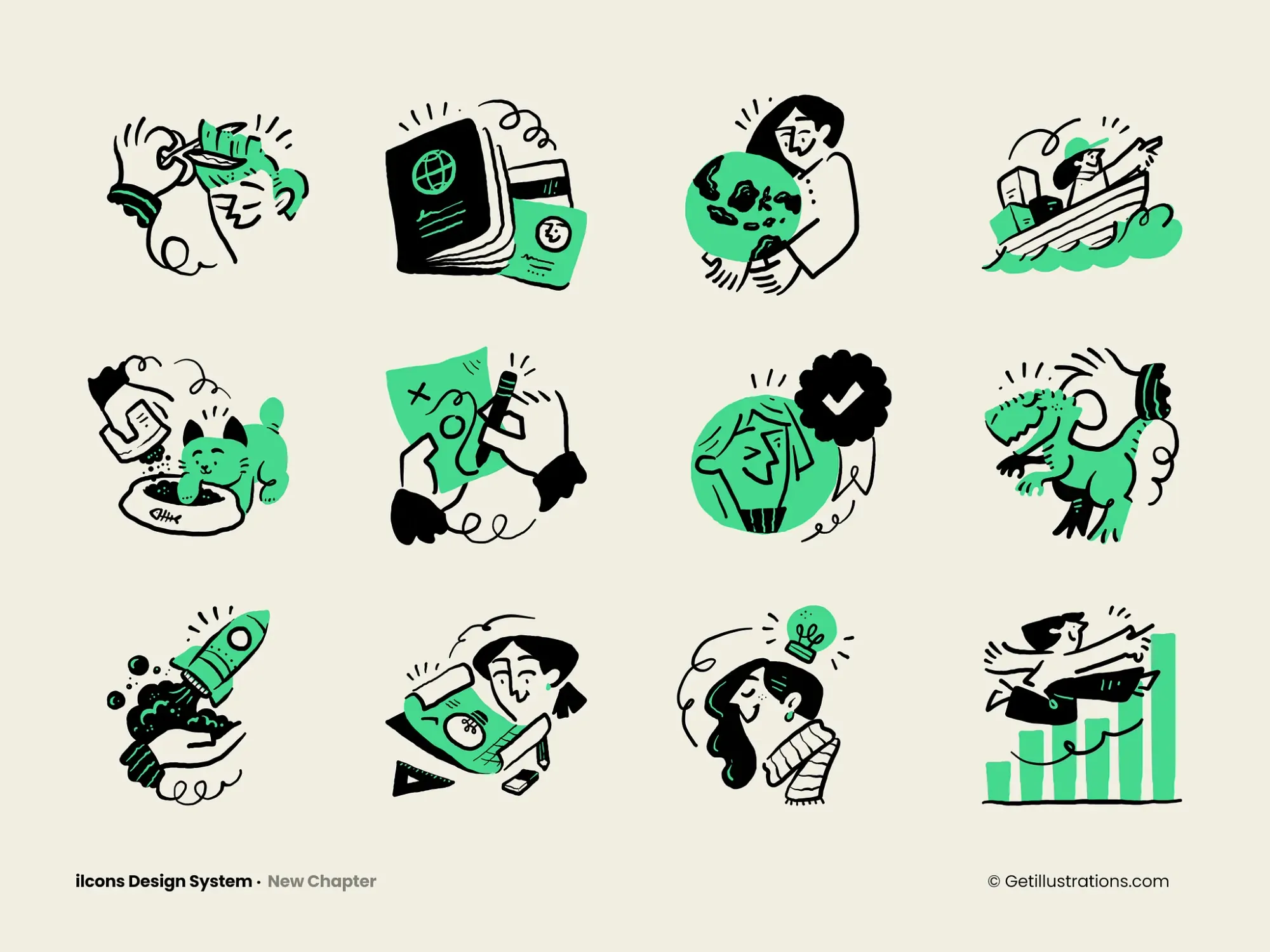
- The "Free Illustrations" Route (For Speed): This is a great starting point, and your data shows many users are searching for "free illustrations for commercial use." You can find libraries like unDraw, Storyset, and Humaaans, or just grab our own free illustrations.
- Pro: Great for testing ideas and for commercial use.
- Con: They are very popular. The hero illustration you pick might be on 1,000 other websites, diluting your brand.
- The Professional Pack Route (The Best Balance): This is where
GetIllustrationscomes in.- Pro: You get a massive, cohesive library of thousands of illustrations (heroes, spots, icons) all in one matching style. This gives you a unique, premium, and human-crafted look for a fraction of the cost of hiring a custom illustrator.
- Con: It's a one-time purchase or subscription.
Final Takeaway
Stop "decorating" your website. Start thinking like a 2026 brand.
Your website illustrations are a functional system. Your hero creates immersion, your spots drive scannability, your empty states build brand love, and your icons provide tactile feedback.
By using this strategic toolkit, you'll create a website that not only looks unique but is future-proof and performs better at every step of the user's journey.
Get one year of unlimited downloads from our entire library. Everything you download is yours to keep and use foreverunder a simple, unrestricted commercial license for business.