How to Use Illustrations in Your SaaS Landing Page (Complete Guide)
Stop confusing users with a "wall of text." This guide shows how to use SaaS illustrations strategically to explain complex ideas, build trust and boost conversions while making your website look even better.
Designing a SaaS landing page that feels modern, trustworthy, and clear is a major challenge. You have about three seconds. That's it. Visitors judge your product instantly, and if they're confused, they leave.
This is where illustrations come in. The right website illustrations or a well-chosen SaaS illustration pack aren't just eye-candy. They're your secret weapon to explain your value and reduce that split-second confusion.
Using a high-quality illustration pack isn't decoration; it's a core part of conversion rate optimization (CRO). In this guide, you'll learn the strategy behind using vector illustrations and SaaS illustrations correctly, so your landing page feels polished, user-friendly, and truly conversion-ready.
Looking for ready-to-use SaaS illustration packs? Explore our full library of SaaS-ready illustrations.)
Why SaaS Illustrations Are Critical for Conversions (It's About Psychology)
Let's be honest: in the SaaS world, you're often selling a complex, intangible product. "AI-powered analytics." "Cloud-based workflow automation." A wall of text just won't cut it. Illustrations bridge the gap between your complex features and your user's understanding.
1. They Communicate Complex Features Instantly
The Problem: Your SaaS product is brilliant, but it's complex. A "wall of text" describing your features is a conversion killer. It overwhelms visitors, and they bounce.
The Solution: Use illustrations as visual metaphors. Instead of a dense paragraph about “multi-platform API integration,” use a simple visual showing your app's logo connecting to logos for Slack, Google Drive, and Notion. It instantly communicates: “it works with your other tools.”
The Result: The user gets that “Aha!” moment in seconds, not minutes. This clarity reduces friction and makes them want to keep exploring. That directly increases your time-on-page, a key signal that search engines like Google love to see.
2. They Build Brand Personality and Trust
The Problem: You're the new kid on the block. Visitors are skeptical. "Why should I trust these folks with my data or my credit card?"
The Solution: Illustrations give your brand a face. Generic, cold stock photos make you look like every other "blue-and-white" SaaS clone. A unique illustration style—whether it's hand-drawn, 3D, or a clean outline—creates a memorable personality. It shows you're a polished, professional team that sweats the details.
The Result: Trust. A friendly, human-feeling design makes users feel more comfortable. This emotional connection is a vital step toward convincing someone to sign up for your free trial.
3. They Guide the User's Eye to Your Call-to-Action (CTA)
The Problem: Your “Start Free Trial” button is right there, but people are scrolling right past it.
The Solution: Use your illustrations to create a visual hierarchy. It's a classic CRO trick, and it works. Have a character in your illustration looking directly at your CTA button or sign-up form. The human brain is hard-wired to follow a person's gaze. You can also use illustrative elements like arrows or flowing lines to subtly "point" the user toward the most important action on the page.
The Result: A higher conversion rate. You are actively, and subconsciously, directing your user's attention to the one spot where they convert.
Where to Use Illustrations (And How to Use It the Right Way)
Strategic placement is everything. Don't just add illustrations to "fill space." Give every single visual a job to do.
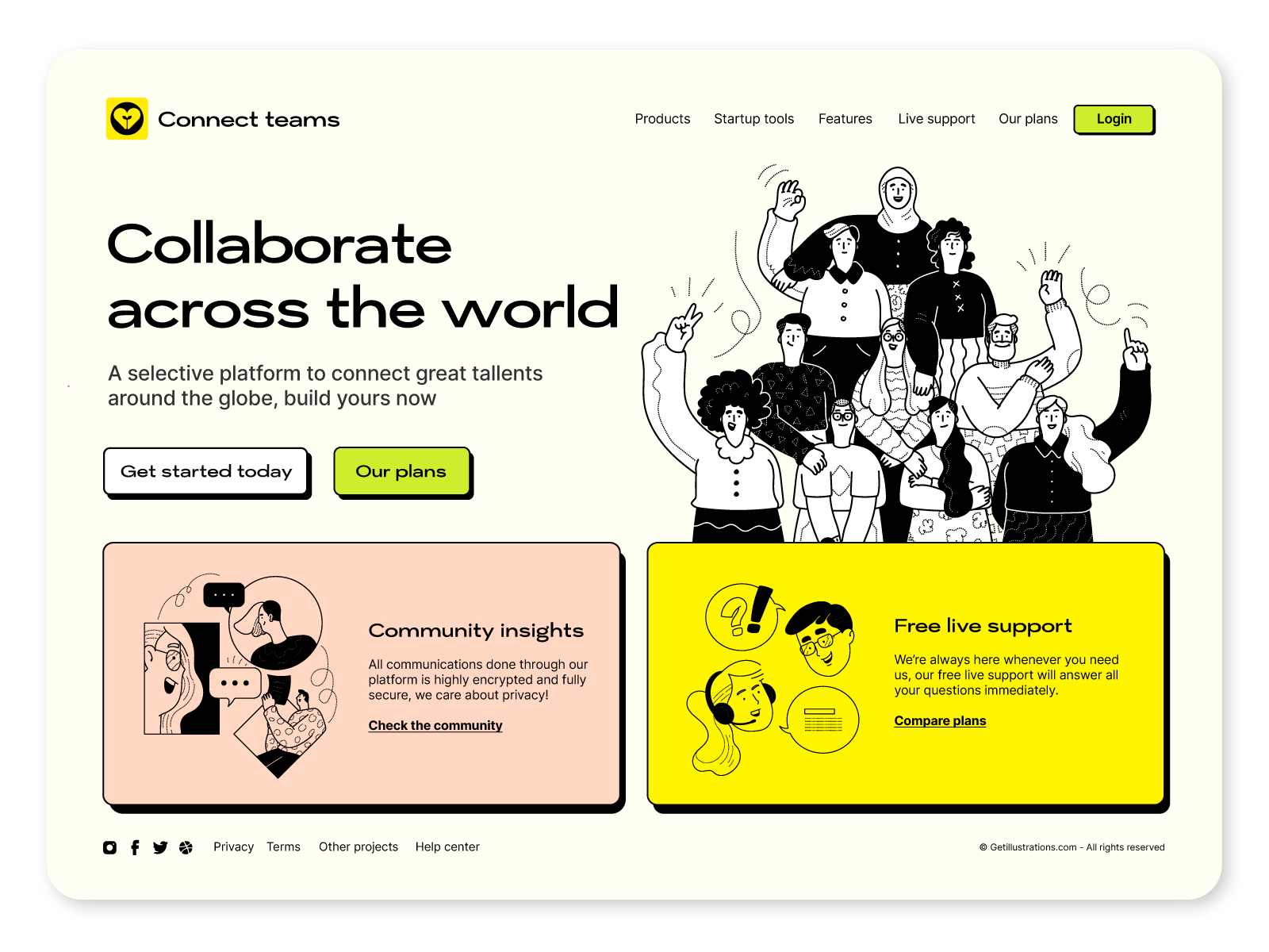
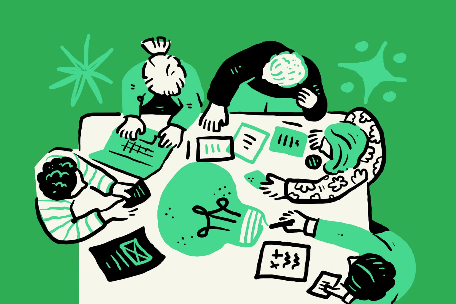
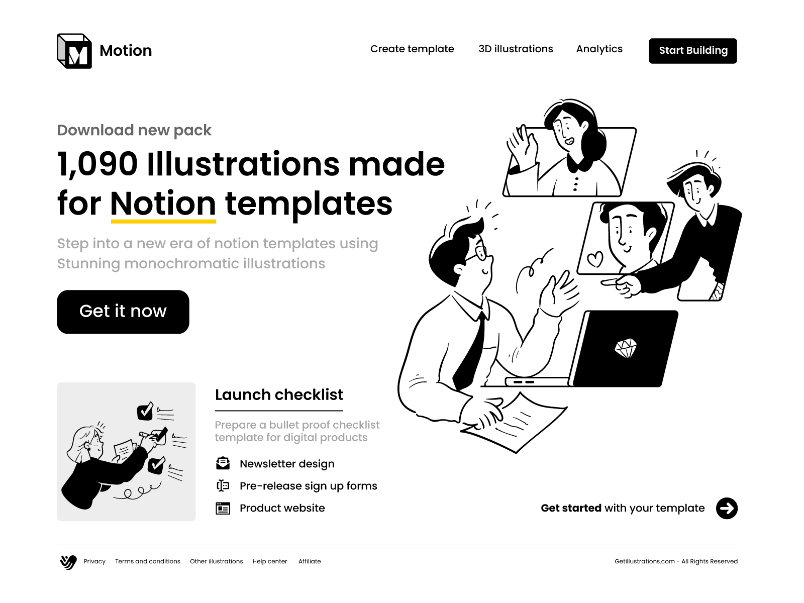
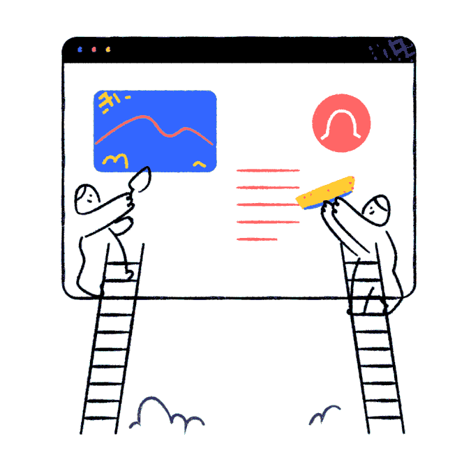
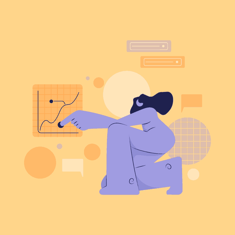
1. Hero Section
The Goal: Answer “What is this?” and “Why should I care?” in three seconds.
How to use it: This is your most important visual. It has to summarize your product's main value. Avoid generic "teamwork" scenes. If your SaaS helps remote teams collaborate, show a visual metaphor of people connecting across a globe. If it saves time, show a character relaxing while automation does the work. This is your first impression. Make it count.
Recommended packs (based on your site's popular pages):
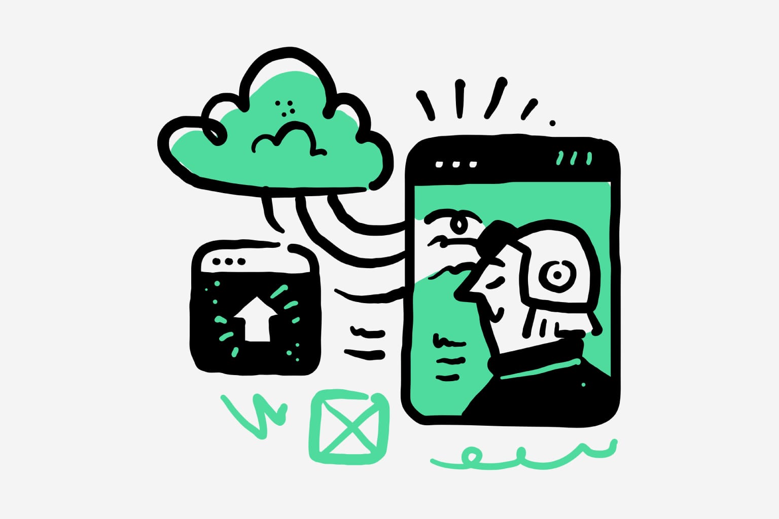
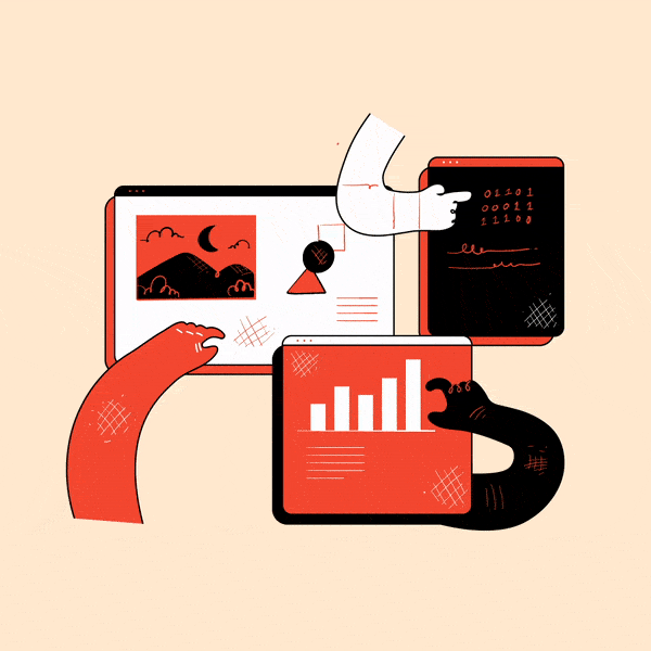
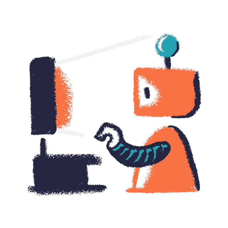
2. Feature Sections
The Goal: Break up that "wall of text" and make technical features easy to digest.
How to use it: Pair each feature H3 with a small, simple "spot illustration." These act as visual anchors. For a feature like “99.9% uptime,” use a rising graph. For “encrypted data,” use a shield or padlock. For “automation,” use cogs or flow arrows.
Recommended packs:
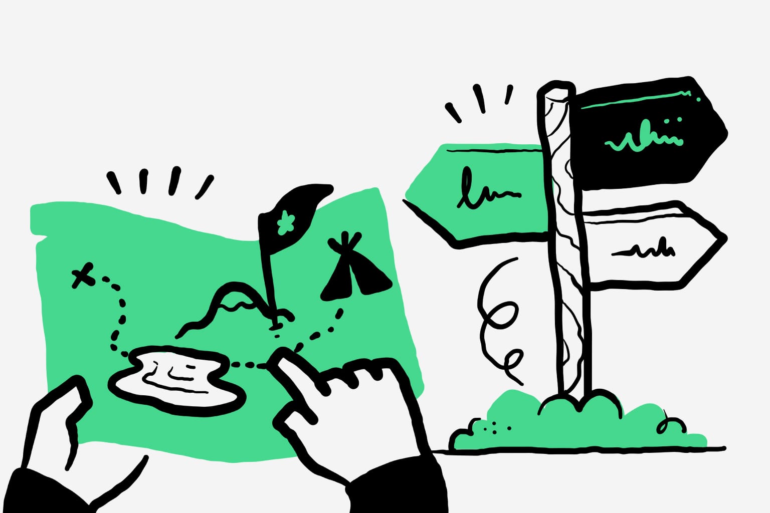
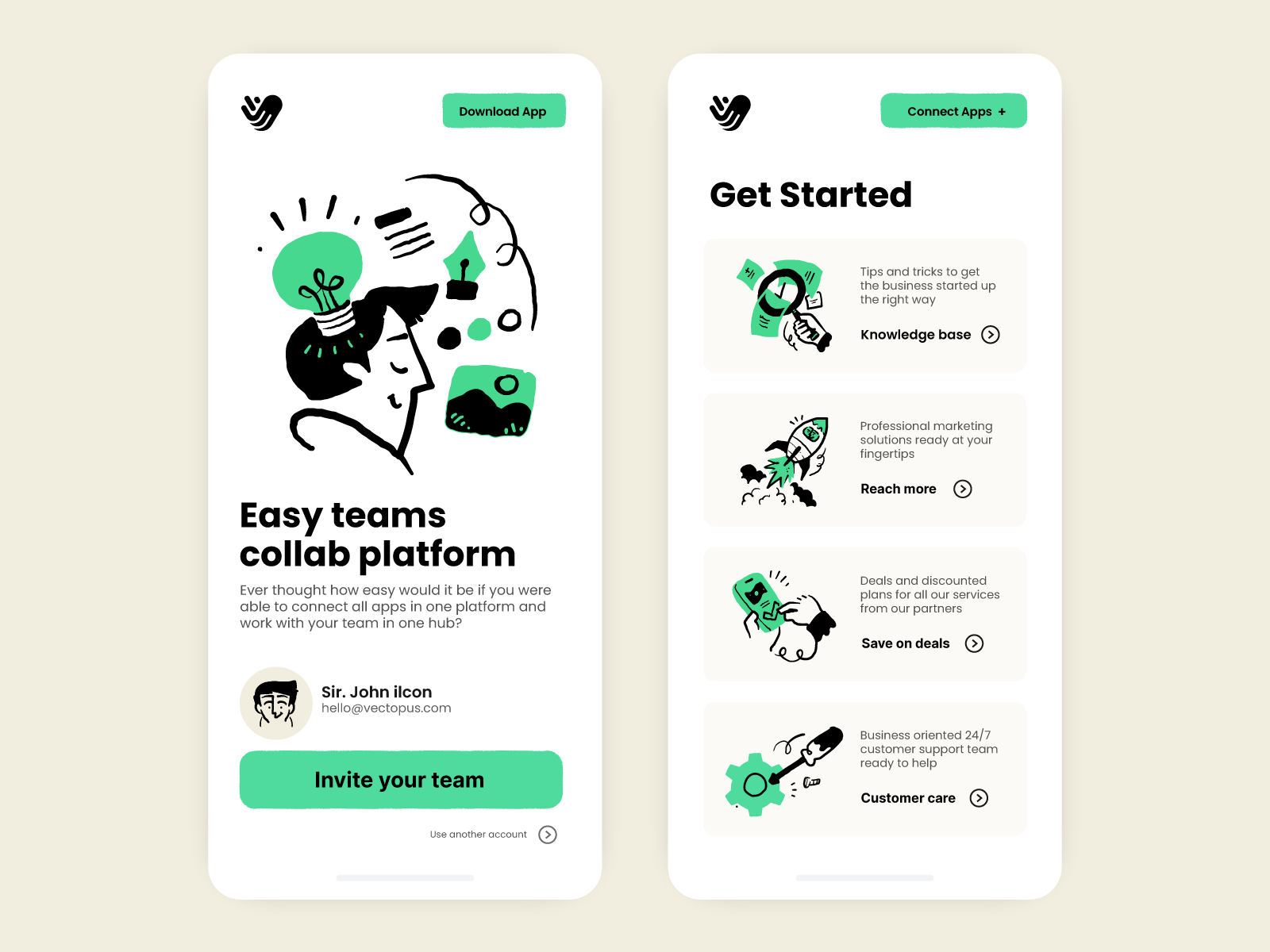
3. “How It Works” or Workflow Section
The Goal: De-mystify your product. Show it's powerful, but easy to use.
How to use it: This is where you build confidence. Use a simple 3- or 4-step visual diagram.
Step 1: (Illustration of 'Upload') → Step 2: (Illustration of 'AI Analyzes') → Step 3: (Illustration of 'Get Report'). You can even use simplified, stylized UI elements from your own product. This shows users exactly what to expect and removes the "fear of the unknown" that kills conversions.
Recommended packs (high-performing tech/fintech packs):
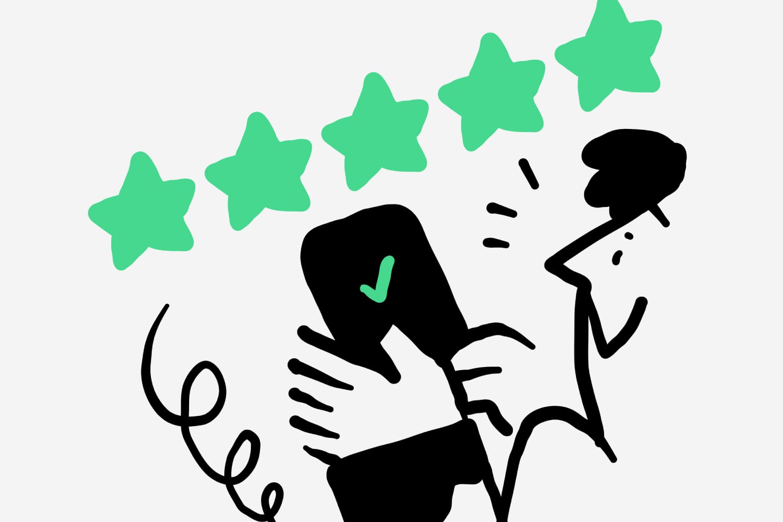
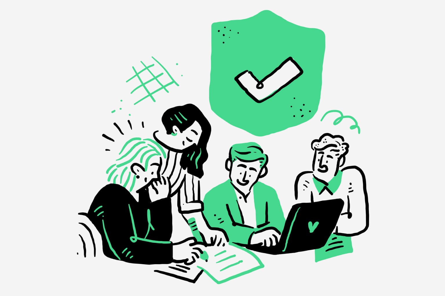
4. Testimonials or Social Proof Area
The Goal: Humanize your customer quotes to make them relatable and trustworthy.
How to use it: Ditch the default grey placeholder icon. Use clean, simple avatar illustrations. It makes your testimonial block look professional, cohesive, and intentional. It reinforces that real, (stylishly represented) people are endorsing your product.
Recommended packs:
The Secret Weapon: Animated Illustrations
Animating illustrations adds life to your project
Want to really stand out? Animate your illustrations. Motion grabs attention and adds a layer of polish that makes your brand feel incredibly modern and high-tech.
This isn't just for your hero section. Think about those "lost" moments in your user journey:
- Loading Screens: Turn a boring wait into a delightful brand moment with a subtle, looping animation.
- 404 Pages: A fun, animated character on a 404 page can turn a user's frustration into a smile.
- Empty States: When a new user's dashboard is empty, an animated illustration can guide them on exactly what to do next.
The best part? You don't need to be a Pixar animator. Many of our SaaS illustration packs are designed to be "animation-ready."
Because they're clean vector SVGs, often built with separate layers, you (or your developer) can easily add subtle motion (like a "hover" effect or a gentle "float") to bring them to life.
Best Practices for a High-Converting SaaS Page
- Be consistent: This is the most important rule. No exceptions. Stick to one illustration style (e.g., all "RawStroke" or all "Notion illustrations"). A messy, inconsistent page looks unprofessional and erodes trust.
- Stay on-brand: Use colors from your brand palette. A good illustration pack will include SVG files, allowing you to easily change the colors to match your logo and buttons. This is a non-negotiable for branding.
- Prioritize relevance: An illustration that's "pretty but pointless" is just clutter. Every visual must support the text next to it. If it doesn't, cut it.
- Optimize for speed: This is critical. Heavy images will slow your page, killing your conversion rates and your Google ranking. Use optimized formats like
WEBPorSVG, and compress yourPNGfiles. - Consider accessibility: Add descriptive
alt-textto your images. This helps screen readers understand the content (important for ADA compliance) and gives Google's crawlers more context about your page.
Download High Quality SaaS & Tech Illustration Packs for Startups
Your landing page deserves visuals that build trust and drive conversions. Based on your top-performing keywords like “illustration pack” and “website illustrations,” we recommend exploring these popular illustration packs for websites, all perfectly suited for SaaS and tech products:
Frequently Asked Questions
Do illustrations help SaaS landing pages convert better?
Yes. Pages that use SaaS illustrations and clear visual storytelling typically have higher engagement and lower bounce rates. Why? Because users understand the product faster and feel more confident about taking action.
What illustration style works best for SaaS websites?
The most effective styles are clean business vector illustrations, outline scenes, and light 3D visuals. These perform well on both desktop and mobile because they stay readable at smaller sizes and match modern UI design trends.
Should I use SVG or PNG illustrations?
Use SVG whenever possible. SVG files load faster, scale infinitely without losing quality, and integrate perfectly with design tools like Figma. PNG works well for more complex, textured scenes, but should always be optimized.
Conclusion
Illustrations are not a "nice-to-have"; they are a fundamental part of a high-performing SaaS landing page. When used strategically, they build trust, explain complex ideas in seconds, and guide users to your conversion goal. A well-chosen illustration library is one of the best investments you can make in your product's story.
Ready to upgrade your SaaS landing page?