The Neo Renaissance Trend, Why Hand Drawn Won the Post-AI Era
Shopify revived Renaissance art. Contra called itself the Network of Human Taste. Then the AI imitations flooded in. The real story underneath: brands are quietly returning to hand-drawn illustration, and that's the trend with legs.
Shopify revived Renaissance art for branding. Contra called itself the Network of Human Taste. Then the AI imitations flooded in. The real story underneath: brands are quietly returning to hand-drawn illustration, and that's the trend with legs.
It should be ridiculous. It isn't. It's the most-shared SaaS launch page of the quarter.
That page is the visible tip of a wider movement design trades are calling the Neo-Renaissance. Brands are trading flat illustration, Corporate Memphis blobs, and AI-rendered character art for chiaroscuro lighting, draped fabric, and dramatic poses borrowed straight from the Italian high Renaissance. The trend is real. The conversation around it is everywhere.
But here's the part nobody's saying out loud: most of what's getting shipped under that flag is tacky AI slop, and the brands actually winning with it are paying real human illustrators to hand-paint every frame.
If you take one thing from this post, take this: the Neo-Renaissance isn't a style. It's a tell. The brands using it well are signaling that they care about craft. The brands faking it with a thirty-second AI prompt are signaling the opposite, and a designer's eye spots the difference inside a second.
This is the actual story of 2026. Not the Renaissance itself. The post-AI return to hand-drawn.
1. The vibe shift, in two pictures
The 2020s opened with a specific look. You know it. Cartoon humans with bean-shaped bodies and four-fingered hands, gesturing at oversized smartphones. Pastel gradients. Flat color, no shadow, no weight. Designers called it Corporate Memphis and rolled their eyes through three years of using it anyway, because every B2B startup on YC's list shipped the same scene.
Then AI image tools showed up, and the floor fell out faster than anyone expected. By late 2024, anyone with $20 a month and a vague prompt could ship a clean character holding a laptop in fifteen seconds. The visual language that signalled modern startup in 2021 became the visual language of I didn't try. Stock illustration platforms, Notion templates, every SaaS landing page on Product Hunt: same blob people, same pastel gradient, same gentle smile, infinite supply.
Brands that wanted to look serious had a problem. Anything that screamed I was easy to make now screamed I am cheap.
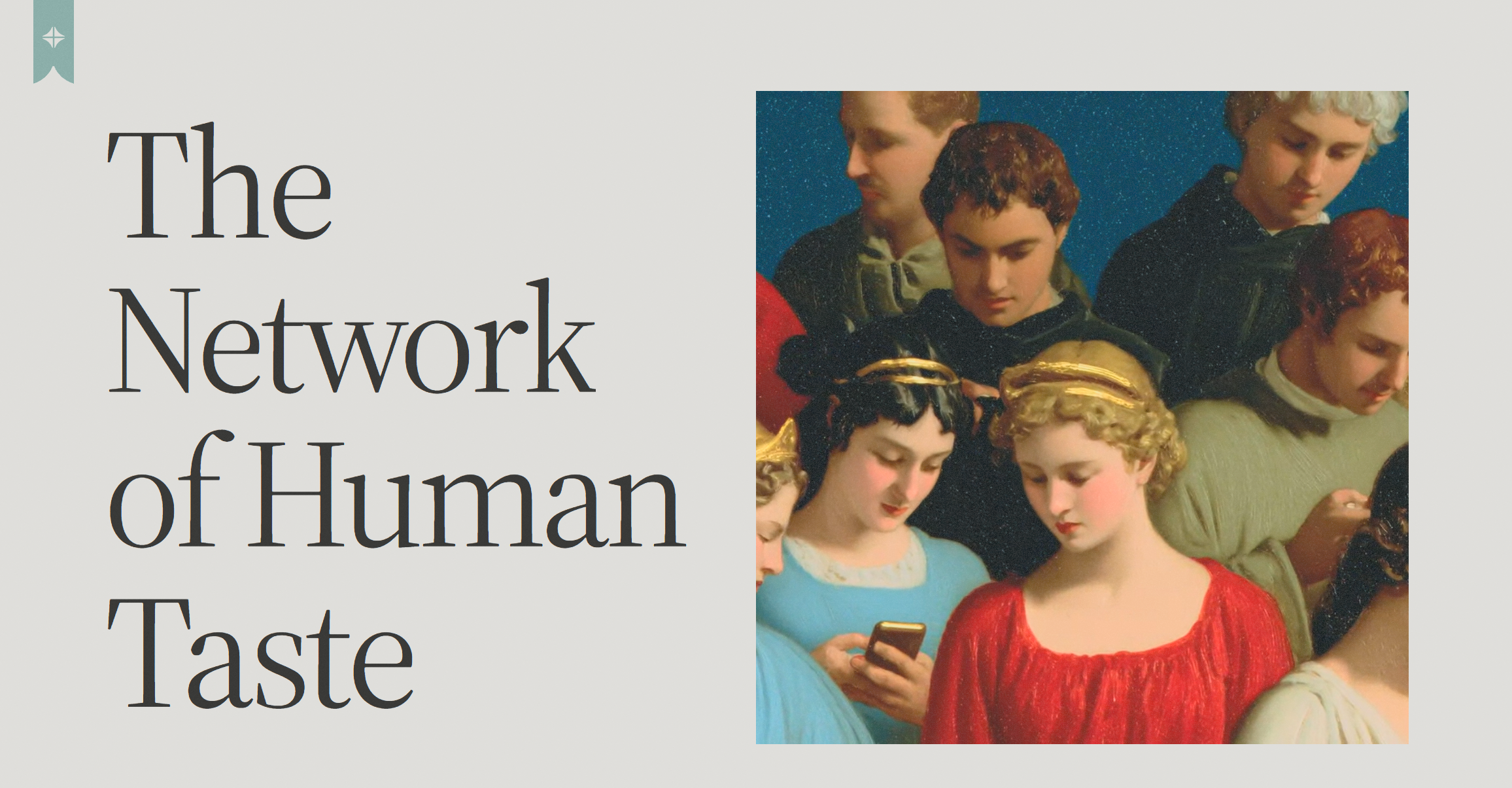
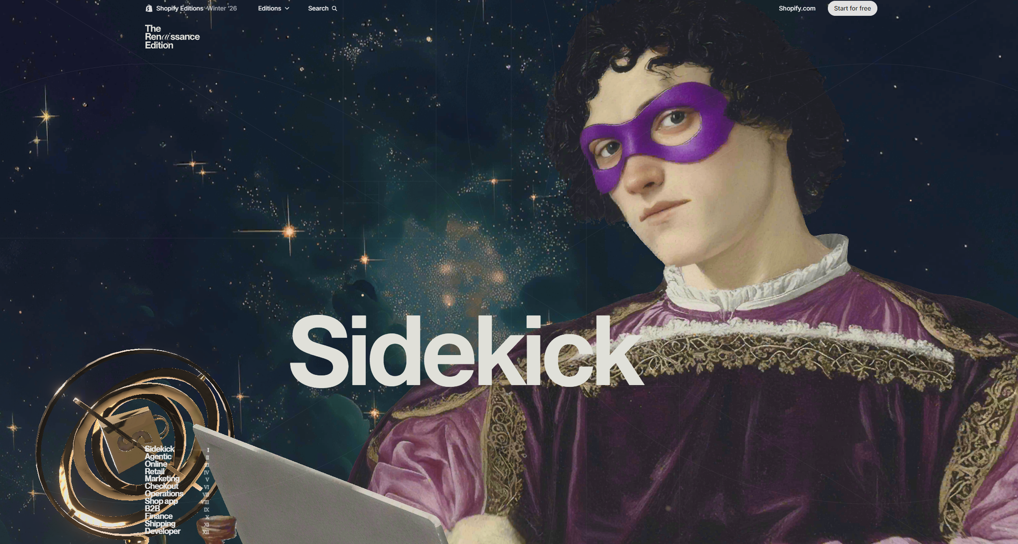
Look at the Contra Labs landing page.
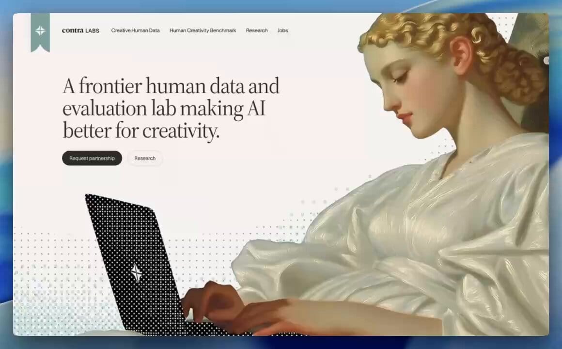
The headline reads The Network of Human Taste, and to the right is a Caravaggio-style group portrait of seven robed figures, three of whom are holding smartphones. This isn't decoration. It's a thesis statement. The page argues that creative judgment is the one thing AI can copy the surface of without ever owning, and they put a literal Renaissance painting on the page to make the point. The image is doing the work the headline can't.
Shopify's Winter '26 update does the same move at scale. Half a dozen full-bleed Renaissance compositions, every one of them mixing classical figures with shopping bags, screens, code editors, and modern footwear.
The framing is direct: commerce is an art form. The Renaissance scaffold is how they make a tool update feel like a cultural moment.
These pages are working. They're driving share, press, screenshots in agency Slack channels. People keep stopping the scroll to look. The question is why. And what most teams are getting wrong when they try to copy it.
2. Why now: the post-AI taste correction
Three years into the AI image flood, a clear pattern has formed. The more an image looks like anyone could have prompted it, the less brand value it carries. Cleanness used to be premium. Now cleanness is free, and free has a specific look: smooth surfaces, generic faces, lighting that comes from nowhere, hands that don't quite work.
When clean is cheap, taste becomes the moat.
The Renaissance is the exact opposite of cheap. It's famously hard. Painters spent a decade learning anatomy, then years on a single fresco. Compositions follow rules: golden ratio framing, directional light from a single named source, drapery that obeys gravity, gestures that mean something. None of that is automatic. All of it is a flex. By dressing a brand campaign in Renaissance grammar, a company is implicitly saying: we have access to people who can do hard things, and we hired them.
That last part matters more than the visual style. Strategists at agencies like Spinta Digital have started describing the new agency role as curator, not producer. Anyone can produce now. Curation, the act of saying this and not that, is the part that takes a person.
The Neo-Renaissance is a way of putting the human hand visibly back into the frame at exactly the moment when most images on the internet have stopped containing one.
3. The tacky tide: when Neo-Renaissance becomes AI slop
Here's where it gets honest. Every cultural moment in design gets copied badly within six months. The Neo-Renaissance moment got copied badly within six weeks, and the reason it spread so fast is the same reason the copies are mostly bad. AI image tools are extremely good at generating things that look Renaissance-shaped without understanding any of the choices a real Renaissance painter was making.
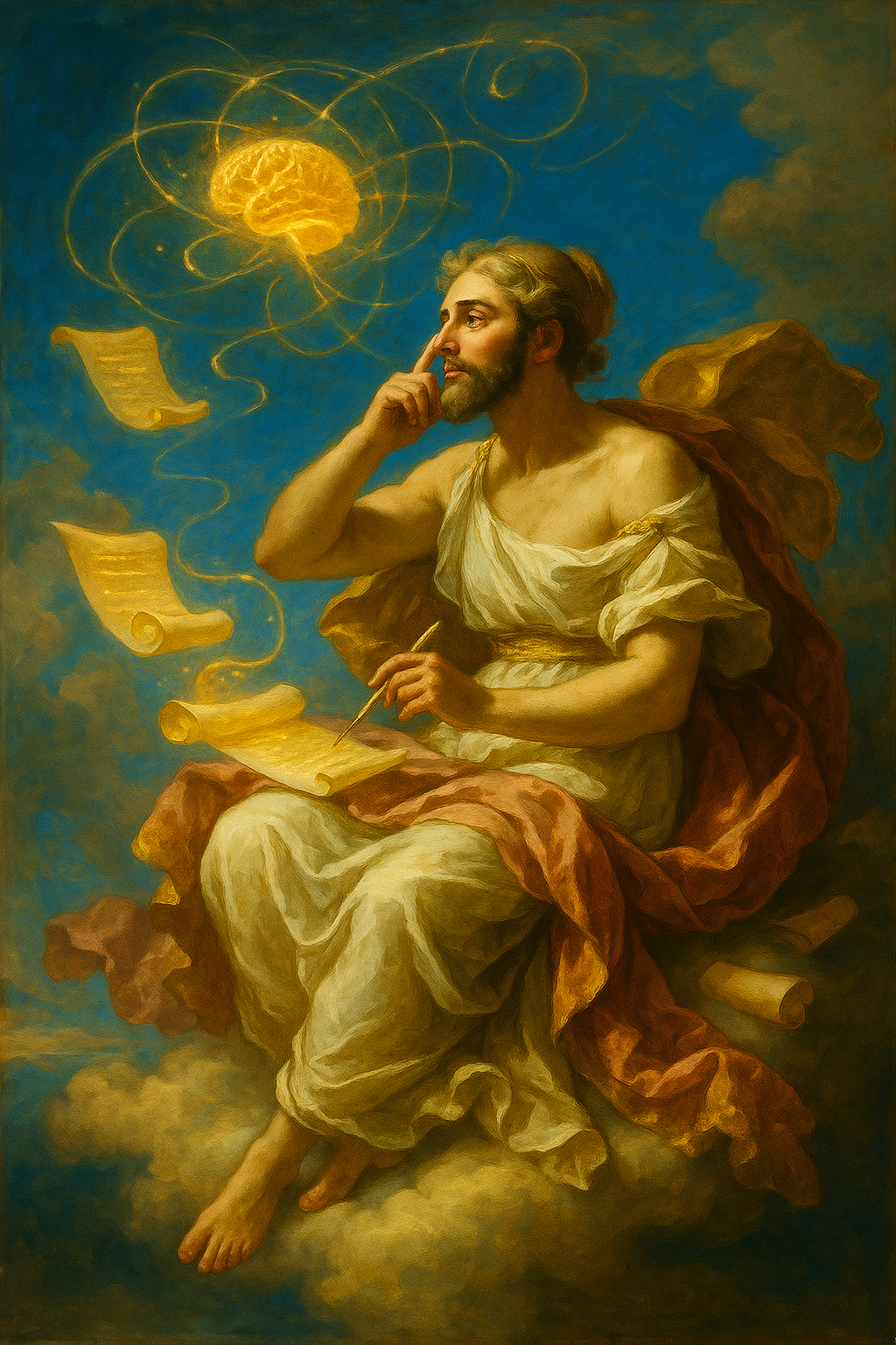
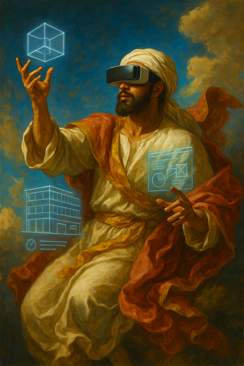
Look at this:
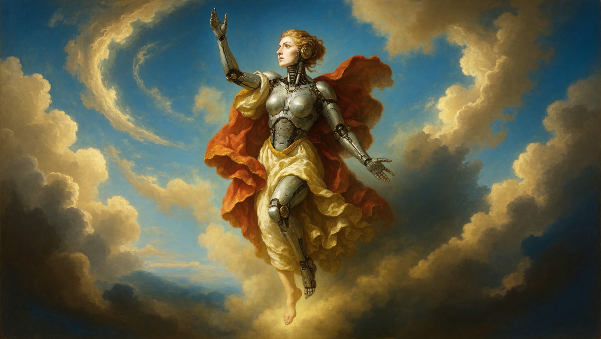
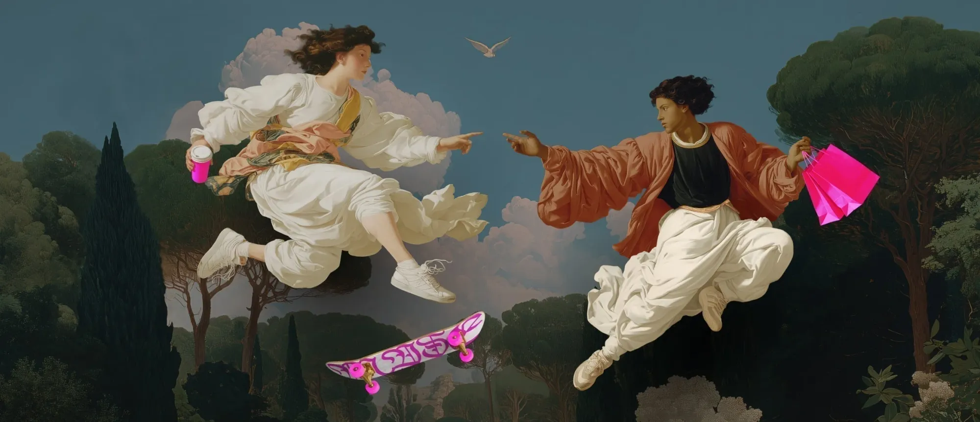
AI-generated: Pretty surface. Notice the brain hologram is a 2024-style sci-fi cliché grafted onto a 1500s composition. The figure doesn't know what it's saying.
AI-generated: The robe drapes ignore gravity. The VR headset has no strap. The hands have the hovering, weightless quality every model defaults to. Ten million of these get generated each week.
Both of these took someone roughly thirty seconds to make. Both look, at thumbnail size, like they belong in the same conversation as the Shopify and Contra work. They don't.
Here's what's missing in the AI versions, and why a designer's eye picks it up before they can articulate it:
- No compositional intent. A real Renaissance painting is a system of triangles and sightlines. Every gaze leads somewhere. AI compositions are statistically averaged. Pretty, but the eye finds nothing to land on.
- No anachronism with a point. Putting a phone in a Renaissance figure's hand is a statement when Contra does it. The phone is the punchline of the painting. The AI version puts a VR headset on a robed figure because that's what got prompted. No joke, no argument, no message. Costume.
- No artist on the canvas. A hand-painted brand image carries the friction of a person making decisions. Brushwork that's a little uneven. A choice to leave one corner slightly unfinished. AI-baroque is glassy in a way that reads, eventually, as nobody was here.
Brands that ship AI-baroque without realising what's wrong end up with a landing page that looks expensive in a screenshot and feels hollow in person. The bounce rate tells the story even when the analytics dashboard doesn't have a category for vibes were off.
The takeaway: the Neo-Renaissance isn't a prompt. It's a hire, or it's a workflow. If you can't commission an illustrator for the centerpiece, the right move is to back off the Renaissance pose entirely and ship something honest.
4. What Shopify and Contra actually did
The visible Neo-Renaissance leaders are not using AI for the hero work. They're paying illustrators.
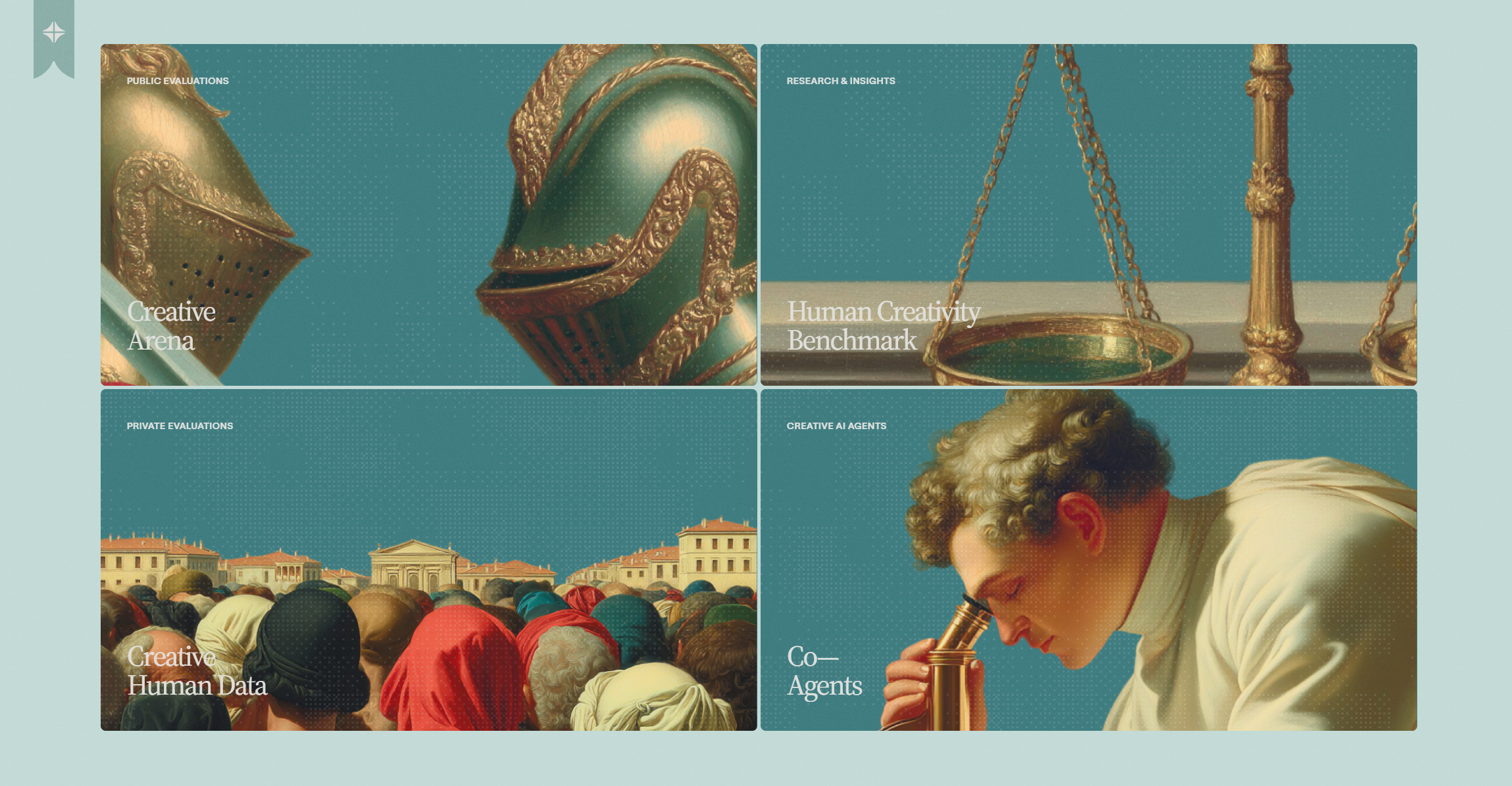
Shopify's Editions program credits its illustrators publicly. The Winter '26 visuals were composed and painted by a team of working artists with portfolios you can find on Are.na and Cargo. The brand isn't pretending the images came from nowhere. The provenance is the value. When other brands look at the Shopify page and feel the difference, what they're feeling is a person decided this.
Contra goes further. Their entire brand position is "Creative Human Benchmark", a phrase they've baked into the page. They publish research, run a job board for human creative work, and use Renaissance imagery to advertise the principle that human taste isn't replaceable yet.
These two examples set the bar. Anything below the bar reads as a brand that wished it had hired Shopify's illustrator and instead opened a generative model.
5. The actual post-AI story: hand-drawn illustration, quietly winning
Now we get to the part of the trend nobody is writing about, even though it's the bigger story commercially.
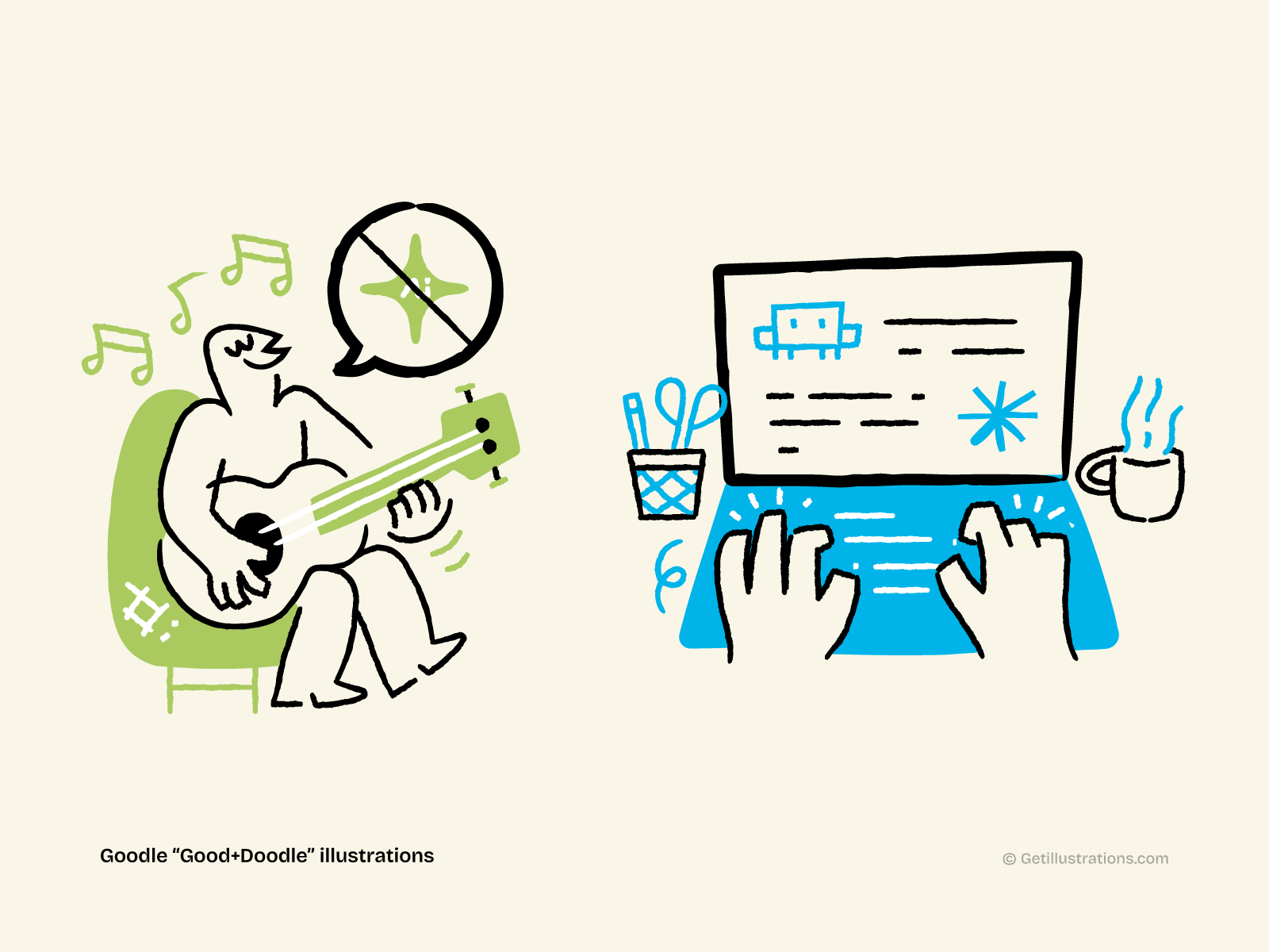
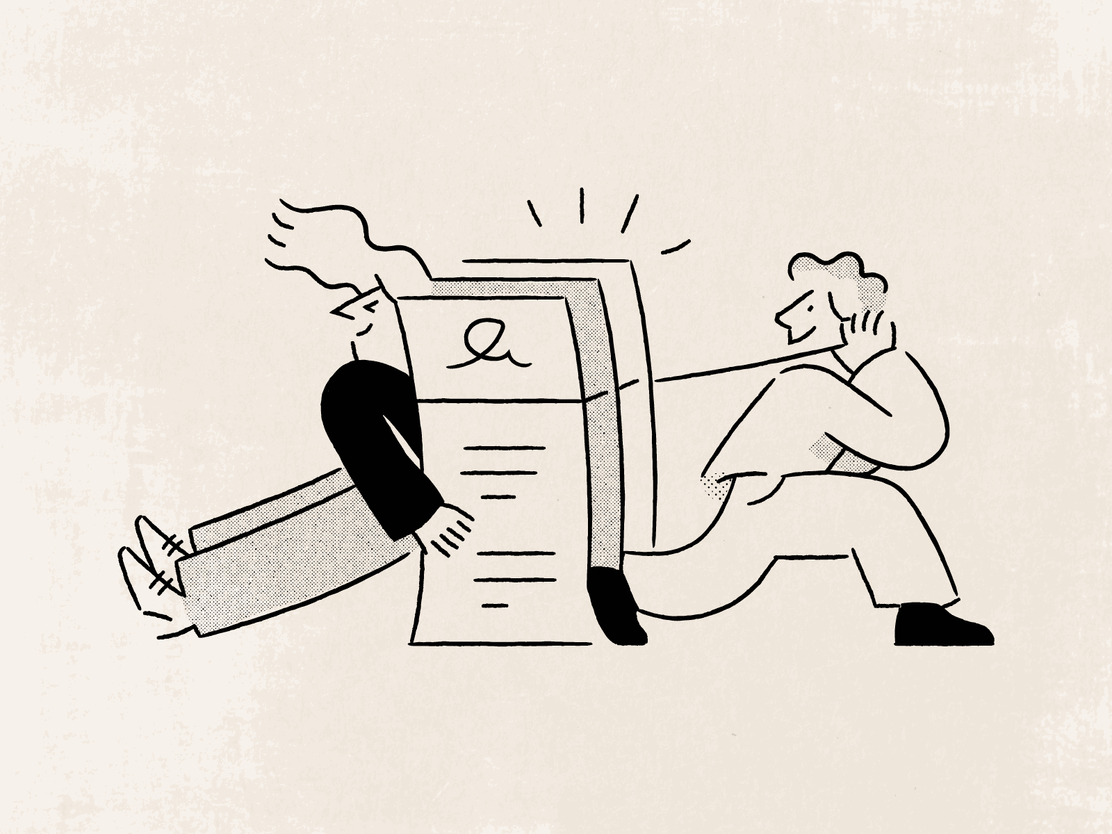
Underneath the high-visibility Neo-Renaissance moment, a much wider shift is happening. Brands are quietly walking back into hand-drawn illustration in general. Not classical Renaissance specifically. Just visibly human. Pen lines that wobble. Sketchy textures. Off-register colour. The kind of work that's clearly been touched by a person and clearly couldn't be flooded out by a prompt the next afternoon.
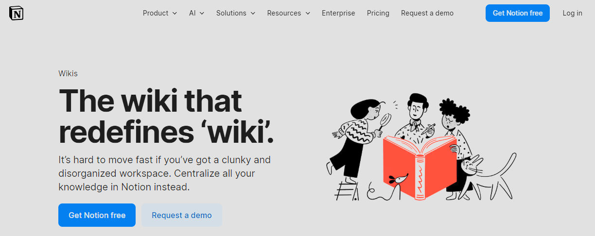
You see it on Notion's marketing pages. On Linear's changelogs. On Stripe's documentation hero illustrations. On every Webflow Conf 2025 keynote slide. The vocabulary is hand-drawn even when the subject is a database.
The reason is the same reason the Neo-Renaissance is happening, just with less costume. Visible human craft is the new premium. Renaissance is one expression of it. Loose pen-and-ink is another. Sharpie-style scribble is a third. They're all answering the same brief: make this look like a person made it on purpose.
This is the move most SaaS teams should be making, instead of chasing the Renaissance pose. It's cheaper to commission. It's faster to refresh. It doesn't require a Caravaggio reference. And it carries the same signal: we hired a person and we like what they made.
6. A build playbook for hand drawn brand work in 2026
If you're a designer or PM trying to get this look into your product without it feeling tacky, here's the practical version. None of this needs an AI image tool.
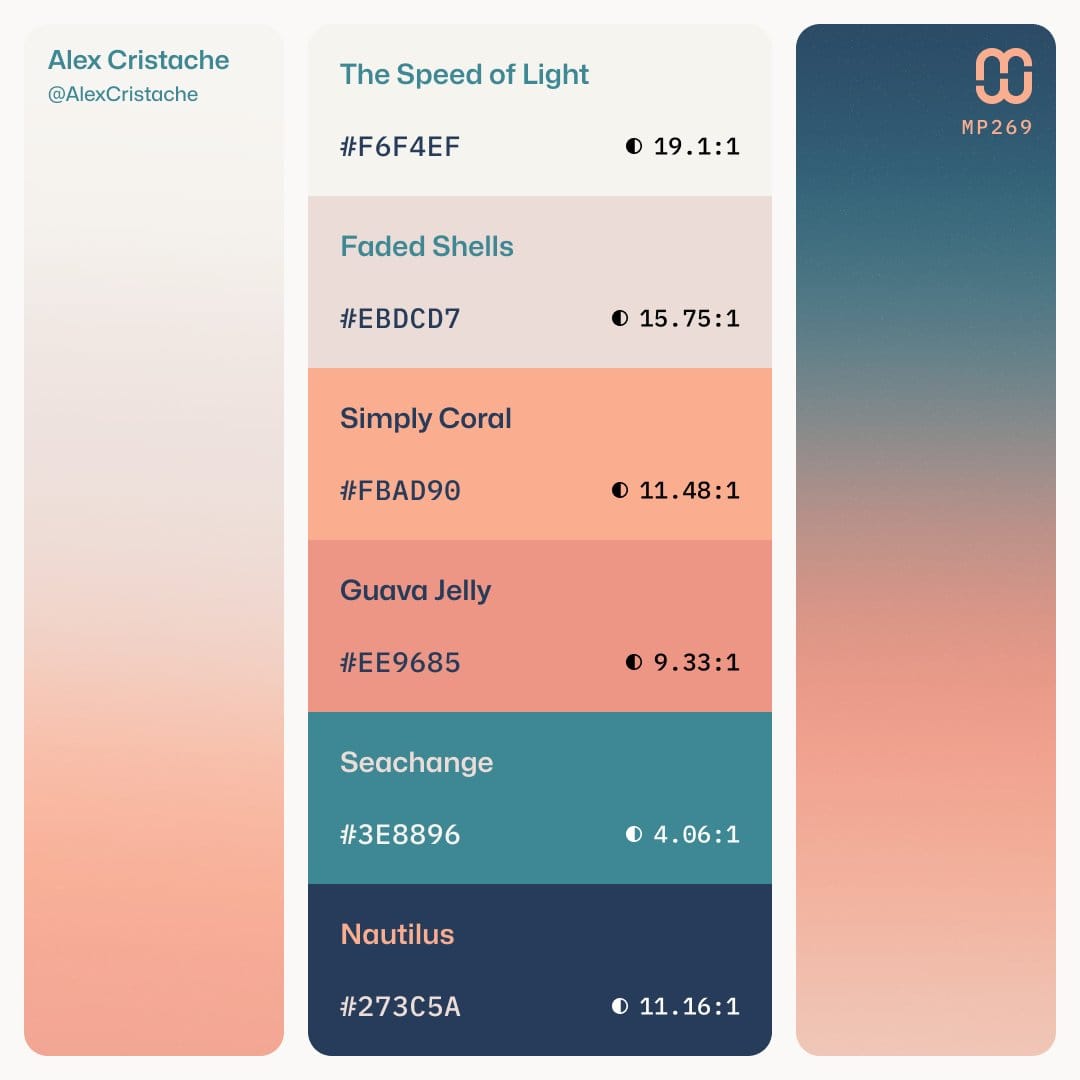
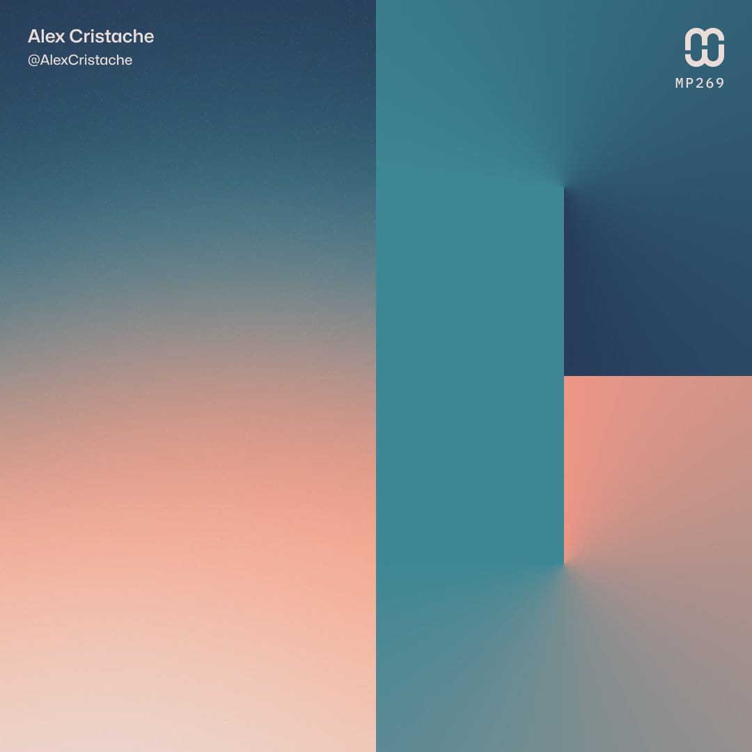
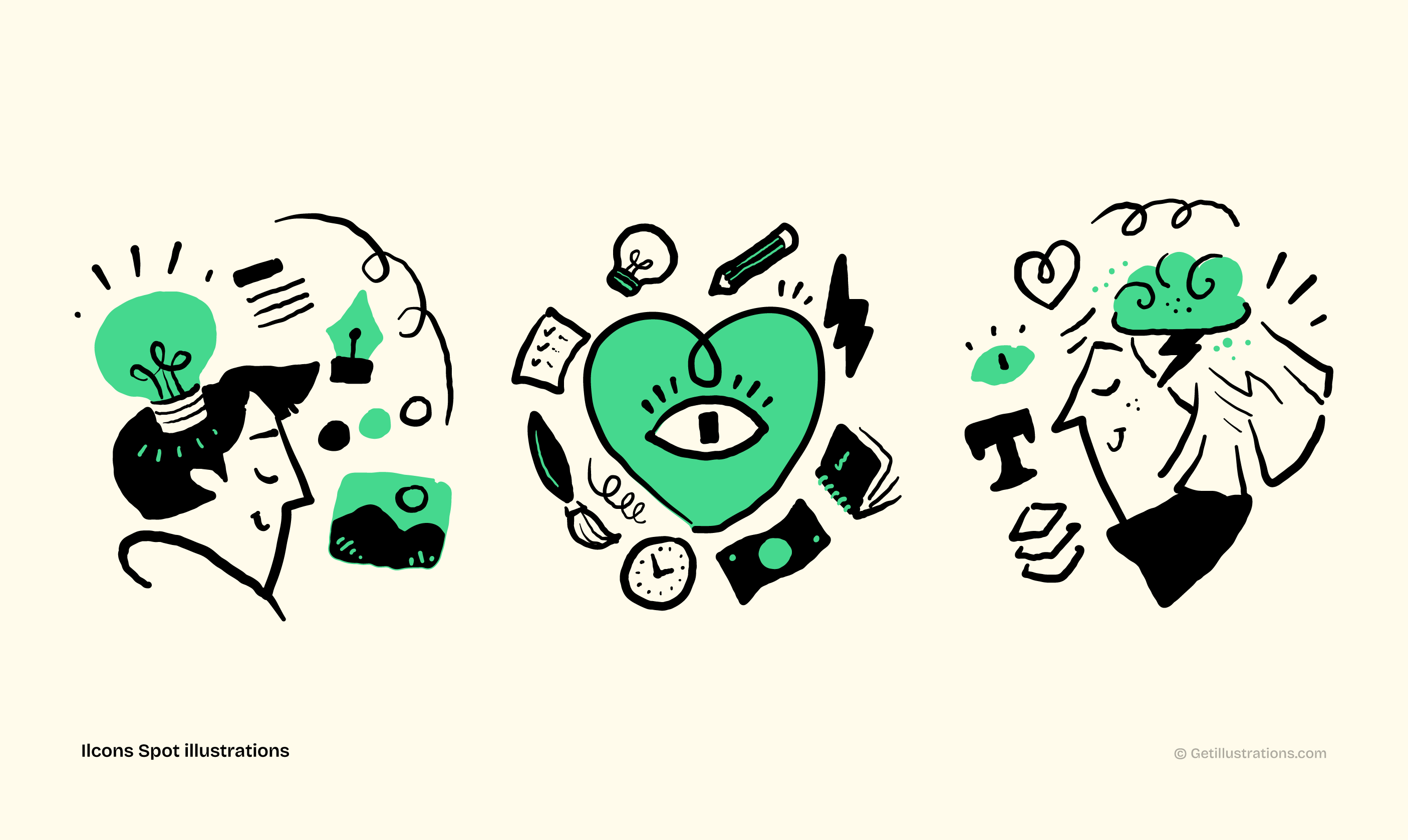
Color Pallets for illustrations and creative work by Alex Cristache
Palette
Walk away from candy-shop neon gradients and the pastel-and-cream Memphis palette. Pick earth and jewel tones: ochre, deep brick red, oxblood, mustard, lapis blue, forest green, ivory. Limit yourself to four base hues plus one accent. The Renaissance painters worked with maybe six pigments in any given panel and the colour discipline is half of why those works still feel coherent five centuries later.
Note: I start my day always looking for colors.. they shape the tone of our illustrations and drive the narrative even further.. one of the best places to find incredible pallets is Alex Cristache timeline on X!
Try this with GetIllustrations. Pick any pack from the hand-drawn illustration library and recolour the SVGs to your brand palette in under a minute with the free SVG color editor. The hand-made line work survives the recolour because the texture is in the strokes, not the fill.
Composition
Stop centering everything. Real human compositions use directional sightlines: the figure looks somewhere, the eye follows. Triangle layouts with three weighted points read as composed. Symmetric balance reads as designed. AI-default compositions read as wallpaper.
If you're working with stock illustration packs, look for ones where the artist drew scenes with intent, not isolated objects on a transparent background. Scene-based work pulls a viewer in. Object-on-white work is a stock asset, and people can tell.
Lighting
Renaissance work uses chiaroscuro: a single named light source, hard contrast, deep shadows. Most stock illustration uses ambient flat light because it's safer. Flat light is what AI defaults to.
Shadow and Light - Rawstroke Illustrations
If you want the Renaissance feel without the costume, ask for, or pick, illustration with directional light. Even a subtle shadow side on a hand-drawn character shifts the work from flat asset to piece.
Texture and grain
The fastest way to add the human read to any vector illustration is a subtle paper-grain or noise overlay. Five percent opacity grain on top of a flat illustration moves the perceived value up a tier.
It mimics the texture of real ink on real paper. Almost nobody bothers. The teams that do it look two years ahead of the teams that don't.
Try this with GetIllustrations. Most of our packs ship with pre-built texture variants so you don't have to layer your own. Browse the full illustration library and filter by hand-drawn styles to see how the artists handled grain.
7. So is it a flash in the pan, or a multi-year cycle?
The literal Neo-Renaissance pose, robes and shopping bags and Tuscan skies, has maybe eighteen months of runway before it becomes a parody of itself. Every visual trend that gets a Fast Company headline gets a don't do this anymore headline twelve months later, and this one is already on the timer.
The deeper shift underneath it, the move toward visibly hand-made brand work as a counter-signal to AI ubiquity, is a multi-year cycle. Probably the dominant aesthetic conversation through 2027 and into 2028. Long enough to plan a brand refresh around. Long enough to retire the Memphis assets without rebuilding twice.
Trade press has started calling the bigger thing brand romanticism, which is a useful frame. We're not in a craft revival because craft is fashionable. We're in one because automation made the human hand the most expensive thing on the page, and brands always end up centring whatever is most expensive.
If your team is still shipping Memphis blobs because they're easy, the runway has closed. If your team is rushing to ship AI-baroque because it looks expensive on a thumbnail, the bounce rate will tell you faster than the trend report will.
The honest move is the one underneath both: hire a person, or use work made by people... Ai is great to get an idea but real human touch is what lasts!
How GetIllustrations fits
Plain version, no pitch.
Every pack on GetIllustrations is hand-drawn by us illustrators. We don't sell AI-generated assets. We don't generate from prompts. The line work is somebody's pen, the texture is somebody's choice, and the catalogue grows because we keep commissioning humans, not models.
If you want to build a Neo-Renaissance-adjacent brand surface this quarter without paying for a custom commission, the hand-drawn illustration packs are the closest production-ready answer. If you want broader hand-made work for landing pages, onboarding, empty states, or in-product moments, the full illustration library covers most categories.