The 2026 SaaS Illustration Playbook: 6 Styles That Actually Convert
In 2026, SaaS illustration styles directly impact landing page conversion design. The right SaaS website illustrations signal trust, innovation, and premium value within milliseconds. Discover the SaaS design trends and how to choose the best illustration for landing pages.
Your SaaS website has about 50 milliseconds to make a first impression. That's not a metaphor, it's what the research tells us. In that tiny window, a visitor decides whether your product looks trustworthy, professional, and worth their time. And here's the thing: they're not reading your headline in those 50 milliseconds. They're reacting to your visuals.
In 2026, the SaaS landscape has a visibility problem. Thousands of products compete for the same audience, and most of their websites look strikingly similar. Same clean layout, same product screenshot in the hero, same generic stock imagery scattered throughout. The result? Everything blurs together.
This is where illustration becomes a strategic asset, not just a decorative one. The right illustration style doesn't just make your website look "nice." It communicates your brand personality, simplifies complex product concepts, and "when done well" directly influences whether someone clicks "Start Free Trial" or bounces.
But not all illustration styles work the same way. A style that converts for a fintech dashboard won't necessarily work for a creative collaboration tool. The key is matching the right visual language to your product, your audience, and your stage of growth.
This guide breaks down the six illustration styles that are driving real results for SaaS companies in 2026 and helps you figure out which one fits your product best.
Why Illustrations Still Matter, Even When Everyone Says "Just Show the Product"
There's a loud conversation happening in the SaaS design world right now. It goes something like this: "Stop hiding behind illustrations. Show the actual product."
And honestly? That advice isn't wrong. Product screenshots, micro-demos, and interactive previews are incredibly effective. Visitors want to see what they're signing up for.
But here's what that advice misses: screenshots and illustrations serve completely different purposes.
A product screenshot shows what your tool looks like. An illustration shows what it feels like to use it. Screenshots communicate features. Illustrations communicate meaning.
Think about it this way. If your SaaS product helps teams collaborate, a screenshot shows the interface. But an illustration of people working together, sharing ideas, solving problems? That tells an emotional story that a screenshot never could.
And there are things that simply can't be shown in a screenshot: abstract concepts like security, speed, data privacy, scalability, or AI intelligence. These ideas live in the realm of metaphor and metaphor is where illustration thrives.
The best-performing SaaS websites in 2026 don't choose between illustrations and product visuals. They use both. Illustrations to set the emotional stage. Screenshots and demos to seal the deal. That combination is what builds trust and drives conversions.
The 6 SaaS Illustration Styles That Convert in 2026
1. Tactile Tech: Humanizing Complexity
SaaS products often deal with invisible, abstract concepts. Cloud computing. Data encryption. API integrations. Workflow automation. How do you make the invisible feel real?
What it looks like: Clean vector lines paired with organic, hand-drawn textures: a touch of grain, stipple effects, or subtle brush strokes layered onto precise shapes. It's "technical" and "human" at the same time.
Why it converts: This style bridges the gap between the coldness of a software product and the warmth of the person using it. It tells the visitor: "Yes, we're technically advanced but we're built by real people who understand your problems."
In a market saturated with polished, AI-smooth visuals, this textured approach stands out precisely because it feels crafted. The imperfections signal care, not carelessness.
Best for: Fintech platforms, cybersecurity products, DevOps tools, and any product where the audience needs reassurance that complex technology is in capable, human hands.
How to implement: Start with your hero section. Replace a generic product mockup with a textured illustration that shows the outcome of using your product, not the product itself. For a cybersecurity tool, that might be a calm, protected digital workspace. For a fintech app, it could be a person confidently managing their finances.
2. The Blueprint Look : Precision as a Trust Signal
For technical audiences like engineers, developers, IT managers, precision is everything. These buyers are skeptical of flashy marketing. They want to see that you understand their world.
What it looks like: Monolinear icons, technical grid overlays, "exploded view" diagrams, and schematic-style illustrations. Think architectural drawings meets software documentation. Clean, precise, almost clinical but elegant.
Why it converts: It speaks the language of the logical buyer. When your visuals look like they were designed with the same rigor as your product, it creates an unconscious association: "If they're this precise about their website, imagine how precise their software is."
This style also works brilliantly for showing the "mechanics" of how your software works. Even when the illustration is metaphorical (a schematic of interconnected nodes representing team communication), the precision format makes the concept feel tangible and trustworthy.
Best for: Project management tools, engineering platforms, developer-focused products, infrastructure SaaS, and enterprise software.
How to implement: Use this style in your "How It Works" section. Create step-by-step schematic illustrations that show your product's workflow each step connected by clean lines that suggest a logical, reliable process.
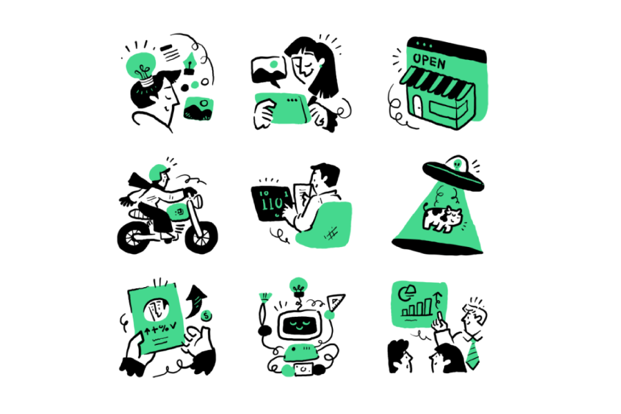
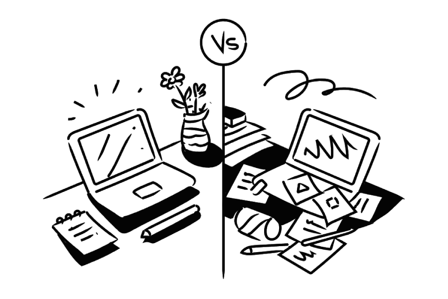
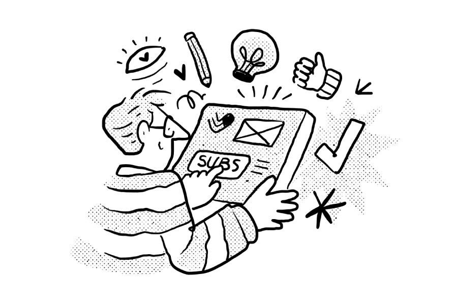
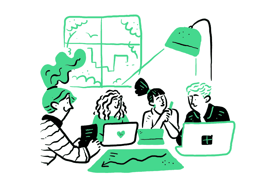
3. Spot Illustrations: The Micro-Conversion System
Here's a shift that's defining 2026: the era of the single giant hero illustration is evolving. The highest-converting SaaS sites are now using systems of small, consistent "spot" illustrations placed strategically throughout the page.
What it looks like: Small, focused illustrations each one tied to a specific feature or benefit. They sit next to feature descriptions, inside cards, beside testimonials, or within pricing tiers. Think of them as visual anchors.
Why it converts: Spot illustrations guide the eye through your page like stepping stones. Each one gives the visitor a visual "rest stop" that reinforces a key message. Research suggests that pairing text with a relevant image makes information significantly more memorable.
More importantly, a system of spot illustrations creates consistency. When every illustration on your page shares the same style, line weight, and color palette, it signals that your product (and your brand) is cohesive and well-designed.
Best for: Any SaaS product with multiple features to communicate which is nearly all of them. Especially effective on pricing pages, feature comparison sections, and onboarding screens.
How to implement: Start by listing your 5-8 core product features. Commission or choose one spot illustration for each. Make sure they share identical visual rules: same stroke width, same color palette, same level of detail. Then place each one directly next to its corresponding feature description.
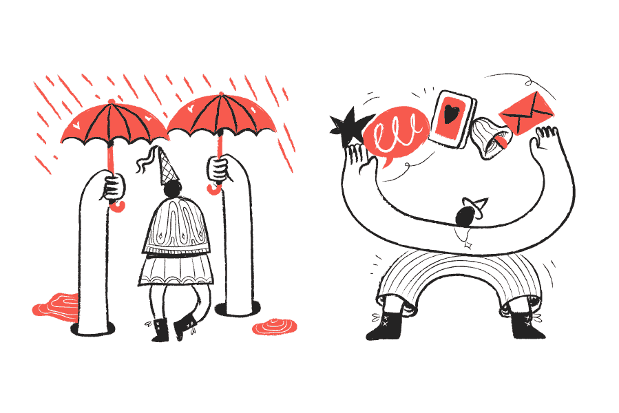
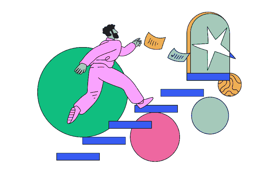
4. Abstract & Surreal Illustrations: Visualizing the Invisible
Some SaaS ideas are too complex for literal visuals. You can’t really “draw” automation or AI without falling into clichés. That’s why abstract surreal illustration is everywhere right now.
What It Looks Like: Unexpected, symbolic, slightly impossible.
- A person with a fish head representing adaptability
- Floating objects connected in impossible ways
- Distorted proportions
- Dreamlike digital landscapes
- Clean vector forms mixed with imaginative compositions
It’s not about showing the product. It’s about expressing intelligence, transformation, and scale.
Why It Converts: Surreal visuals signal innovation. They tell users: “This isn’t ordinary software.” They create curiosity, emotional impact, and memorability, especially in industries like AI, ML, automation, analytics, and Web3.
Literal illustrations explain. Surreal illustrations differentiate.
How to Use It: Use abstract surreal art in your hero section or background. Let it create atmosphere and intrigue, then anchor everything with clear, simple copy.
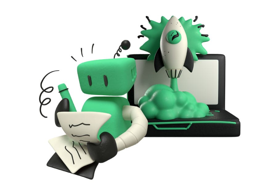
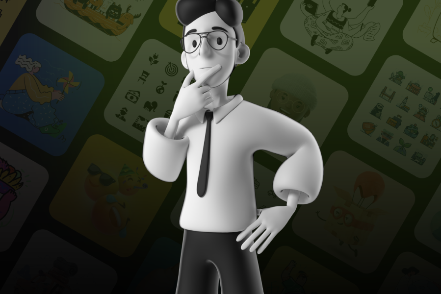
5. High-Contrast 3D: The Premium Signal
If you're charging a premium price, your visuals need to look like a premium product. That's not vanity, it's pricing psychology.
What it looks like: Clay-morphic elements, high-gloss 3D objects, soft shadows, and depth-rich compositions. Think Apple-level polish applied to SaaS visuals. Objects feel like you could reach out and touch them.
Why it converts: 3D illustrations make the digital feel physical. They give a software product a sense of weight and substance. When a visitor sees 3D visuals with careful lighting and shadows, the unconscious reaction is: "This company invests in quality."
The emotional response is immediate premium visuals justify premium pricing. Companies using high-quality 3D illustrations on their pricing pages often see higher conversion on their mid-tier and top-tier plans because the visual language has already set the expectation of value.
Best for: Enterprise SaaS, premium-tier products, design tools, and any product positioned as the "best in class" rather than the "most affordable" option.
How to implement: Use 3D illustrations sparingly for maximum impact. Your hero section and pricing page are the highest-value placements. Avoid scattering 3D elements everywhere the "premium" effect comes from restraint. One stunning 3D composition is worth more than twenty mediocre ones.
Performance note: 3D assets tend to be heavier files. Make sure they're properly optimized compressed, lazy-loaded below the fold, and delivered in the right format. The premium feel disappears instantly if your page takes 5 seconds to load.
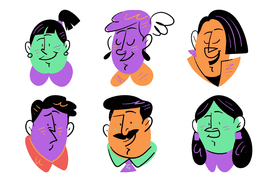
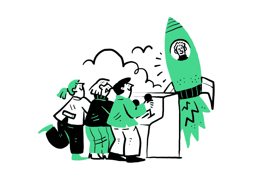
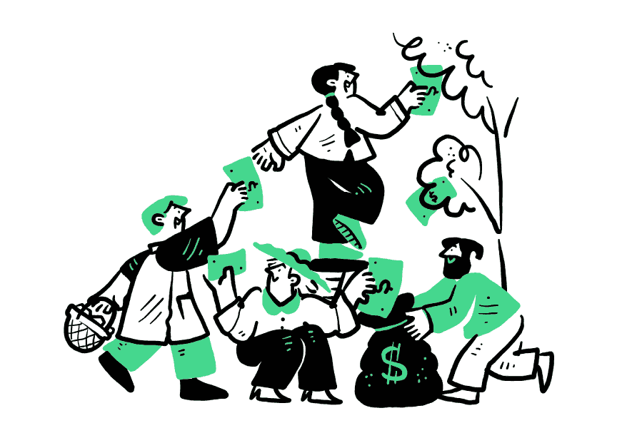
6. Character-Driven Narratives: The Brand Recall Engine
Here's a question: if someone saw one of your illustrations on LinkedIn, outside the context of your website, would they instantly know it was your brand?
If the answer is no, you have a recognition problem. And character-driven illustration is one of the most effective ways to solve it.
What it looks like: A recurring cast of illustrated characters used consistently across your website, product, social media, and marketing. They have a distinct style unique proportions, recognizable expressions, a specific color palette. They show up in your hero section, your blog, your onboarding flow, and your email campaigns.
Why it converts: Characters build a story that stock icons and generic illustrations simply cannot. When a visitor sees your unique character on a LinkedIn ad, then again on your landing page, then again in the product onboarding, you've created narrative continuity. That repetition builds trust and recall.
Characters also make abstract workflows relatable. Instead of "Our platform connects your team," you show characters "actual people" connecting. The product benefit becomes a human story.
Best for: Consumer-facing SaaS, HR and team tools, education platforms, creative tools, community-driven products, any brand that wants to feel approachable and human.
How to implement: Invest in a character system, not just a few one-off characters. You need a diverse cast that can represent your users across multiple scenarios. Establish visual rules: consistent head-to-body ratio, same level of detail, shared color palette. Then deploy them everywhere, consistency is what builds recognition.
How to Match Your Illustration Style to Your SaaS Stage
Not every SaaS company has the same needs. A pre-launch startup optimizing for speed has very different visual requirements than a Series C company building an enterprise brand. Here's a practical framework:
Early Stage / MVP
Best styles: Spot illustrations, minimal line art, abstract geometry.
Why: You need to move fast. These styles are lightweight, versatile, and easy to implement. They communicate professionalism without requiring a huge upfront investment in custom illustration. They also load fast — critical when every millisecond of page speed affects your early conversion rates.
Practical tip: Buy a cohesive illustration pack with a consistent style. You can always evolve your visual identity later, but consistency now is more important than uniqueness.
Growth Stage / Series A–B
Best styles: Tactile tech, character-driven narratives.
Why: You're no longer competing just on product features — you're building a brand. This is when illustration style becomes a competitive advantage. Characters and textured illustrations give your brand personality that separates you from the dozens of competitors in your space.
Practical tip: Consider commissioning a custom character set based on an existing illustration pack's style. This gives you the consistency of a professional system with the uniqueness of a custom approach.
Enterprise / Scale
Best styles: High-contrast 3D, blueprint/schematic, comprehensive spot illustration systems.
Why: Enterprise buyers evaluate everything. Your visual quality signals your operational quality. Premium 3D illustrations justify premium pricing. Blueprint-style illustrations communicate technical rigor. A complete spot illustration system across your entire site shows attention to detail at scale.
Practical tip: At this stage, invest in a full illustration design system — a documented set of visual rules, reusable components, and a library of assets that your team can use across every touchpoint consistently.
5 Rules for SaaS Illustrations That Actually Convert
Regardless of which style you choose, these principles apply to every SaaS website.
Rule 1: Consistency Beats Creativity
A website with one stunning illustration and nine mismatched ones looks worse than a website with ten "good enough" illustrations that share the same style. Visual consistency is a trust signal. Mix-and-match is a trust killer.
Before you pick any style, make sure you can sustain it across every page of your site.
Rule 2: Illustrations Should Answer a Question
Every illustration on your page should answer: "What does this product do for me?" If an illustration is just filling space: if you could remove it and the page would work just as well, it's decoration, not communication.
The best SaaS illustrations clarify a feature, visualize a benefit, or tell a piece of the product story.
Rule 3: Your Strongest Visual Goes Above the Fold
Your hero illustration is doing the heaviest lifting on your entire site. It needs to reinforce your headline, not compete with it. Make sure your hero visual and your hero copy are telling the same story and that story is about the visitor's outcome, not your product's features.
Rule 4: Optimize for Speed
A beautiful illustration that takes 3 seconds to load is a conversion killer. Use SVG format wherever possible: it's scalable, lightweight, and can be styled with CSS. Compress everything. Lazy-load illustrations below the fold. Inline critical SVGs above the fold to eliminate render-blocking requests.
Your illustration style should be a performance asset, not a performance liability.
Rule 5: Test What You Think You Know
The illustration you love might not be the illustration that converts. Run A/B tests: illustration vs. product screenshot in the hero. Character style A vs. character style B. Dark background vs. light background. Let the data tell you what works, your assumptions will surprise you.
Choosing Your Path Forward
In 2026, the SaaS companies that stand out aren't necessarily the ones with the biggest design budgets. They're the ones that make intentional visual choices — picking an illustration style that aligns with their brand, their audience, and their growth stage, then applying it consistently across every touchpoint.
The six styles in this guide aren't trends that will fade next quarter. They're proven visual languages that map to real buyer psychology: trust, clarity, sophistication, warmth, precision, and recall.
Your next step? Audit your current website through this lens. Ask yourself: "Does our visual language match the story we're trying to tell?" If the answer is no or if the answer is "we don't really have a visual language" > that's your opportunity.
The right illustration system doesn't just make your website look better. It makes your product easier to understand, your brand easier to remember, and your conversion rate easier to grow.
Quick Reference:
Which Style Is Right for Your SaaS?
| Style | Best Signal | Ideal Audience | Best Placement |
|---|---|---|---|
| Tactile Tech | "We're human and capable" | Fintech, Security, DevOps | Hero section, About page |
| Blueprint | "We're precise and reliable" | Engineering, PM tools | How It Works, Features |
| Spot Illustrations | "We're organized and clear" | All SaaS products | Feature cards, Pricing |
| Abstract Surreal | "We're innovative and seamless" | AI, Automation, Analytics | Hero background, Headers |
| High-Contrast 3D | "We're premium and polished" | Enterprise, Design tools | Hero section, Pricing page |
| Character-Driven | "We're approachable and memorable" | HR, Education, Community | Everywhere (system) |
Published on GetIllustrations.com / Your complete illustration system for modern web and app design.