About Gradient illustration
Gradient Illustration: Origin & Design Theory
Gradients: light translated into color
A gradient is light made into color: a smooth transition that simulates how illumination falls across a surface, from highlight to shadow, from warm to cool. The eye reads a gradient as depth and atmosphere because it mirrors the continuous tonal shift we see in the physical world, where no edge is ever perfectly flat. That is why even a single two-stop blend can make a flat shape feel rounded, lit, and alive, and why a well-chosen gradient carries mood the way a flat fill never can.
The rise, fall and return of gradients
In graphic design history, gradient use has followed a cyclical pattern: the skeuomorphic excess of early interfaces that piled on glossy blends and bevels, the flat-design reaction of roughly 2012 to 2015 that stripped them away in the name of clarity, and then the return of gradients in a more disciplined form. The second wave was smarter than the first. Designers learned to treat the gradient as a deliberate accent rather than a default texture, using it for emphasis and energy instead of fake realism.
Modern screens made gradient illustration possible
Technology made the revival possible. Modern OLED and P3 wide-color displays render subtle tonal steps that older screens crushed into visible banding, so blends that once looked muddy now read as clean and luminous. Color management and high-bit-depth rendering let a coral-to-violet sweep stay smooth across a hero section, and CSS gradients plus SVG mean those transitions ship as lightweight, scalable code rather than heavy raster files.
Gradient as the signature of ambitious software
Culturally, gradient became the signature of ambitious software. Stripe’s multi-color backgrounds, Figma’s purple-to-pink system, and the aurora-style palettes of crypto and Web3 all leaned on gradient to say forward-looking and premium. Used well, a gradient is shorthand for energy and modernity; used carelessly it muddies hierarchy, which is why direction, contrast, and restraint matter as much as the colors themselves.
Direction and contrast in gradient design
Direction is the part most people overlook. A vertical blend feels like sky and ground and reads as calm, a diagonal sweep adds movement and momentum, and a radial gradient pulls focus toward a center like a spotlight. Pairing analogous hues keeps a blend soft and believable, while jumping across the color wheel produces the high-voltage neon look. The most reliable gradients also hold a clear value contrast from one stop to the next, so the shape stays legible and text placed over it remains readable rather than dissolving into the background.
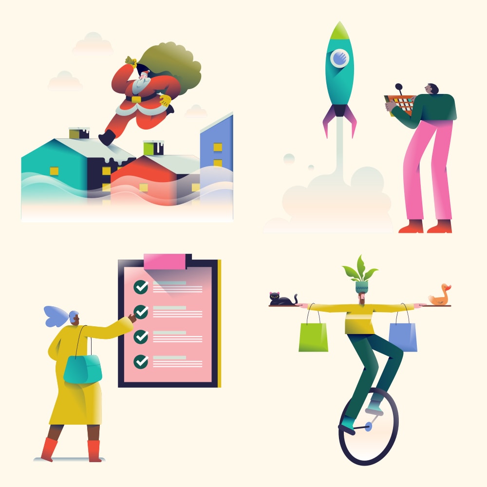
Our library offers two approaches: the Gradient illustrations pack (125 pieces) with elaborate pastel-toned character scenes that deliver warm, approachable energy, and the Neon Line illustrations pack (250 pieces) with hand-drawn line characters infused with neon gradient highlights against dark backgrounds, luminous visuals that literally glow.
Why Choose Gradient
- Emotional depth and mood. Color transitions trigger automatic associative readings, where coral to violet reads as sunset and navy to blue reads as deep space, so a palette can set a feeling before any copy is read.
- Dimension without realism. A gradient implies light and volume on otherwise flat shapes, giving illustrations a rounded, lit quality while keeping the clean simplicity of vector art.
- Dark background compatibility. Neon gradients are designed for dark contexts, and their luminous quality genuinely glows against deep backgrounds where flat color would look dull.
- Forward-looking brand signaling. The visual language of crypto, Web3, AI, and next-generation tech has converged on gradient, so the style reads as current and ambitious.
- Immediate differentiation. Most illustration libraries default to flat fills, so a gradient set stands out instantly in a feed or a landing page full of solid color.
- Lightweight and scalable. As vector and CSS-driven blends, gradients ship as small, resolution-independent assets that stay crisp from a favicon to a full-bleed hero.
Best For
- Technology product hero sections. The highest-impact context, where a gradient communicates modern, cutting-edge quality the moment the page loads.
- Cryptocurrency, Web3 & blockchain. A direct visual heritage in neon gradient aesthetics makes the style feel native to these audiences.
- Startup & VC marketing materials. Pitch decks, investor sites, and press kits use gradient to signal ambition and a premium, well-funded feel.
- Social media & digital advertising. Scroll-stopping visual energy cuts through feeds dominated by photography and flat illustration.
- Music, entertainment & creative platforms. A natural affinity with neon and gradient visual systems suits event, streaming, and nightlife branding.
- Dark-mode interfaces & app marketing. Luminous neon blends are built for dark backgrounds, making them ideal for app screenshots, onboarding, and night-themed UI.
Pro Tips
- Design your brand palette gradient first. Warm pastel (Gradient pack) or cool neon (Neon Line pack): choose your direction.
- Use dark backgrounds for neon gradient. Luminous quality disappears on white. Use dark hero sections and card backgrounds.
- Use for emotional climax points. Hero, pricing, and CTA are the right contexts for gradient’s high-energy language.
Gradient illustration packs


Gradient icon packs 3 icon packs

Everything you need
Figma plugin
Browse all Gradient illustrations, preview them in your colour system, and insert them straight into your file, without leaving Figma.
Install the Figma plugin →All Access
Every Gradient illustration. Every style. One subscription: 42K+ assets for $195/year.
Get All Access →Custom illustrations
Need Gradient illustrations built for your exact brand? Our team creates custom sets matched to your design language.
Explore custom services →Get all 9 Gradient illustrations
One subscription. Every pack. Every style. Updated weekly.