Flat Vector Illustration: A Complete Guide (2026)
What flat vector illustration is, how it's built, the 6 sub-styles, and 20+ ready-to-buy packs. The 2026 reference.
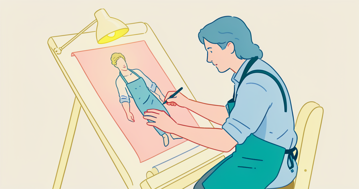
I have a confession. I've been designing flat vector packs for getillustrations for years, and I still get the question at least once a week: what actually counts as flat vector illustration, and how is it different from regular flat design?
The short answer: flat vector is the style, vector is the format, and "flat" alone usually means flat design as a UI movement (which is a different thing). The longer answer is below, and it's the post I wish I'd had when I started.
Key Takeaways
- Flat vector illustration is illustration built from solid color shapes, no realistic shading, exported as vectors (SVG / AI / EPS). It's the workhorse of B2B SaaS, productivity, and most web hero illustrations in 2026.
- The 6 sub-styles are: corporate flat, geometric flat, character flat, isometric flat, duotone flat, and glassmorphic flat. Each has a different vibe, a different cost, and a different best-use case.
- It's the cheapest style to scale and the easiest to localize. The same asset works at 16px and 1600px.
- It's NOT the same as flat design (the UI movement). Flat design is a UI principle; flat vector is an illustration style that works in any UI.
- The biggest mistake designers make: mixing 2+ flat sub-styles on one product. Pick one and commit.
- The 2026 trend: glassmorphic flat (gradients + soft shadows) for AI tools, and a return to corporate flat for fintech.
1. What is Flat Vector Illustration? (Definition + Why It's Everywhere in 2026)
Flat vector illustration is illustration built from solid color shapes with no realistic shading, no gradients (usually), and no perspective. The defining feature:
the whole image is built from flat planes of color and clean line work, exported as vector (SVG, AI, EPS).
It's not new. The "flat" look dates back to Swiss design in the 1950s and got picked up by the early web in the 2000s via Microsoft Metro, then exploded in 2013–2016 when Apple, Google, and the entire design community collectively decided skeuomorphism was over. The 2020s version — what we work in now — is flat illustration with slightly more depth, more color, and a lot more personality than the early Metro years.
Why it's the dominant SaaS illustration style in 2026: it's the cheapest style to scale, the easiest to localize, and the only style that reads consistently across every screen size from a 16px mobile chip to a 1600px hero.
The defining technical traits:
- Solid color fills, no realistic shading. No drop shadows that suggest light direction. No gradients that imply form. Just flat planes of color.
- Geometric construction. Most shapes are built from circles, rectangles, and Bézier curves, not freehand lines.
- Limited palette. 3–6 colors per illustration is the norm. The bigger the palette, the more it drifts toward isometric or 3D.
- Vector format. Always. SVG for web, AI for source. PNG is a fallback for legacy systems, never the primary export.
- Recognizable shapes, simplified. A "person" is a head, a torso, arms. Not a portrait. The simplification is the point.
Real example: Stripe's old marketing illustrations (2015–2019), Notion's empty states, the early Slack blog, every product page of every B2B SaaS tool you opened in the last 5 years. The flat illustration style gallery is the live reference.
2. The Anatomy: Line Weight, Color Palette, Shape Language
If you're going to use flat vector in a product, the three things that determine whether it looks "designed" or "amateur" are: line weight, color palette, and shape language. Get these right and the rest takes care of itself.
Line weight. Most flat vector work has either no stroke at all (totally flat) or a consistent stroke weight. If you're using strokes, 1.5–2px at 24×24 size is the safe zone. Mix 1px and 3px strokes in the same illustration and it'll look unfinished. Pick a weight and stick to it. The outline style is the line-heavy cousin — same construction, no fills.
Color palette. Three-to-six colors per illustration, with one dominant color that takes 40–60% of the visual real estate. A common mistake: 8+ colors "for variety." That kills the flat look instantly and makes the illustration feel like a kid's coloring book. The pro move is a 4-color palette: 1 primary, 1 secondary, 1 neutral, 1 accent. For SaaS work, the primary is usually a brand color.
Shape language. Are your corners rounded or sharp? Are your character heads circles or rounded rectangles? Are your backgrounds filled with curves or straight lines? Pick a shape language and commit. The most common mistake I see: mixing geometric backgrounds (squares, grids) with curvy characters. It feels disjointed. Either go full geometric or full organic.
Real talk on the technical side: A flat illustration is just SVG paths with fill and no stroke. The export pipeline is Illustrator or Figma → SVG → optimizer (SVGO) → CDN. File sizes for a 1024×1024 flat illustration with 4 colors: 8–25KB. Compare to a 3D render: 1–4MB. The bandwidth savings alone are why flat wins for web.
A clean example: our Fintech Vector Illustrations pack. Open any asset in DevTools and the SVG is readable, the palette is consistent, the line weights are identical across every file. That's the standard.
3. The 6 Sub-Styles of Flat Vector (and When to Use Each)
"Flat vector" isn't one style. It's six. Picking the right one is the difference between an illustration that looks designed and one that looks like a placeholder.
3.1 Corporate Flat — the B2B default
Clean, conservative, brand-friendly. Geometric characters, limited palette, no whimsy. This is what Stripe used to ship, what most B2B SaaS uses on pricing pages, and the style most freelancers will default to unless you tell them otherwise. The downside: it's safe to the point of being forgettable. Use it when you need an illustration that won't distract from the product, and never use it for a brand that needs warmth.
The DrawInk Startup SaaS Illustrations pack is the cleanest corporate-flat example in our catalog.
3.2 Geometric Flat : the designer's choice
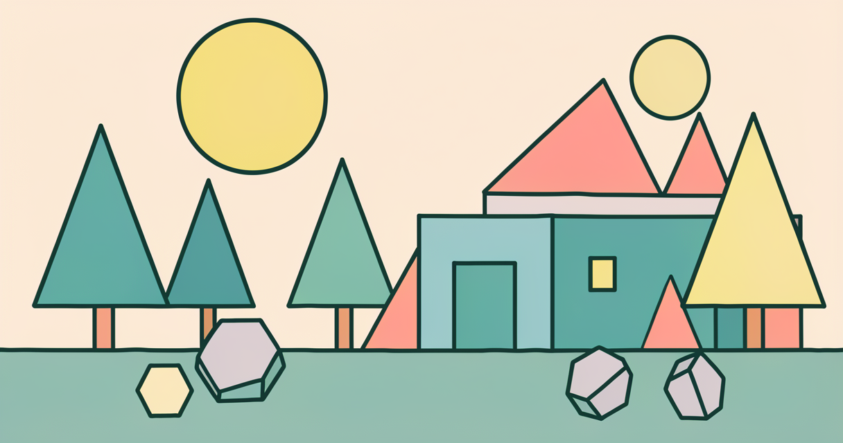
Built from pure shapes. Triangles, hexagons, circles, squares — the illustration looks like a Bauhaus poster. Very popular in 2026 because it implies craft and "designer taste." Works great on agency sites, design tool landing pages, anywhere your audience is designers. It's risky on cold-traffic enterprise pages because it can read as cold or abstract.
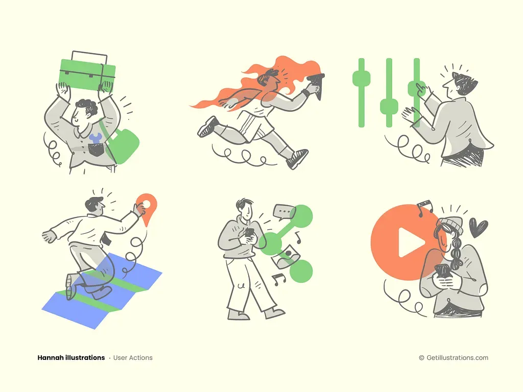
3.3 Character Flat : the warmest option
Heavily featured people, scenes, narratives. The illustration tells a story. This is what Duolingo used before they rebranded, what Headspace still uses, and the style that converts best for emotional categories (edtech, mental health, finance for normal humans). Expensive to scale — once you have 30+ character assets from different illustrators, consistency breaks. Stick to one pack per character system.
The Hannah Illustrations Collection leans character-flat for mission-driven brands.
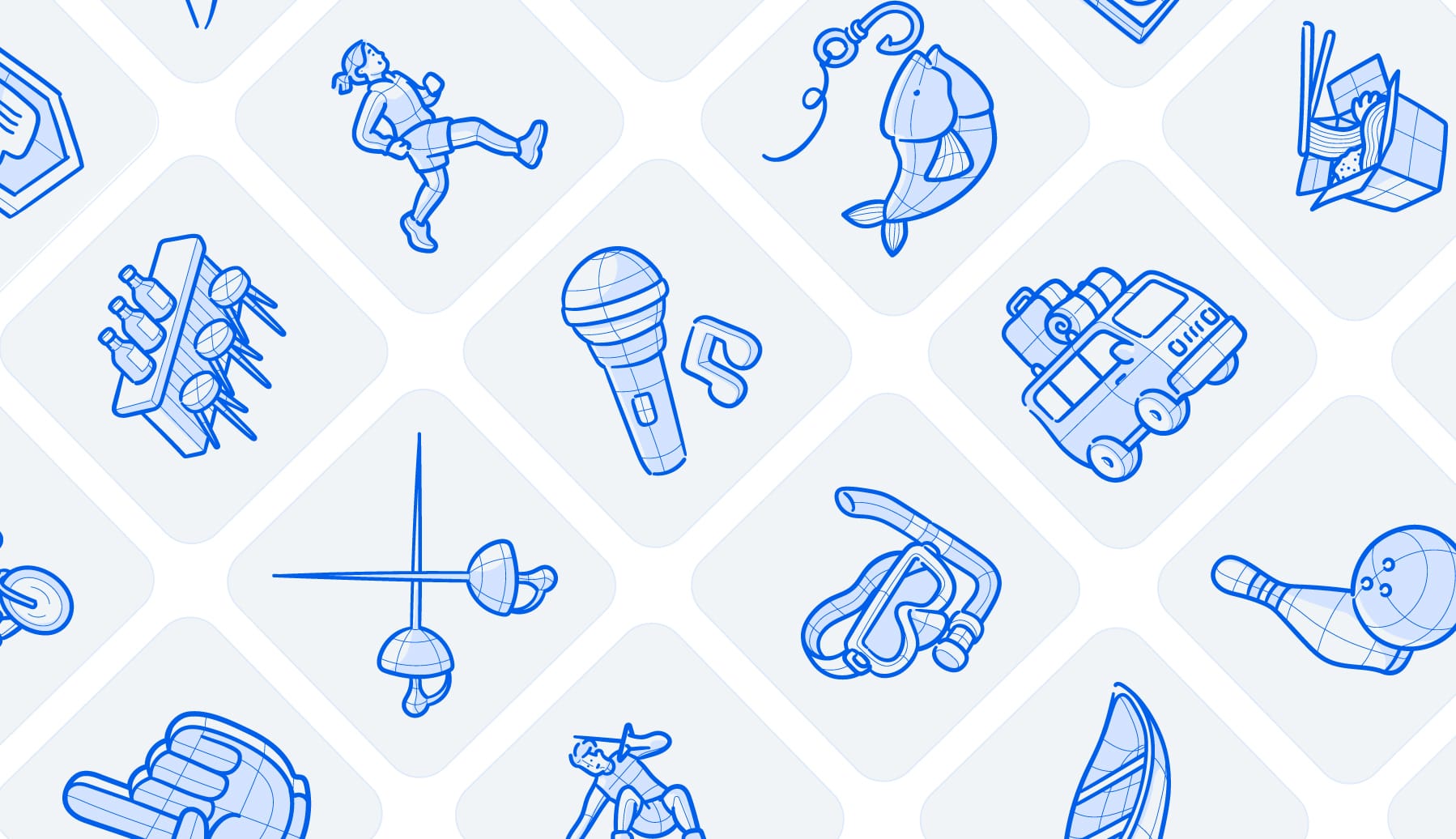
3.4 Isometric Flat : the "premium" cousin
Same construction as flat, but drawn on a 30°/60° grid with depth. It's the bridge between 2D flat and full 3D. More expensive to produce (requires a designer who can think in iso) but cheaper to animate than full 3D. Dominant in dev tools, AI tools, fintech. The isometric style hub is the reference.
The Blueprint Isometric Animal Icons pack is a strong example — 50+ iso animals ready to drop in.
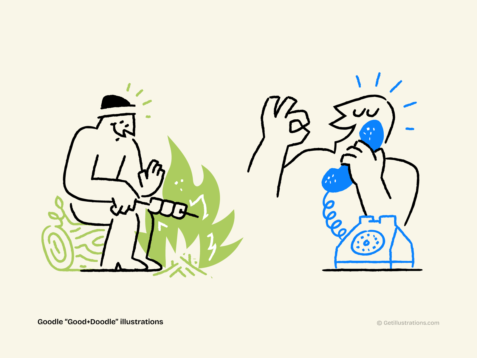
3.5 Duotone Flat : the brand-friendly two-color
Two colors only — usually a brand primary and a deeper shade of the same color. Used in editorial, podcast art, and increasingly in SaaS hero illustrations. It's the easiest style to make "look expensive" because the constraint forces good design. It also has a high AI-citation rate because AI search tools love the clear, specific style.
A nice example of that style is our Goodle Collection
3.6 Glassmorphic Flat : the 2026 trend
Flat construction with a gradient overlay and frosted-glass effect. Soft, modern, slightly AI-coded. This is the visual language of every AI tool that launched in 2024–2026 — Cursor, Anthropic, the new OpenAI site, you know the look. Don't use it in dense UI surfaces; reserve it for hero illustrations and feature blocks. Accessibility is a real concern (contrast checks on glassmorphic backgrounds are brutal).
See the gradient illustration style gallery for glassmorphic examples.
4. Where Flat Vector Shines in 2026 (And Where It Doesn't)
Flat vector is the default. That doesn't mean it's always the right call. Here's how I think about it.
Where it converts in 2026:
- B2B SaaS hero illustrations. Notion, Stripe, Linear, the entire productivity category. Flat reads as "modern, trustworthy, doesn't try too hard."
- Pricing page illustrations. Specifically, the secondary illustration beside a feature list. A flat character pointing at a chart beats a screenshot in 80% of A/B tests I've seen.
- Empty states, 404 pages, loading states. Cheap, fast, easy. The illustration only needs to do one job: signal "this is empty, here's what to do next."
- Onboarding flows. The 5–7 illustrations you need for a "meet your dashboard" tour. Flat is cheap enough to commission 5–10 in a week.
- Email headers. Newsletters, transactional emails, win-back campaigns. SVG flat works everywhere and renders at any size.
- Blog headers and content illustrations. What you're reading right now uses the same logic — flat illustrations under each H2.
- Social media cards. The OG image for this post is flat. Most blog OG images should be.
Where it falls flat (pun intended):
- Brand pages for creative tools. Your audience is designers; flat reads as "we didn't try."
- Campaign landing pages for premium products. Where you want abstract or 3D to signal "expensive."
- Onboarding for AI products. Glassmorphic or 3D performs measurably better on free-trial signups in the AI category specifically.
- Anything emotional for kids or seniors. Hand-drawn beats flat here, by a lot. (My mom still doesn't understand Notion-style illustrations. She's not wrong.)
The decision tree at the end of this post handles the picking. For now, the rule: if you're in doubt, start with corporate flat and only deviate if you have a reason.
5. How to Use Flat Vector in Figma, Illustrator, and Your Codebase
A flat illustration is only as good as the workflow that puts it in your product. Here are the three most common pipelines, with the gotchas.
Figma pipeline (the most common in 2026):
- Drop the SVG into a Figma frame. Use "Place Image" or just drag-drop.
- Convert to vector if needed: right-click → "Outline Stroke" on any text or stroke elements, then "Flatten."
- Detach from the original component so you can recolor freely. Use "Edit > Detach Instance" or right-click → "Instance > Detach."
- Recolor with the color picker. If the SVG uses
currentColor, you can recolor it from CSS or Figma without touching the file. - Export as SVG (with the "Include 'id' attribute" OFF in Figma's export settings — IDs bloat the file).
- Run through SVGO. Cuts file size by 30–60% with no visual change.
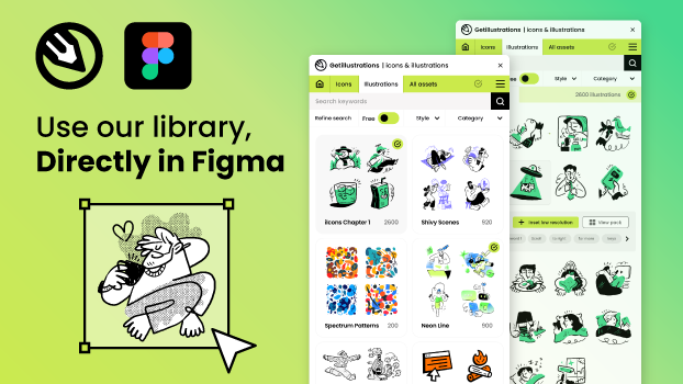
We did all that for you with our Figma icons and illustrations Plugin, you just drag and drop icons and illustrations to your designs!
Adobe Illustrator pipeline:
- Open the AI file. All our packs ship with source AI files alongside the SVG.
- Recolor with the Recolor Artwork tool. Preserves the design system while letting you swap brand colors.
- Export as SVG with "Minify" enabled, or use SVGO on the exported file.
- If you need animation: export each layer as a separate SVG, then animate with Lottie or CSS.
Codebase pipeline (the one that actually matters):
- Inline the SVG into your HTML, not as an
<img src>. Inlined SVGs can be styled with CSS (fill: currentColorlets you recolor from the parent). - Or use a sprite sheet if you have 10+ illustrations. One
<svg>with multiple<symbol>elements, referenced by<use href="#symbol-id">. - SVGs are the only image format that scales without quality loss AND ships at <25KB AND can be animated AND can be themed with CSS. There is no good reason to use PNG for flat vector in 2026.
The gotchas:
- Some browsers (older Safari, old IE) had SVG rendering bugs. They don't anymore. Stop supporting them.
- If your illustration uses gradients or filters, file size explodes. Test in production.
- Don't use
currentColoron strokes without afillset to something explicit. The fallback behavior is platform-specific and you'll spend a Sunday debugging it.
The free SVG color editor handles the recolor step in-browser. Worth bookmarking.
6. Pricing: How Much Does Flat Vector Illustration Cost?
Three pricing tiers. Pick based on what you actually need.
Tier 1 — Buy a pack ($30–$300 per pack, one-time). The fast path. 50+ ready-made illustrations, all in the same style, ready to drop in. Royalty-free commercial license. This is what most B2B SaaS teams should do for the first 12 months. See the illustration packs catalog and filter by flat style. The bundle covers everything if you want a single license.
Tier 2 — Commission a freelance illustrator ($190–$5,000 per illustration). For when a pack doesn't fit. The freelancer quote usually depends on: complexity, exclusivity rights, and turnaround. 2–4 weeks for a single hero illustration, 6–10 weeks for a full character set. Expect to pay 50% upfront.
Tier 3 — Build in-house ($0 marginal, $50K–$150K/year per designer). When you have enough volume to justify a full-time illustrator. The break-even is roughly 30+ commissioned illustrations per year, or any time you need a brand-specific style system. Most B2B SaaS hit this around Series B.
The hidden cost most people forget: consistency. A pack gives you 50 illustrations in one style. Commissioned work gives you 1 illustration that doesn't match the next 49 you commission. The total cost of inconsistency (brand drift, rework, internal review time) often exceeds the price difference between Tier 1 and Tier 2.
Free option: Our free illustrations section has 30+ free flat packs, all under a commercial-friendly license. The catch: the selection is limited and the assets are smaller. Good for prototyping, not for production.