
How to Pair Fonts for a Website: Headings, Body Text and the Illustration Next to Them
How to pair fonts for a website in four decisions: pick the body font first, match the heading to your illustration, write the CSS and test it on a phone.


You've got the landing page half built in Figma. The illustration is in, a chunky 3D rocket from a pack you bought last week, and the headline next to it is still set in whatever Figma defaulted to. You open Google Fonts, scroll for twenty minutes, and close it with nothing chosen.
That scroll is the problem this guide fixes. Most font pairing advice for websites shows two faces floating in a white specimen and calls it done. On a real page the type sits next to artwork that already has its own line weight and colour, and the pair has to agree with that too.
This guide shows how to pair fonts in four decisions, then gives you a heading and body pairing for four of the illustration styles in the GetIllustrations pack library, the CSS in plain words and a five minute test on a phone. Every pack in that library begins with a human illustrator (four are labelled Remixed by AI), so the line weight you're matching was somebody's deliberate choice.
Why does font pairing matter on a page with an illustration
Type sets the voice, the artwork sets the scene
A heading font tells the visitor how the product sounds before they read a word. A serif says established, a geometric sans says product, a handwriting face says somebody is on the other end. The illustration beside it is doing the same job with lines and colour, and when the two disagree the page feels like it was built by two teams who never met.
Look at the picture at the top of this article. The headline is a heavy sans with tight spacing, the paragraph is a quiet grey, and the textured 3D drawings carry the same rounded, chunky weight as the headline. Swap that headline for a thin serif and the artwork would suddenly look like a stock photo someone dropped in.
What the usual guides leave out
We read the top results for how to pair fonts before writing this. They agree on the rules (contrast, hierarchy, two families at most) and then show each pair as an isolated image. None of the ones we read gives you the CSS, and none judges a font pairing with illustrations sitting right beside it.
The rules below are short, because they're the easy part. The real work is getting the sizes right and judging the type next to the artwork you've already picked.
How do you choose a heading font and a body font
Decision 1, role: pick the body font first
Body text does most of the reading on a page, so choose it first. You want a text face with open shapes, a generous x height and at least a regular and a bold weight. Inter, Source Sans 3, Nunito, Work Sans and DM Sans all qualify, and every one of them turns up as the body font in the 112 pairings on our font pairing page.
Only then pick the heading. It has one job, to be noticed, so it can afford personality the body can't.
Decision 2, contrast: one thing the same, one thing different
Which fonts go together? Two that share one trait and differ in another. Share the mood and differ in structure, as in the classic serif and sans serif pairing, or share the structure and differ in weight, like Archivo Black over Archivo, one family at two extremes.
What fails is two faces that are nearly the same, say Roboto headings over Open Sans text. The eye reads that as a mistake rather than a choice.
Decision 3, x height: why two fonts at the same size look uneven
The x height is the height of a lowercase x, and of most lowercase letters, above the baseline. Set a 16 px paragraph in a face with a tall x height and it looks bigger than the same 16 px in a face with a short one. When a heading and a body font have very different x heights the page looks slightly off and nobody can say why.
Matching x height is the quiet half of font pairing. Type a line of both fonts at the same size and compare the lowercase x: close is fine, identical is rare. If they're far apart, change one of the fonts rather than fighting it with sizes.
Decision 4, mood: serif, geometric sans or display
This is where the illustration comes in. Outline drawings want a light heading, either a regular weight sans or a serif with fine hairlines. Flat and 3D art can carry a bold sans, and hand drawn work suits a rounded or handwriting face, as long as you keep it to a few words.
| Illustration style | Heading font | Body font | Why it works |
|---|---|---|---|
| Hand drawn | Fredoka | Nunito | Rounded corners meet the warmth of a sketched line, the body stays plain |
| Outline and line art | Manrope at regular weight | Roboto | A regular weight heading matches a thin single stroke instead of shouting over it |
| Flat | Bricolage Grotesque | Inter | Clean shapes beside clean shapes, with all the weight in the heading |
| 3D | Unbounded | Inter | Heavy wide letters hold their own against light, shadow and volume |
Every heading and body font combination in that table is on our font pairing page, so you can preview it with your own headline before you load anything. The sections below explain the why for each style.
Which fonts go with hand drawn illustrations
Rounded or handwriting heading over a plain sans body
Hand drawn packs are warm by nature, all wobbly outlines and uneven fills. At the time of writing the hand drawn style page lists 8,000+ illustrations across 95 packs, 2 of them free. A heading with soft corners meets that warmth halfway, and a plain body font keeps the page from turning into a birthday card.
Fredoka with Nunito is the safe pick: both rounded, the heading much heavier. Caveat with Nunito goes further into handwriting, which works for a hero of five words and stops working at a paragraph.
A worked example with a free doodle pack
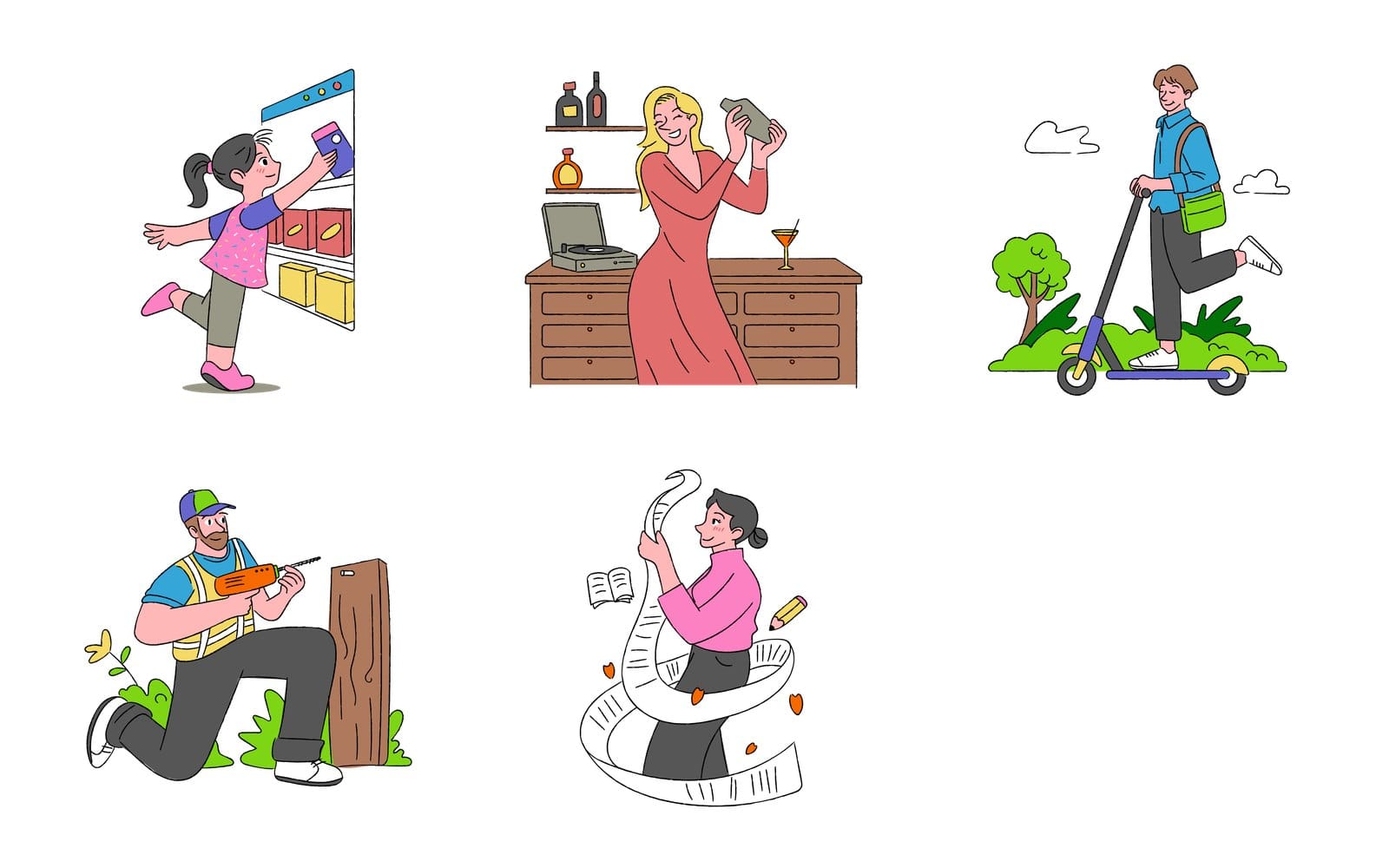
These five come from the Free Doodle Pop Colorful Activities pack, one of the packs on our free illustrations page. The lines are dark and even, the colours are flat and bright, and the people are mid movement. Fredoka at 700 for the heading picks up the rounded line ends, and Nunito at 400 for the body matches the even stroke without copying it.
Caveat looks good on this set in a two word headline. By the third line of text it starts to feel like a note stuck to the fridge, which is where most handwriting faces run out.
Which fonts go with outline and line art illustrations
Match the stroke: regular weight headings for thin single lines
Outline is the biggest of the four styles here, 12,000+ drawings in 131 packs at the time of writing, 10 of them free, all on the outline style page. The thing to match is the stroke. A continuous line drawing is one thin, even line, and a black 800 weight heading next to it looks like a shout beside a whisper.
Use a heading at regular or medium weight and let size make the hierarchy instead. Manrope over Roboto, or Figtree over Source Sans 3, both keep the stroke of the type close to the stroke of the drawing. If you want an editorial feel, Newsreader over Inter gives you a serif with hairlines that echo the single line.
A worked example with continuous line illustrations
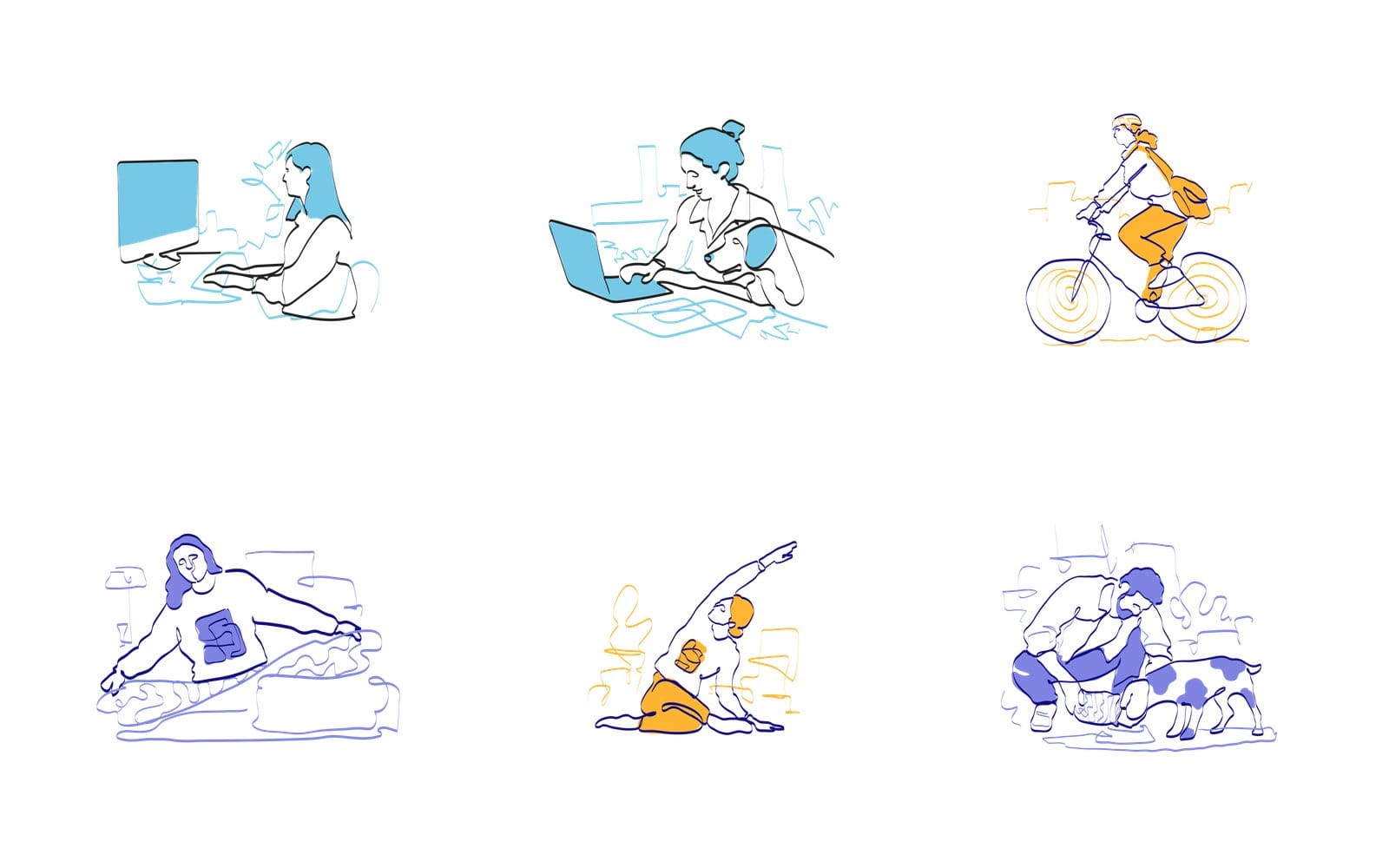
These six come from two Oneline Illustrations packs, drawn in a continuous line with a flat second colour laid behind it. Hold a 48 px heading next to them and the test is simple: does the heavy part of the letter look thicker than the line of the drawing? If yes, drop a weight.
Colour helps as well. The blue, orange and purple in these drawings are the natural accent colour for a link or a button, and the colour theory wheel builds a full palette around whichever one you pick.
Which fonts go with flat illustrations
Bold sans headings and a neutral body
Flat illustration is shapes and solid colour with no shading, which is also a fair description of a geometric sans. The flat style page holds 8,000+ illustrations with 10 free packs at the time of writing. Because the artwork is already clean, the heading can carry more weight than it could next to a line drawing.
Bricolage Grotesque with Inter is the font combo we'd reach for first on a SaaS landing page. Space Grotesk with DM Sans is quirkier, Sora with Nunito is friendlier. All three put a bold heading over a body font that stays out of the way, which is the point.
A worked example with a two colour ink pack
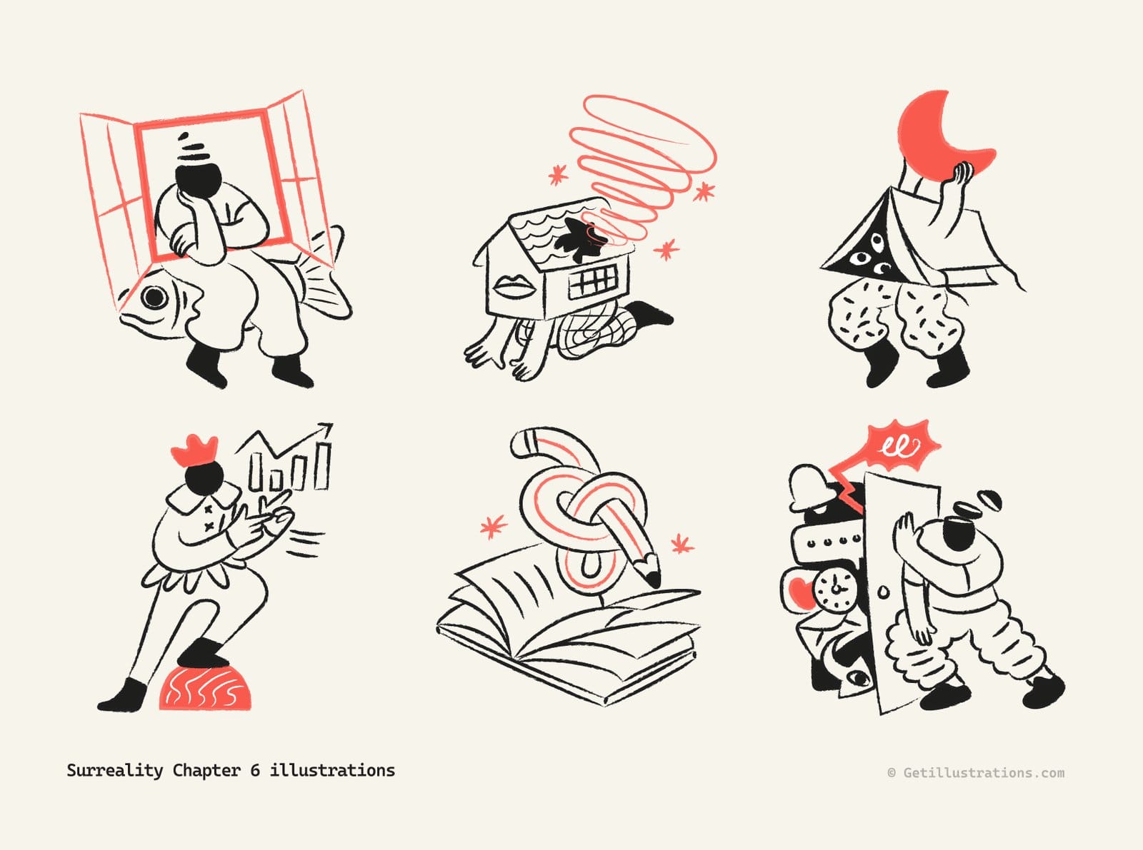
Surreality Chapter 6 is flat in the sense that matters for type: black and one coral accent, no gradients, no shadows. The brush edges give it more energy than a geometric flat pack, so the heading needs weight to stand up to it. A thin elegant serif would be flattened by those strokes.
Syne over Plus Jakarta Sans is a good match for this particular set, because Syne has the same slightly odd proportions the characters do. Keep the body neutral and the odd stuff stays in the heading where it belongs.
Which fonts go with 3D illustrations
Heavy, wide headings that hold their own against rendered depth
3D illustrations have light, shadow and volume, and they're usually the heaviest thing on the page. The 3D style page lists 2,400+ illustrations in 36 packs at the time of writing, 3 of them free. A light heading next to a rendered object disappears, so go heavy and, if the family has it, wide.
Unbounded with Inter is the pairing to start with. Archivo Black with Archivo is the classic version of the same idea, and Anton with Poppins works when the headline is short and the page is loud.
A worked example with a 3D SaaS pack

This made up landing page puts InkDex 3D illustrations beside a heavy, tightly spaced sans headline and a grey body paragraph. Notice that nothing in the type competes with the artwork for texture. The heading is big and plain and leaves all the detail to the illustrations.
One limit: every extra weight is another file to download, and Unbounded's wide letters eat horizontal space on a phone. Check the hero wraps to no more than three lines at 360 px wide before you commit.
How do you write the CSS for a Google Fonts pairing
The property names below are written in plain words, with spaces where the code has hyphens. Hit Copy CSS on any card of the font pairing page and you get the two font family lines, heading and body, with the names spelled right. The link and the sizes come from the steps below.
One Google Fonts link for both families and only the weights you use
Google's css2 endpoint takes both families in a single request, each as its own family parameter, with the weights listed after the name and display set to swap at the end. Ask for 400 and 700 and nothing else unless you use it, because every weight is another request. The Google Fonts CSS API docs show the full syntax.
Put two preconnect links before it, one to fonts.googleapis.com and one to fonts.gstatic.com with the crossorigin attribute. The web.dev font guide recommends both hints, along with swap for branding text and optional for body text.
The font family declaration with a generic fallback
Set the body font on the body element with a generic keyword after it, sans serif or serif (the first one takes a hyphen in code), so the browser has somewhere to go if the request fails. Then set the heading font on h1, h2 and h3 the same way. Two declarations and you're done.
Font size adjust so the fallback keeps the same x height
While the web font loads, the fallback shows at the same size but with a different x height, and the text jumps when the real font lands. The font size adjust property scales the fallback so the lowercase letters stay the same height. It became Baseline in July 2024, which means it works across current browsers, and the MDN page has the details.
The value is the x height divided by the font size, so it differs per font. Set a line in the fallback and a line in the web font at the same size, then nudge the number until the lowercase x in both is the same height.
A type scale of 1.25 with body text at 16 to 18 px
Pick a body size between 16 and 18 px and multiply by 1.25 for each level up. That gives you a system instead of a pile of sizes, and it's the ratio our pairing page suggests (1.333 if you want more drama). Use a line height of 1.5 for body text, the same figure WCAG 2.2 criterion 1.4.12 tests with: your page must lose no content when a reader forces line height to 1.5 times the font size, so don't give text boxes a fixed height.
| Level | Size at a 16 px base | Line height |
|---|---|---|
| Body text | 16 px | 1.5 |
| Lead paragraph | 20 px | 1.5 |
| H3 | 25 px | 1.3 |
| H2 | 31 px | 1.2 |
| H1 or hero | 39 to 49 px | 1.1 |
Keep lines between 45 and 90 characters, the range Butterick's Practical Typography gives for body text. At 16 px with a normal sans that is a column of roughly 400 to 700 px, so set a maximum width on your paragraphs.
How do you test two fonts together at real sizes
Preview your headline at 48 px, then check the body at 16 px
On the font pairing page, type your real headline into the field labelled Type your own preview text, and every card's heading switches to your words. Then drag the Heading slider, which runs from 16 to 64 px and starts at 32, up to 48, close to a hero headline.
The slider only moves the heading. Each card's body line keeps the pairing's own description at a fixed size, so judge the body font on your own page at 16 px. Whether the x heights agree and the stroke matches your artwork is your call, since the tool previews and doesn't judge.
Check it on a phone next to the illustration, not in a specimen
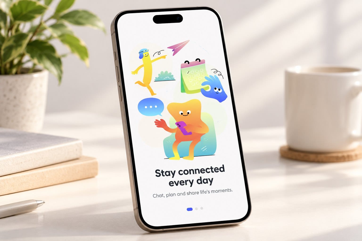
This mockup, made from three illustrations in the Shapeless Gradient pack, shows what to look at: a short rounded heading, one line of body text and the artwork at roughly phone size. At that size a heavy heading wraps onto a third line and a thin one vanishes beside all that colour. Open your page on your actual phone, not the responsive view in a desktop browser.
Five minutes is enough. Read the headline, read one paragraph, look at the drawing, and ask whether the three feel like one product.
Try it in the Design Studio with the illustration on the canvas
If the page isn't built yet, the Design Studio puts an illustration from the library and a text layer on one canvas, so you can try a pairing beside the artwork before writing a line of code. The font pairing page links straight to it as Try any pairing in the Design Studio.
Common mistakes when pairing fonts, and how to fix them
Two fonts that are almost the same
Roboto with Open Sans, Lato with Source Sans 3, Montserrat with Poppins. Each pair shares structure, weight and mood, so the reader can't tell why there are two. Fix: keep the body and swap the heading for something in a different category, serif or display, or the same family two weights apart.
A third family that adds noise and bytes
A heading font, a body font, and then a third one for buttons or labels because it looked nice in a template. Every family is more requests and more to go wrong. Fix: use the body font in bold for buttons and labels, or at 600 if it's a variable font.
A heading face that fights the illustration's line weight
A black 900 weight heading beside a hairline continuous line drawing, or a wispy script beside a 3D render. Fix: match the stroke of the drawing with the stroke of the heading, then build hierarchy with size and space. If the pack sits on the outline style page, start light, and if it's on the 3D page, start heavy.
Can you use Google Fonts and these illustrations on a commercial website
Yes to both, with one detail. Every font on our pairing page is a Google Font released under the SIL Open Font License or the Apache License, free for personal and commercial projects with no licence fee.
For the artwork, free packs can go into personal and commercial work with a visible credit to GetIllustrations. Paid packs and plans need no credit and come with a commercial licence, and the yearly plan opens every pack on the illustration packs page. Browse by style there, or start from the curated collections, where packs come grouped as a set.
Questions people ask about pairing fonts
How many fonts should a website use?
Two families: one for headings, one for body text. A third is almost never needed and always costs bytes. If you need more variety, use more weights of the two you have.
Can you pair two sans serif fonts?
Yes, and plenty of the pairings on our page do: 46 of the 112 sit in its sans serif category alone. Make them differ clearly in weight or in character, a geometric heading over a humanist body, for example. Two neutral grotesks at similar weights is the one combination to avoid.
Should body text be serif or sans serif?
Either works on screen today. Sans is the safer default for app interfaces and SaaS pages, serif suits long reads and editorial sites. Pick by x height and how open the letters are, not by category.
Are Google Fonts free for commercial websites?
Yes for every font on our pairing page. They're under the SIL Open Font License or the Apache License, both of which allow commercial use, and you can self host the files if you want full control over caching.
Do web fonts slow down a website?
Each family and weight is a request and more bytes, so they can. Load only the weights you use, add preconnect hints, set display to swap, and prefer a variable font when the family offers one. Two families at two weights each is a small cost on most connections.
Pick the body font first, match the heading to the stroke of your illustration, write two declarations, and test it on your phone. That's the whole method, and it takes less time than the scroll through Google Fonts you were about to do.