How to Make Vector Line Art: Clean Strokes, One Weight Everywhere and an SVG That Holds Up
Make vector line art with one stroke weight across a set, from 24px icons to 1200px heroes, set caps and joins once, and export an SVG that scales right.

You know the moment. The outline illustration looks lovely at 800 pixels in the hero, so you drop the same drawing into a 120 pixel empty state and the lines turn to grey mush. Or the SVG goes into the codebase and every stroke comes out twice as fat as it was in Figma, and nobody can say why.
Most line art tutorials stop at the canvas. They teach you to draw a nice line in Clip Studio or Illustrator and never ask what happens when that line has to live on a screen at three sizes and inside a file a browser has to read. That's the part this guide is about.
I'll go through picking one stroke weight that reads at 24 pixels and at 1200, setting caps and joins once, deciding between live and expanded strokes, reading the exported SVG line by line, and recolouring a whole set without opening Illustrator. The examples come from the outline packs in the GetIllustrations library, every one of which begins with a human illustrator.
What makes line art work as a vector
Line art is a style, vector is a format, and you want both
Line art means the drawing is made of lines with little or no fill. A vector drawing stores those lines as maths, points and curves, instead of pixels. A pencil sketch scanned to JPG is line art but not vector, and a flat illustration exported as SVG is vector but not line art.
For a screen you want both, because a vector line can be redrawn at any size and recoloured in code. If you're still fuzzy on the format side, what is a vector image covers the basics.
Why strokes beat filled shapes while you're still drawing
A line in a vector editor can be stored two ways. As a stroke, the file holds the centre path plus a width, so you can change the weight of a hundred drawings by typing one number. As a filled shape, the file holds the outline of the ink, and the weight is baked in forever.
Keep everything as strokes until the last possible moment. You'll thank yourself the first time a product manager asks whether the icons could be a touch bolder.
The outline packs in the library as a reference set
When I want to show someone what consistent line art looks like, I open the outline style page. It holds more than 12,000 simple outline illustrations in 131 packs, 10 of them free, running from hairline to bold marker strokes. The continuous line packs are the clearest example: one weight throughout, and any fill sits behind the line instead of competing with it.
How to choose a stroke weight that survives every size
Start from the smallest place the drawing will appear
Weight decisions go wrong because people pick them on a big artboard. Zoomed in at 400 percent a 1 pixel line looks crisp and elegant, and then it ships to a phone and vanishes. Decide the smallest rendered size first, draw a test at that size, and only then scale up.
Material's system icon guidance puts icons on a 24 by 24 dp canvas with a 20 dp live area and 2 dp of padding. The 2 dp stroke weight quoted in so many icon guides is a sensible place to start, but treat it as common practice rather than a Material rule.
The 24 pixel icon test and the 1200 pixel hero test
My own test is blunt. Export the drawing as a 24 pixel PNG and look at it on a 1x screen, not a retina laptop. If any line has gone grey, the weight is too thin or the detail is too dense for that size.
Then put the same drawing at 1200 pixels wide in a hero and stand back from the monitor. Lines that look like wire are too thin for that size, lines that look like marker are too heavy, and a stroke that scales with the drawing rarely passes both tests. The table below is where I'd start, measured as the stroke width at the rendered size.
| Where it appears | Rendered size | Stroke that still reads | What goes wrong below that |
|---|---|---|---|
| Toolbar or list icon | 16 to 24 px | 1.5 to 2 px | Hairlines blur into grey on a 1x screen |
| Empty state or card | 120 to 240 px | 2 to 3 px | A 1 px line looks like a pencil sketch next to bold type |
| Hero or onboarding screen | 600 to 1200 px | 4 to 8 px | Thin lines read as wire, very thick ones as marker |
| A4 print at 300 dpi | 2480 px wide | 8 px or more | Anything under a quarter of a millimetre can drop out on cheap paper |
If one drawing has to cover both ends of the table, keep its strokes live and save a second export with the weight retyped for the far end. With live strokes that's one number to change, not a redraw.
One weight for the whole set, and when a second weight is allowed
Pick one stroke weight for the set and write it down somewhere the next designer will see it. The one exception I'd allow is a second, thinner weight for interior detail such as eyes, buttons or texture, at roughly half the main weight. Three weights in one set always reads as three illustrators.
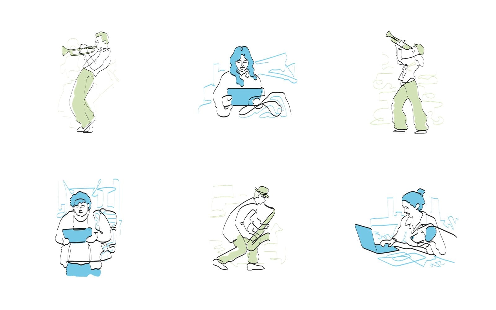
Look at the sheet above. Six drawings from the People At Work pack, one black stroke everywhere, and the coloured fills sit behind the line rather than fighting it. Shrink it to a thumbnail and the figures still read, which is the whole point.
How to make vector line art in Figma
Pen tool, centre aligned stroke and a locked reference layer
Drop your sketch or reference on the canvas, set its opacity to around 30 percent, and lock the layer so you can't drag it by accident. Press P for the Pen tool and draw the main contour as one path, clicking for corners and dragging for curves. Finish the path with Escape rather than closing it unless the shape is meant to be closed.
In the Stroke section of the right panel set the position to Center. Figma offers Inside and Outside too, but SVG only knows centre strokes, so anything else gets simplified at export and the code gets messier for no gain.
Round caps, round joins and the miter angle
Open the advanced stroke settings, the small icon beside the stroke weight. Set the end caps to Round and Join to Round. Round caps finish an open line with a half circle, which is what makes a continuous line illustration look like ink rather than a cut ribbon.
Miter joins produce a sharp spike at acute corners, and the miter angle setting only exists to clip that spike. Once your joins are round you can ignore it entirely. Figma styles hold colours, not caps or joins, so when the drawing is done, select every path and set both in one go.
Fewer anchor points, smoother curves
Beginners add a point every few millimetres and the curve wobbles between them. A good curve uses the fewest points that describe it, usually one at each change of direction. If you've already drawn a lumpy path, delete every second point and pull the handles longer, it almost always improves.
Keep the handles on a point roughly in line with each other for a smooth pass, and Alt drag a handle to break the pair only where the drawing really has a corner. That one habit does more for clean line art than any plugin.
How to draw vector line art in Illustrator
The Stroke panel settings to set once
Illustrator's Stroke panel has the same decisions with slightly different names. Open it from Window, Stroke, and click Show Options if it looks short. Here's the side by side.
| Setting | Figma | Illustrator | Why |
|---|---|---|---|
| Stroke position | Center | Align Stroke to Center | SVG only knows centre strokes, so what you see is what you ship |
| Cap | Round | Round Cap | Open ends of a continuous line look finished at any size |
| Join | Round | Round Join | No spikes at sharp corners and no clipped miters |
| Weight | One value for the whole set | One value for the whole set | Mixed weights are the first thing a reader notices |
| Miter limit | Leave the miter angle at its default | Leave Limit at its default | Only matters with miter joins, so once joins are round you can forget it |
Save the result as a Graphic Style, or at least as the default appearance of the document, so a new path starts right. Nothing wastes more time than fixing caps on 200 paths the night before launch.
Image Trace for a scanned ink drawing and what to clean up after
If the drawing started on paper, place the scan and open Window, Image Trace. Choose the Line Art preset, then in the Advanced section switch Create to Strokes and set the Stroke value a little above the width of your ink lines. Tick Ignore White, press Expand, and you have paths.
What you get is never finished. Expect stray fragments where the ink was faint and doubled lines where it was thick, and check every corner, because the trace tends to round them off. Spend ten minutes with the Smooth tool and the Delete Anchor Point tool before you do anything else.
Align to pixel grid and why it matters for icons
For icons, turn on Snap to Pixel from the View menu and keep Align to Pixel Grid ticked in the Transform panel. A 2 pixel stroke centred on a whole pixel coordinate covers exactly two pixels and renders crisp. Centre it on a half pixel and it covers one full pixel and two halves, so both edges go grey, which is where blurry icons come from.
Odd weights flip the rule, so a 1 pixel stroke is only crisp when it's centred on a half pixel. This matters far less for a hero illustration, where nobody looks at individual pixels, but for a toolbar icon it's the difference between sharp and smudged.
Should you expand strokes before exporting an SVG
Keep strokes live when the drawing may be recoloured or resized
A live stroke stays editable. The weight is one number, the colour is one attribute, and a developer can change either in CSS without touching the drawing. For a set of UI illustrations that will be tuned over the life of the product, that flexibility is worth keeping.
Expand strokes when the width must never change
Expand, or outline, the stroke when the drawing goes somewhere you don't control: a logo handed to a print shop, a cutting file, an icon for a platform that strips stroke attributes. In Figma it's Object, Outline stroke, and in Illustrator it's Object, Path, Outline Stroke. Keep the live version in the source file and expand only on a copy.
What Figma and Illustrator do to inside and outside strokes on export
Figma's own help page says SVG export only supports centre strokes. An inside or outside stroke is simplified on export, which keeps the look but makes the SVG code more complex and harder to edit by hand. Draw with Center from the start and the export stays a plain stroke you can read.
Illustrator only allows inside and outside alignment on closed paths, so an open line is centred already. To export, choose File, Export, Export As, pick SVG, and in the SVG Options window that follows set Styling to Presentation Attributes rather than Internal CSS. That puts the stroke colour and width on each path, where other tools, including the colour editor further down, can read them.
How to export line art as an SVG that holds up
Read the exported file: viewBox, SVG stroke width and the unitless trap
Open the exported line art SVG in a text editor. Up top you'll see a viewBox, four numbers that describe the drawing's own coordinate space. Each path carries a stroke colour and a stroke width, and that width is normally written without a unit.
Here's the trap. The default stroke width is 1 px, but a unitless width is a count of user units, and user units scale with the viewBox.
A width of 2 on a viewBox 24 wide is 2 pixels when the icon renders at 24 pixels, and 8 pixels when the same file renders at 96. That is why one SVG looks right in your design tool and fat on the page.
Caps and joins in the code: stroke linecap and stroke linejoin
Caps and joins export as two attributes, stroke linecap and stroke linejoin, written with a hyphen between the words in the file. The default linecap is butt, which stops the stroke dead at the last point. Round extends each end by a half circle whose diameter equals the stroke width, and square extends by half the stroke width with a flat end.
If the file is missing those attributes, the browser falls back to butt and miter, and your carefully rounded drawing arrives with square ends. Check they're present on the paths or, better, set them once on the group that wraps the whole drawing.
Non scaling stroke for icons that get resized in CSS
When one SVG icon is rendered at several sizes through CSS, you can pin the stroke width. Add a vector effect attribute with the value non scaling stroke, again hyphenated in the file, and the width stays constant whatever transform or zoom the element gets. MDN lists it as available across browsers since July 2020, so you don't need a fallback any more.
Use it with care on illustrations. A hero drawing scaled up to twice its size with a pinned 2 pixel stroke will look like wire, which is exactly the problem the weight table was trying to avoid.
A short checklist before you ship
- The viewBox matches the artboard, and any fixed width and height on the file are ones you meant to keep.
- Every line has fill none, a stroke colour and the one stroke width shared across the set.
- Linecap and linejoin are set to round on the paths or on the wrapping group.
- No path has an inside or outside stroke that got rebuilt at export.
- The file opens in a browser at 24 pixels and at 1200 and the weight reads at both.
How to recolour a line art set to your brand colour
Changing the stroke colour of an SVG one swatch at a time
This is the bit that used to mean opening every file in Illustrator. Drop a pack SVG on the free SVG Color Editor and the panel lists every colour it found, under the heading Colours found. Click the swatch for the stroke, pick your brand hex, and every path using it changes at once.
The buttons are named plainly: Reset colours puts the file back the way it arrived, Download SVG and Download PNG save the result, Copy the SVG code puts it on the clipboard, and Load another SVG starts again. One thing to know before you drop a file: a copy of it goes to our server.
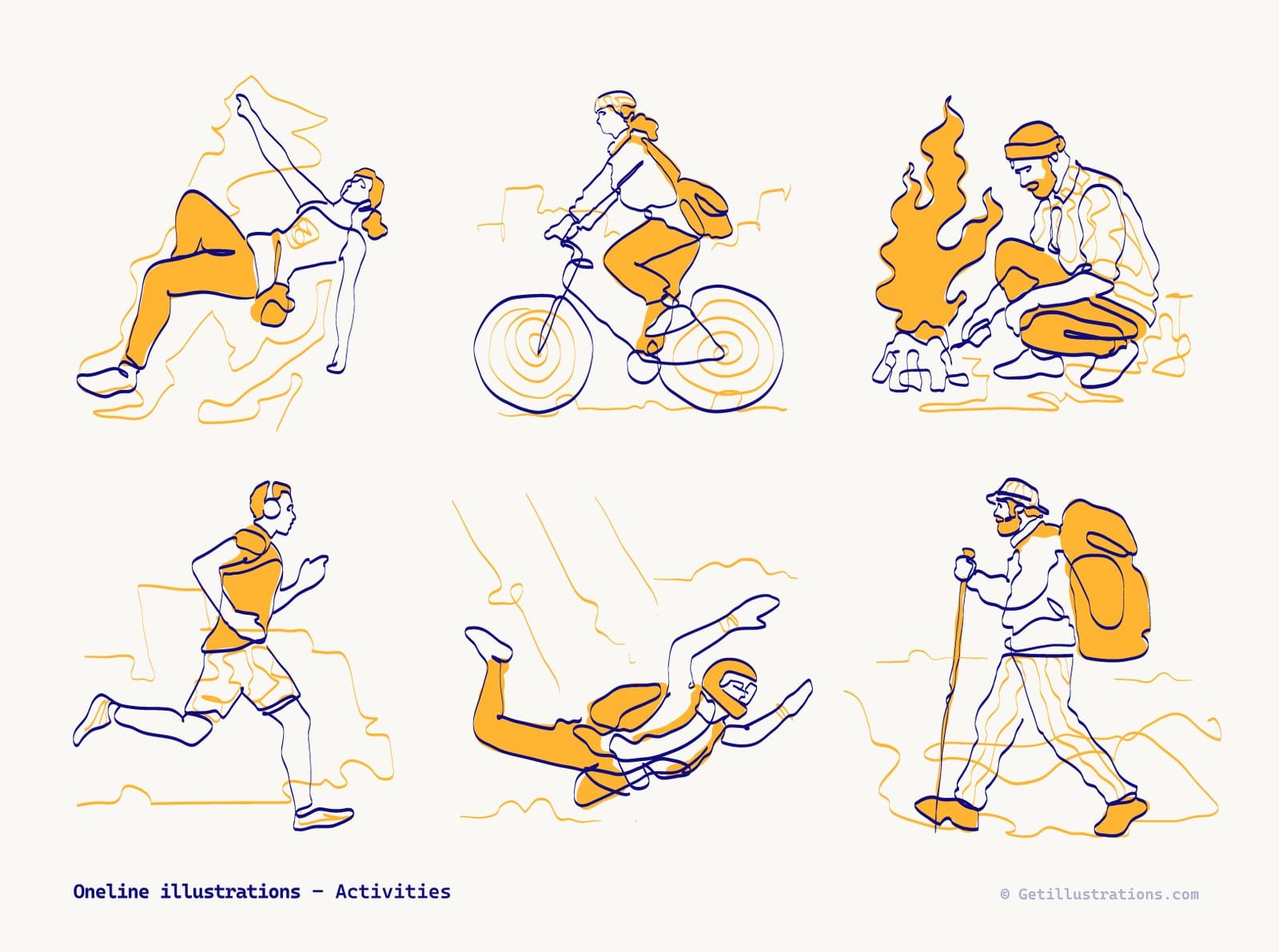
The Activities pack above shows why one stroke colour matters. The editor works on one file at a time, but because the illustrator used one stroke colour and one fill colour throughout, the same navy swap in each file keeps all six drawings matched.
What the editor will not touch: CSS classes, hsl and currentColor
The editor changes fill and stroke colours set as attributes or inline styles, plus gradient stops and pattern colours. It won't move or reshape a path, and it skips colours written in a style block or a CSS class, hsl() colours and currentColor. If your Illustrator export used Internal CSS, the swatches won't appear, so go back and export with Presentation Attributes.
Using currentColor so the icon follows your text colour
For inline icons in a UI, set the stroke to currentColor by hand in the file. The icon then takes whatever colour the surrounding text has, so a dark mode switch or a hover state recolours it along with the text. Do the brand colour pass in the editor first and switch to currentColor on the icons that live beside text.
How to turn a scanned or raster line drawing into vector
Preparing the scan: black ink, no shading, no gaps
Automatic tracing is only as good as the scan. Ink the drawing in solid black, skip pencil shading, close any gap in a line that should be continuous, and scan at 300 dpi or more against plain white paper. Bump the contrast in any image editor until the paper is white and the ink is black with nothing in between.
Tracing it so even lines come out as real strokes
Drop the scan on Vectorizer Lab and pick the Line art preset, the one whose hint says it keeps thin strokes and hatching. The tool thins each long, thin region to its skeleton, measures the width along its length, and writes an even line as one stroked path with a real width. In the layered SVG export the lines and dots sit in their own groups, so you can select every stroke at once and change its weight or colour.
Like the colour editor, it copies what you drop to our server. The full walkthrough, with the settings that matter, is in how to convert PNG to SVG.
Where automatic tracing stops: tapers stay filled shapes
A brush line that swells and thins can't be one stroke with one width, so the tool keeps it as a filled band. That's correct behaviour, but it means a tapered drawing won't give you the single editable weight this whole article is about. If you want that, redraw the main contours over the trace with the Pen tool and keep the trace as a reference layer.
Common vector line art mistakes and how to fix them
Strokes that vanish or go fat when the artwork is scaled
Most often this is the unitless width from the export section. Check the viewBox, work out the rendered size, and set the width for that ratio. If one icon renders at several sizes, pin it with the non scaling stroke value.
Mixed caps in one drawing
A set drawn over weeks picks up square ends on some paths and round on others, and the mix reads as sloppy. Select every path in the file and set the cap and join in one go, then, in Illustrator, save the stroke as a Graphic Style so new paths can take it in one click. In the SVG, set both on the wrapping group and delete them from the individual paths.
Hairlines that disappear on a phone
A hairline that looks fine in a desktop hero gets halved when the layout shrinks the drawing to fit a phone. Below about 1 pixel at the rendered size it goes pale and patchy, or drops out altogether. Thicken it, or pin the width with non scaling stroke so the layout can't thin it.
An SVG that looks right in your design tool and wrong in the browser
Usually the design tool was showing you stroke settings that never made it into the file. Open the SVG in a text editor and look for linecap, linejoin and width on the paths. If they aren't there, the browser's defaults are what you shipped.
Should you draw your own line art or download it
131 outline packs, 10 of them free, each begun by a human illustrator
Drawing a consistent set of forty line illustrations takes a good illustrator a few weeks, and most product teams don't have one on staff. If what you need is a set of outline illustrations for empty states or onboarding screens, the illustration packs in that style already have the weight, caps and joins decided, and the free illustrations page is where to test a style before committing. Every pack starts with a human illustrator, and the few that were remixed with AI carry a Remixed by AI label on their pack page.
What you get in the download: flattened SVG and layered AI source
Each drawing comes as an SVG that's flattened artwork, ready to drop into a design or a codebase, and the layered Adobe Illustrator source files come with the full pack ZIP rather than with a single SVG. The SVGs aren't split into named layers, so if you need to animate or edit individual parts, open the Illustrator file. For a colour change the flat SVG is all you need.
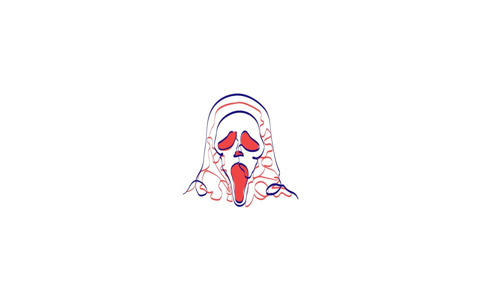
That drawing is from the free Halloween oneline pack. Download it, open the SVG in a text editor and go through the checklist above: the viewBox, whether each line is a stroke or a filled shape, and which caps and joins it carries.
Licence: a credit for free packs, none for Standard and Extended
Free packs can be used in personal and commercial projects with a visible credit such as Illustrations by GetIllustrations.com in your footer or credits page. Standard and Extended licences don't need a credit. The full wording is on the licence page, so read it before you ship.
Questions about vector line art
What is the difference between line art and vector art?
Line art describes the look, a drawing built from lines with little fill. Vector describes the file, shapes stored as points and curves that redraw at any size. A drawing can be either, both or neither, and for anything on a screen you want both.
What stroke width should I use for line art icons?
For icons on a 24 pixel canvas, 1.5 to 2 pixels at the rendered size reads on both 1x and retina screens. Go thinner and 1x displays turn the line grey. Keep the same number across the whole set.
Should I outline strokes before exporting an SVG?
Only when the file leaves your control, such as a print job or a platform that strips stroke attributes. For a product UI keep the strokes live so the weight and colour stay editable in code. Always keep the live version as the source.
Why does my SVG stroke look thicker or thinner in the browser?
Because a unitless stroke width is measured in the viewBox's own units, and those scale with the rendered size. A width of 2 on a 24 unit viewBox is 2 pixels at 24 pixels and 8 pixels at 96. Set the width for the size you render at, or pin it with the non scaling stroke value.
Can I change the stroke colour of an SVG without opening Illustrator?
Yes. Drop the file on the SVG Color Editor, click the stroke swatch under Colours found, pick a new colour and press Download SVG. It works on colours set as attributes or inline styles, which is what a Presentation Attributes export from Illustrator writes, and it skips colours set in a CSS class.
Pick one weight, round the ends, keep the strokes live and read the file before you ship it. Do those four things and a line art set holds up from a 24 pixel icon to a 1200 pixel hero, with one number to retype when a size needs it.