
Illustration Trends 2027: 8 Styles Designers Will Use, With Pack Examples
Illustration trends 2027: eight styles designers will use next year, each backed by a whole collection from human illustrators, plus how to pick one.

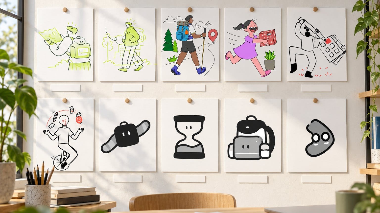
It's October, the planning deck for next year is open in Figma, and someone on the team has typed "illustration trends 2027" into Google hoping for a straight answer. What comes back is a stack of 2026 mood lists about neo traditionalism, maximalist psychedelia and eco imagery, plus one 2027 forecast for design in general that never names an illustration style. Lovely to read, useless to ship, because none of it comes with a file you can drop into a hero section on Monday.
This is the other kind of list: eight 2027 illustration trends a product or brand designer can plan a year around, each one backed by a whole collection in the GetIllustrations library. The first five, Ilcons, Sharpie, Grain, Halftone and Goodle, are the five our collections page ranks highest by sales, and after them come Bots, our newest series, then Surreality and Clay 3D. After the eight you'll find a four step method for choosing one, fixes for when it isn't working, the research on human made art and the licence terms as they stand on the site today.
One thing up front, because AI comes up a lot in this piece. Every illustration in our library begins with a human illustrator. Four of our 456 packs were then remixed by AI and carry a Remixed by AI label, we name them further down, and none of the four sits in a collection on this list.
A note on the pictures, too. One is a sheet of our drawings on white exactly as they ship, three are showcase mockups from our own pack pages, and two, the board above the title and the phone screens in the Bots section, are scenes ChatGPT built from illustration files we handed it. None of them is a photograph of a real customer's product, and every caption says which kind you're looking at.
What are the illustration trends for 2027
Eight, by our count: mini illustrations built as a system, bold marker outlines with no colour, grain texture over flat fills, halftone dots with heavy contours, doodles with an accent colour you can swap, mascots and bot characters for AI products, surreal scenes for business, and soft clay 3D objects. Each gets its own section below with a collection you can open today.
Why 2027 is about showing a person drew it
Figma's State of the Designer 2026 report asked 906 designers about their tools, and 91 percent said new AI tools improve their designs. That's the backdrop for every trend on this page. When nearly everyone on a team can type a prompt and get a passable drawing, a passable drawing stops meaning anything.
Icons8's 2027 forecast makes the sharper point, and it's the only real 2027 piece we found. Handmade only works when you can prove it, design arrives as a system of matching pieces, and provenance becomes part of the layout. We read that as a warning about faking handwork, and it's why this article names the four packs in our library that carry an AI label.
How we picked these eight: our 2026 post, Search Console and what sells
Three inputs. Our 2026 trends post was the starting point, and Search Console shows it already catches a little of the 2027 phrase: 35 impressions and 3 clicks at an average position of 5.8 over the last 90 days, next to 451 impressions and 172 clicks for the 2026 phrase. People have started asking, and the results page still has no real answer.
The second input was the design press, mainly the current illustration trends coverage in Creative Bloq and Creative Boom, with the agency work it showed for brand clients through 2026. Our own sales were the third, and they're the closest thing we have to a record of stock illustration trends: the collections page has sorted by best seller since 22 September, so we could see which visual systems designers keep coming back for. We dropped any new illustration trend we couldn't back with a whole collection.
A trend you can't put on a page is a mood, and a product team can't ship a mood.
What our 2026 list got right and wrong
Looking back at the 2026 post, the calls that pointed at handwork and texture aged well, and the calls made on colour alone aged fastest, because palettes move with every product launch. That's our opinion after a year of watching the catalogue, and we haven't measured it.
This year's list is stricter. Eight directions, and each one has a whole collection behind it.
Which illustration styles will designers use in 2027
Here are the eight trending illustration styles, best sellers first. Each one links to its collection page, with what's inside and where we'd use it, and the sections with the most to show carry a picture or two.
1. Mini illustrations that work as a system (Ilcons collection)
This is the Icons8 point from the other side. A brand shows its process by shipping a system, one stroke weight and one colour logic repeated across hundreds of small scenes. Anyone can get one pretty illustration, but a grid of 50 that match is very hard to fake.
The Ilcons collection is our best selling collection and the clearest example of the idea: 3,311 mini illustrations across 18 packs, in SVG, AI and PNG. They're small enough to sit where an icon would and detailed enough to carry a feature card on their own, and in the flat chapters every fill sits on its own path under the line. Swap those fills for your brand colour and a whole chapter follows, while four 3D icon packs, the free sampler among them, are built to sit at the same sizes.
2. Bold marker outlines with no colour (Sharpie collection)
Black marker strokes on white, nothing else. It sounds austere, and that's the point: a monochrome drawing takes whatever brand palette you put behind it and still looks like a hand held the pen. On a dark theme you flip the black to white and carry on.
The Sharpie collection is 1,064 marker drawn illustrations and icons across 25 packs, covering UI states, business, lifestyle, travel, nature and the seasons, in SVG, PNG and AI. It has whole packs for empty states and 404 pages, the moments when a screen has nothing else to show and a warm drawing does the talking. The outline style page has more line work if you want to compare weights.
3. Grain texture over flat fills (Grain collection)
A fine noise laid over every fill, so a flat vector reads like a screen print. Grain is the quickest way we know to make a screen feel physical, and it gets there without the weight of a halftone dot. It also survives print, which most smooth renders don't.
The Grain collection is 825 illustrations across 22 packs with one grain overlay applied as a vector layer at a controlled opacity, which is why a teamwork scene and a SaaS illustration from different packs sit on the same page without adjustment. Because the grain sits on its own layer above the fills, you can recolour the fills underneath without touching the texture. Grain Reframed is the free pack, famous paintings redrawn in the style, if you want to test the texture on a live page first.
4. Halftone dots and heavy contours (Halftone collection)
Thick contours with dots where a gradient would normally go, the way newspapers used to print shade. Most digital illustration trends of the last few years chased smooth gradients, so a halftone character now looks like it was made by someone with ink on their fingers. We think 2027 rewards exactly that read.
The Halftone collection is 685 illustrations across four packs: 250 hand gestures and animals, 235 doodle characters, 175 in Chapter 2 and a free sampler of 25, all in SVG, AI and PNG. It's the pairing we'd reach for with Grain when a piece has to work on paper, dots on the poster and grain in the folded newsletter. Our rule of thumb on screen is to keep halftone above about 80 pixels, because below that the dots turn into mud.
5. Doodles with an accent colour you can swap (Goodle collection)
A loose black line with one flat accent colour. Swap the accent and a whole page rebrands in an afternoon, which is why we'd hand this style to a startup that changes its palette twice a year.
The Goodle collection lists 18 packs across business, education, avatars, wellness and daily life, and the free Goodle pack lets you test the direction before you buy. None of the 18 carries a Remixed by AI label.
The doodle also has a newer, louder sibling in the library, the Doodle Pop series. It keeps the hand inked line and trades the single accent for full colour, and the picture below shows it doing a whole hero on its own.
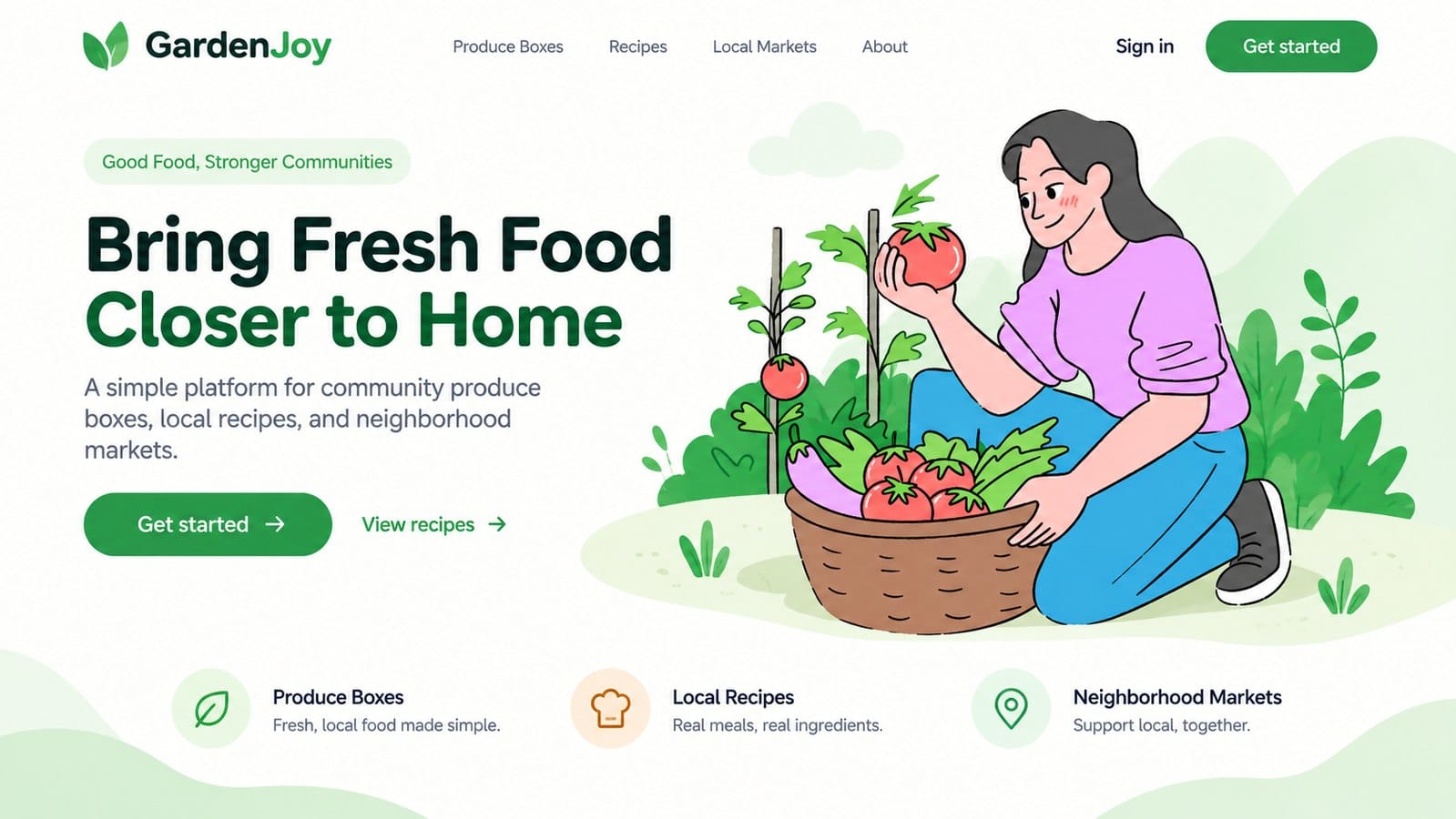
That's a showcase from the Free Doodle Pop activities pack page, a made up community produce site with a kneeling gardener holding a tomato over her basket. The pack itself is 40 free illustrations in SVG, AI and PNG, and its page carries two more website mockups if you want to see the style on other products before you download anything.
The paid chapters follow the same line: Doodle Pop Business and Marketing is 34 illustrations and Doodle Pop Lifestyle is 25. Doodle Pop isn't part of the Goodle collection, it's its own series, so buy it as packs. We'd pick Goodle when the brand colour has to do the work and Doodle Pop when the page is allowed to be loud.
6. Mascots and bot characters for AI products (Bots collection)
Every product with a chat box now needs a face for it, and in 2027 one mascot won't cover it, you'll want a whole cast. An hourglass with a face for the loading state, a backpack for the travel feature, a smartwatch for reminders, all in the same thick line so they read as one family from the first onboarding screen to the chat window. The phone screens below are a mockup ChatGPT put together from four of those files.
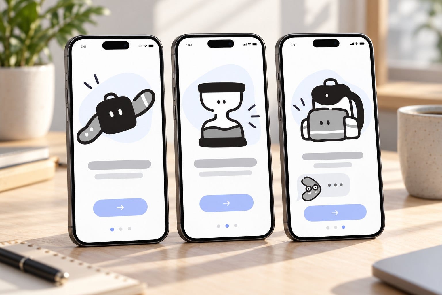
The Bots collection is the newest series on the site, and it's the one we'd point an AI product at first. It's four chapters and 400 illustrations in the Outline style: the first 100 AI agent avatars, 100 more in Chapter 2 with animatable faces on food, shopping, money and travel objects, 125 business and abstract avatars in Chapter 3, and 75 letters, numbers and symbols in Chapter 4, so even a 404 page can stay in the family. The first pack ships 100 SVG files, 100 PNG files and the AI source file.
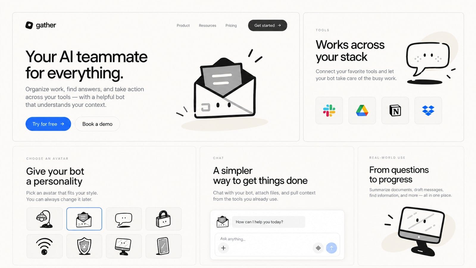
The picture above is a showcase from the first Bots pack page itself, a made up AI teammate landing page. The open envelope with eyes carries the hero, a speech bubble and a monitor take the feature cards, and the card titled Give your bot a personality puts eight avatars in a picker beside a chat box. That card is the whole argument for a cast: the user chooses the face, and every face still looks like the same product.
All four chapters are paid, there's no free Bots sampler, and none of the four carries a Remixed by AI label. That matters more here than anywhere else on this list, because an AI product with an AI drawn mascot is a joke the internet will make for you.
7. Surreal scenes for business and tech (Surreality collection)
A person with a lightbulb for a head juggling ideas on a unicycle, a delivery carried in under a crown at a royal pace, a figure attacking a calendar with a pencil twice their size. Surrealism gives a dull B2B pitch something to look at, and it's the style we'd pick for an about page or a conference deck that needs to feel like someone with taste made it. One scene per section, never six.
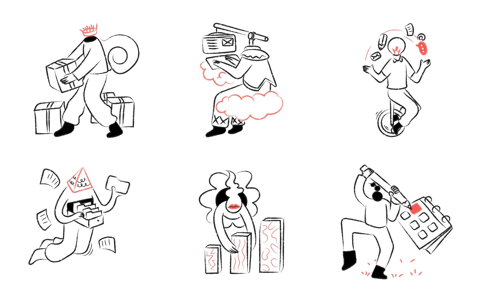
The six drawings above are from Surreality Chapter 4 on white, exactly as they ship: 100 surreal vector graphics in SVG, PNG and AI, drawn by hand on a loose black line with one red accent. The Surreality collection is five packs, about 420 illustrations across the Surrealism set, Surreality 2, Surreality Abstract and Chapters 3 and 4, with limited palettes and strong tonal contrast so they take a brand colour without a fight. Our Surreality 3D chapters are a separate series and aren't part of this collection.
8. Soft clay 3D objects (Clay 3D collection)
Soft, rounded, lit from one side, usually on a cream background. 3D hasn't gone anywhere, it has just stopped being glossy. The 2027 version looks like it was pressed out of clay by hand, even on a screen.
The Clay 3D collection is where this direction lives in our library, five packs covering business, celebration, hand gestures, multimedia icons and a freebie, and the 3D illustration style page gathers our other 3D sets, including a few we'd skip for a brand that wants to look handmade. Use clay where a product needs warmth at hero size, on app store screens and feature pages, and keep it out of the small UI, where the lighting turns to smudge.
| Style | Collection | Size | Free sampler | Best surface |
|---|---|---|---|---|
| Mini illustrations as a system | Ilcons | 3,311 illustrations, 18 packs | Yes, 36 free 3D app icons | Feature grids, onboarding, empty states |
| Bold marker outlines, no colour | Sharpie | 1,064 illustrations and icons, 25 packs | Yes, Valentine icons | Empty states, 404 pages, docs |
| Grain texture over flat fills | Grain | 825 illustrations, 22 packs | Yes, Grain Reframed | Landing pages, blog headers, print |
| Halftone dots and heavy contours | Halftone | 685 illustrations, 4 packs | Yes, 25 illustrations | Editorial pages, newsletters, print |
| Doodles with a swappable accent | Goodle | 18 packs | Yes, the free Goodle pack | Marketing pages, startup sites |
| Mascots and bot characters | Bots | 400 illustrations, 4 chapters | No | Chat interfaces, onboarding, avatars |
| Surreal scenes for business | Surreality | About 420 illustrations, 5 packs | No | About pages, decks, hero sections |
| Soft clay 3D objects | Clay 3D | 5 packs | Yes, the freebie pack | Product pages, app store screens |
How to pick an illustration style for a product in 2027
Eight styles is a lot to choose from, and the best seller this year won't automatically suit your product. This is the four step method we use when a team asks which one.
Match the style to the surface: hero, empty state, onboarding, print
Decide where the illustration will live before you fall for a look. A hero can carry texture and a full scene at 600 pixels wide and more. An empty state gets about a second to explain one missing thing, and a settings screen just needs drawings that stay quiet.
| Surface | What the style has to do | Pick from |
|---|---|---|
| Hero on a landing page | Carry the headline at 600 pixels wide and more | Surreality, Grain, Clay 3D |
| Empty state | Explain one missing thing in a glance | Sharpie, Goodle, Bots |
| Onboarding steps | Repeat a cast across 3 to 5 screens | Bots, Ilcons |
| Settings and small UI | Read at 32 to 64 pixels on light and dark | Sharpie, Ilcons |
| Print and packaging | Hold its texture at 300 dpi on paper | Halftone, Grain |
The quickest way to check a surface is to look at a pack on the surfaces its own page shows. Our Flagship Activities pack, 50 drawings of people cycling, hiking, cooking, cleaning and working in a dark line with a lime accent, carries showcases of the same drawing on a website with its phone view, on a street billboard and on a shipping box. Flagship is a Gradient series rather than one of the eight styles, but its page is the cleanest three surface test we know of in the library.
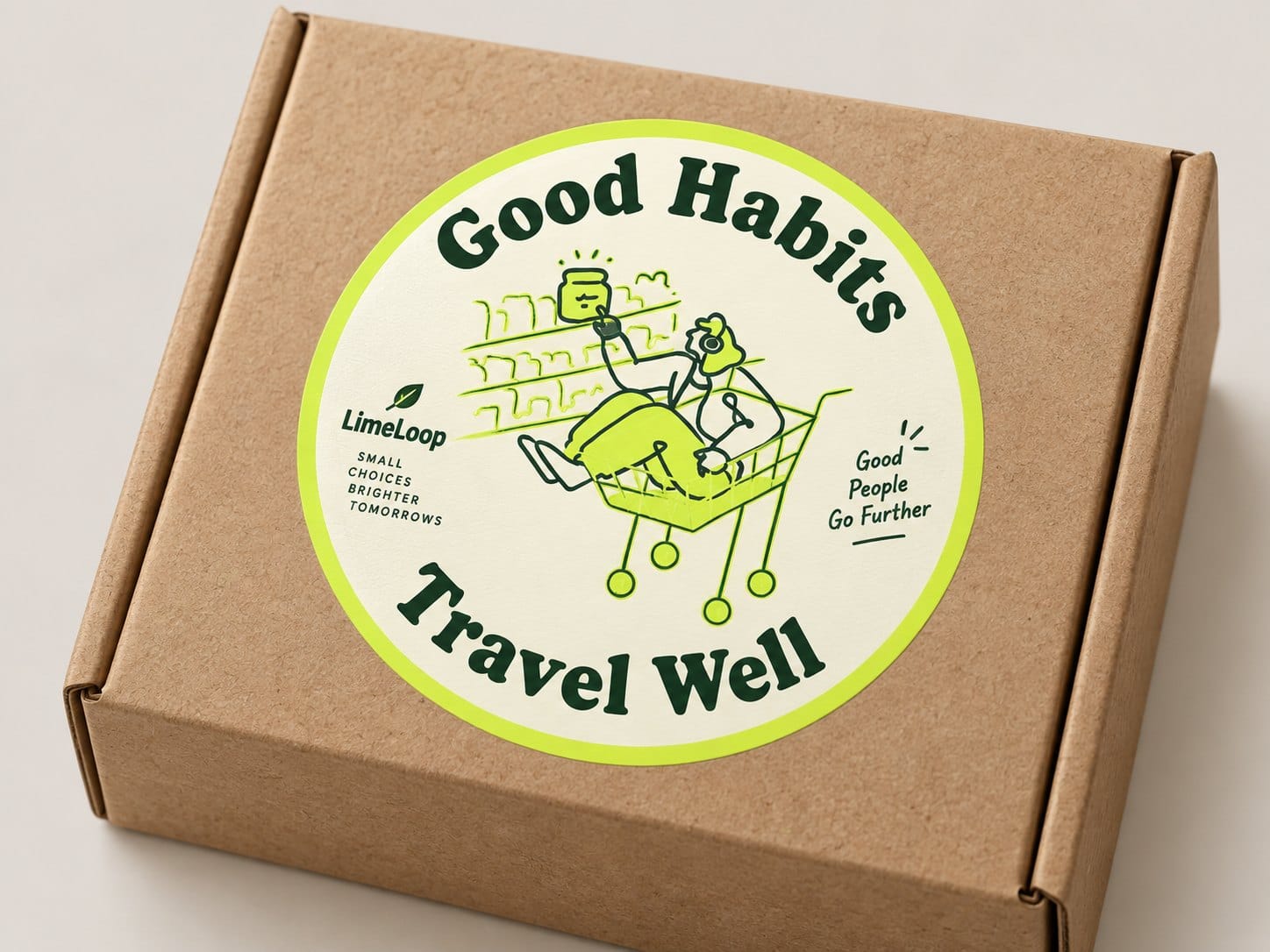
That box showcase is the test that matters. A figure lounging in a shopping cart, printed in one dark line and one lime on a cream sticker, survives kraft card at arm's length, and anything that survives there will survive a hero. Open the pack page and compare it with the billboard version before you decide, because sooner or later a print job will ask you the same question.
Check it survives at 48 pixels and on a dark theme
Export one illustration at 48 pixels square and one at 320, put both on your darkest background, and look at them on a phone in daylight. Halftone dots and fine grain tend to fall apart small, and cream clay objects can look dirty on a near black theme. Do it with a free sampler or the pack page preview before you buy, while changing your mind still costs nothing.
Decide what you can recolour: SVG packs versus PNG packs
Every pack page shows the formats a pack ships in under File types, in the row beside Style, and it's the first thing to read. Ilcons, Sharpie, Grain and Halftone all ship SVG, AI and PNG, and so does the first Bots pack, so a brand recolour is a selection and a fill change in Figma or Illustrator, or in our Design Studio editor. A PNG only pack is placed as it comes, which is fine for a hero and painful for a design system.
If your palette is still open, our colour theory page is a decent place to settle it before you start swapping fills.
Buy the collection when you will need more than one pack
The most common mistake we see is three styles on one marketing site: a clay hero, outline icons from somewhere else, a flat empty state from a third place. Pick one direction and extend it with the matching chapters. That's what the collections are for: the packs in a collection are picked to sit together, so the fifth pack you open keeps step with the first, and the illustration packs page covers everything else, including All Access if you'd rather not choose.
What to do when an illustration style is not working
It happens. A style that looked right in a Figma frame reads as noise on the live page, or a stakeholder says the hero looks AI made. Three fixes, in order.
Cut the count to one illustration per section
Most noise complaints are really density complaints. One illustration per section, with real whitespace around it, fixes them without changing the style, and it's a ten minute edit.
Say where the art came from
A short credit on your about page naming the library or the illustrator is the kind of provenance Icons8 describes, and it beats letting people guess. Our human made illustrations page exists for exactly that conversation.
Step down one notch to a quieter style
If clay 3D is too much, Goodle keeps the warmth with less rendering. Halftone that turns to mud at small sizes can usually hand over to Sharpie, which keeps the marker feel with a cleaner contour, and a board that finds Surreality too strange will often take Grain, the same texture without the lightbulb heads.
And if the whole direction is wrong, say so early. Swapping a pack in week two costs an afternoon. Swapping it after the brand guidelines ship costs a quarter.
Are hand drawn illustrations still relevant when everyone uses AI
We think they matter more now, though we would say that, since we sell them. Two pieces of evidence make the case better than we can.
What the research says people prefer
A 2025 study in Empirical Studies of the Arts ran two experiments, one with 250 people rating artworks on a scale and one with 102 people choosing between pairs. When the works sat side by side, people liked and valued the human made pieces more, and the rating only design wasn't sensitive enough to show it. Your landing page sits beside every other tab the visitor has open, which makes it a side by side comparison, the exact condition where the preference showed.
There's a legal angle too. The US Copyright Office concluded in January 2025 that a prompt alone doesn't make an output copyrightable, and that protection applies where a human contributes perceptible expression or makes creative arrangements or modifications. If your brand needs artwork with a clear rights holder, that's an argument for starting with a person.
What a Remixed by AI label means on our packs
Every illustration in the library begins with a human illustrator. For four packs out of 456, InkDex 3D Chapters 1 and 2, Surreality 3D Chapter 2 and Papercut 3D Halftone, the finished set was then remixed by AI from those originals, and each of those packs says so with a Remixed by AI badge. None of the four is in any of the eight collections above, so if your brief says human made only, everything on this list qualifies.
Where an AI generator fits next to a pack
Sometimes the collection has 99 of the 100 drawings you need and the last one is a very specific scene. Our AI illustration generator makes custom illustrations in the style of our human drawn packs for exactly that gap. We'd use it for the missing piece, never for the whole set, and we'd say so in the credit.
Can you use trending illustrations commercially
What a paid pack licence covers
Every paid pack comes with a perpetual, royalty free licence: commercial use, up to 500 assets per design, use in templates and themes you sell, in the SVG, PNG and AI formats the pack ships. The Standard licence adds unlimited commercial projects, client work, no attribution and up to two team members. What you can't do is redistribute the standalone files, so no reselling a pack as a pack, and the full wording is on the licence page.
What changes for free packs
Free illustrations need a credit link, and that includes the Free Doodle Pop pack above. The free samplers in Grain, Halftone, Goodle and Doodle Pop are the easy way to test a 2027 direction on a live page before you buy a collection, and the free illustrations page has the rest. There's no free Bots pack, so for that one the pack page showcases are your test.
Illustration trends 2027 FAQ
What are the biggest illustration trends in 2027
Mini illustrations built as a system, bold marker outlines, grain texture, halftone dots, doodles with a swappable accent colour, mascots and bot characters for AI products, surreal scenes for business, and soft clay 3D. What ties these illustration design trends together is art that shows a person made it, and a straight answer when someone asks how.
Which illustration style is best for a SaaS website in 2027
Most SaaS sites go wrong by mixing web illustration styles, so pick one system and stretch it. Ilcons on its own covers feature cards, onboarding and empty states, and if the product has a chat or assistant surface, a Bots mascot family is the one addition we'd make. Keep the two close in line weight and colour so the mascot reads as part of the same product.
Are hand drawn illustrations still in style now that everyone uses AI
Yes, and more so. In side by side tests people liked and valued human made art more, and with 91 percent of the designers in Figma's survey saying AI tools improve their designs, a drawing that visibly came from a hand is the thing that stands out.
Is 3D illustration still trending in 2027
Yes, in a quieter form. We see soft clay objects for product pages and app store screens, lit from one side on cream, taking over from the glossy plastic 3D of a few years ago. Keep it at hero size and out of the small UI.
Can I use these illustrations in client work and products for sale
Yes, with a paid pack or collection. The pack licence covers commercial use and templates or themes for sale, up to 500 assets per design, and the Standard licence adds client work, unlimited commercial projects and no attribution. Free packs need a credit link, and the standalone files can't be resold or redistributed.
Pick one direction from the eight, test it at 48 pixels and on a dark background, then buy the collection that extends it. The illustration packs page is where to start, and the Bots collection is where we'd start if your product talks back.