A color theory wheel that
does the maths.
A color theory wheel puts every hue on a circle so you can see which colours work together: opposites give the strongest contrast, neighbours feel calm, and evenly spaced picks stay balanced. Pick a base colour below and this one works out its complementary, analogous, triadic, split complementary, tetradic, square and monochromatic partners for you. Then check any pair for readable contrast and export the palette as CSS, SCSS, Tailwind, JSON or a GIMP palette, free and right in your browser.
Shades & Tints
Harmony Type
Generated Palette
Export
Current Palette (0 colors)
Export Current Palette
Saved Palettes
The quick brown fox jumps over the lazy dog.
Large Bold Text
AA is the minimum standard for most projects. AAA is enhanced accessibility. Large text is 18pt+ (or 14pt+ bold).
- 7 harmony modes from one base colour
- WCAG contrast AA and AAA, live
- 7 export formats CSS, SCSS, Tailwind, JSON and more
- No install palettes saved in your browser
How to read a color theory wheel
Every colour on this wheel is three numbers: hue, saturation and value. The ring sets the first, the triangle inside it sets the other two, and the panel beside them writes the result out in four formats you can copy.
The ring is hue
Hue is the position around the circle, from 0 to 360 degrees. Red sits at the top at 0, then the hues run clockwise: yellow at 60, green at 120, cyan at 180, blue at 240 and magenta at 300.
The triangle is saturation and brightness
The triangle turns to follow your hue. Its three corners are the pure hue, white and black, so dragging toward white gives you a pale tint and dragging toward black a deep shade.
Four ways to write a colour
The panel shows the same colour as HEX, RGB, HSL and HSV, each with a copy button. Type a hex code into the field under them and the wheel jumps straight to that colour.
Tints and shades
Under the wheel sits a row of nine steps: four lighter, your colour in the middle, four darker. Click any of them and it becomes the colour you're working with.
Harmonies are angles
Complementary colours sit opposite each other, analogous ones side by side, triadic ones on a triangle. The Harmonies tab does that geometry for you and labels each colour with its role.
A screen wheel, not a paint wheel
This wheel is built on light, the RGB model your monitor uses, which is why red's opposite here is cyan. On the red, yellow and blue wheel most of us learned with paint, the opposite of red is green.
The seven color harmonies on the wheel
A harmony is a rule for picking colours by their angle on the wheel. Every card below starts from the blue the wheel opens on, #398FE6, so each hex code is exactly what the tool gives you before you touch anything.
-
Complementary
Two hues 180 degrees apartYour base and the colour straight across the wheel. It's the loudest pairing there is, so it works best when one colour does most of the work and the other stays a small accent.
Use it for: A button or a price that has to stand out from everything around it.
- #398FE6
- #E68F39
-
Analogous
Three hues 30 degrees apartYour base and its two neighbours, 30 degrees either side. They share so much that they always look related and calm, the way a sunset or a forest does.
Use it for: Backgrounds, soft gradients and illustrations that should feel quiet.
- #398FE6
- #39E6E6
- #3939E6
-
Triadic
Three hues 120 degrees apartThree colours spaced evenly, so they form a triangle on the wheel. Bright and playful, and still balanced, as long as one colour leads and the other two support it.
Use it for: Brands for kids, games and anything that should feel cheerful.
- #398FE6
- #E6398F
- #8FE639
-
Split complementary
Your base and two hues 150 degrees awayInstead of the exact opposite you take the two colours either side of it. You keep most of the contrast with less tension, which makes it an easier first palette than plain complementary.
Use it for: Interface palettes that need contrast without a clash.
- #398FE6
- #E63939
- #E6E639
-
Tetradic
Two pairs of opposites, a rectangleYour base, a hue 60 degrees along, and the opposite of each. Four colours is a lot to manage, so let one dominate and keep the other three small.
Use it for: Charts and dashboards that need several colours you can tell apart.
- #398FE6
- #8F39E6
- #E68F39
- #8FE639
-
Square
Four hues 90 degrees apartFour colours spaced evenly around the wheel, every one of them strong. It's the hardest harmony to keep tidy. Pull three of them toward white or grey on the triangle and it settles down.
Use it for: Patterns and playful illustration work.
- #398FE6
- #E639E6
- #E68F39
- #39E639
-
Monochromatic
One hue, lighter and darkerA single hue in a darker, a lighter and a muted version. Hard to get wrong and quick to look polished, but it only stays readable if the light and dark steps are far enough apart.
Use it for: Brand sites, slide decks and icon sets in one colour.
- #398FE6
- #2D70B3
- #80BFFF
- #B3D9FF
-
Which one should you pick?
Want calm? Go analogous. Need one thing to shout? Complementary, with the accent kept small.
Something playful? Triadic. Not sure at all? Start with split complementary, then nudge the base around the ring until it feels right.
Warm and cool colors on the wheel
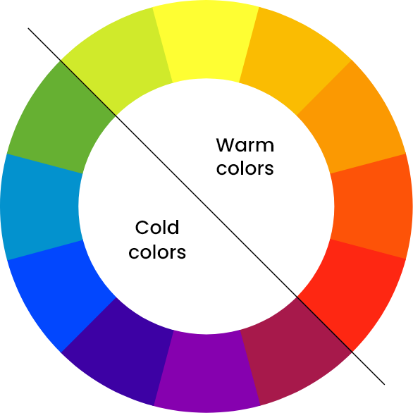
Split the wheel in half and you get two moods. Reds, oranges and yellows feel warm and seem to come toward you. Greens, blues and violets feel cool and sit back.
Designers use that on purpose. A warm accent on a cool page pulls the eye straight to it, which is why so many buttons are orange on blue layouts. Keep most of a design on one side of the wheel and borrow a little from the other.
Color contrast on the wheel
Used as a color contrast wheel, the ring shows which hues sit opposite each other and so contrast the most. But your eyes judge readable text on lightness, not hue. Two colours from opposite sides of the wheel can be almost equally bright, and then text in one on the other turns to mush.
So measure it. The Contrast Checker tab gives the WCAG ratio for any text and background pair: 4.5:1 passes AA for normal text, 3:1 passes AA for large text, and 7:1 passes AAA. Here are three pairs of opposites, measured the same way.
| Pair of opposites | Ratio | AA text | AA large | AAA text |
|---|---|---|---|---|
The wheel's starting blue on its exact complement#398FE6 on #E68F39 |
1.34:1 | Fail | Fail | Fail |
Pure red on pure cyan, also opposites#FF0000 on #00FFFF |
3.19:1 | Fail | Pass | Fail |
Pure blue on pure yellow, opposites far apart in lightness#0000FF on #FFFF00 |
8.00:1 | Pass | Pass | Pass |
How designers use a color wheel
Theory is the easy part. This is the order most palettes actually get built in, from one colour you already have to illustrations that match it.
- 1Start from a colour you haveA logo, a product photo, a line in the brand guide. Type its hex into the wheel so the palette grows from something real.
- 2Pick a harmony for the moodAnalogous for calm, complementary for one bold accent, triadic for something playful. Clicking through all seven in the Harmonies tab takes seconds.
- 3Give every colour a jobA common rule gives about 60 percent of the space to one colour, 30 percent to a second and 10 percent to an accent. Buttons and links get the accent.
- 4Check text against backgroundsRun each text and background pair through the Contrast Checker. If a pair fails, drag it toward white or black on the triangle until it passes.
- 5Export it to your codeDownload the palette as CSS variables, SCSS, a Tailwind config, JSON or a hex list, or as a GIMP or JASC palette file for paint programs.
- 6Recolour your illustrationsDrop an SVG into our free SVG color editor and swap each colour for one of your hex codes. Most of our illustration packs ship as editable SVG.
Open the wheel, it's free ↑ No account, no install. Want bright examples to study? See the colorful illustration style.
Best illustrations showcasing the correct use of colours
Illustrations have the power to bring any design to life, and when colors are used thoughtfully, they can make an even bigger impact. Great illustration packs don't just look beautiful. They help tell a story and make designs more engaging. Below, we've picked five standout packs that use color in creative and inspiring ways to help you craft stunning visuals effortlessly.
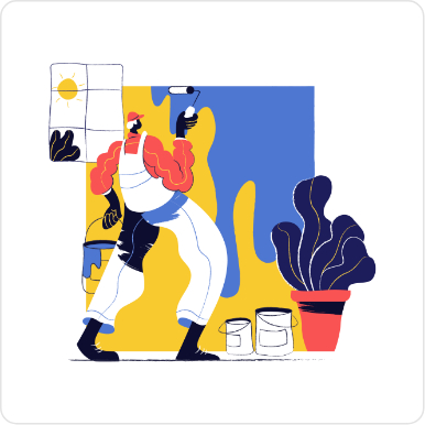
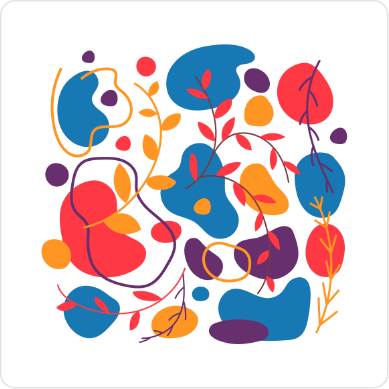
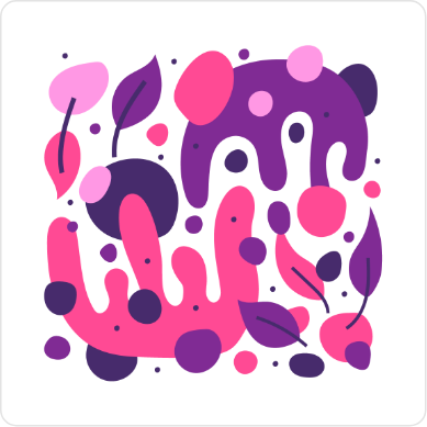
With intense colors and interesting hand drawn characters and elements, the Paint Illustrations are an awesome addition to your collection of illustrations adding a really unique touch to any project you use it in.
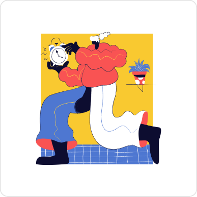

One of our most extensive illustration packs, featuring beautiful colorful illustrations for web and apps. This pack focuses on the Fin-tech and startup scene with an additional library of avatars in the same style.



This is our masterpiece! Hand-drawn with simple black brush outlines and spot colors that highlight the scene's elements and environment, our quirky characters are eager to tell stories in these colorful dynamic illustrations.



Introducing the CMYK Illustrations pack, a unique blend of hand-drawn artistry and vibrant color palettes designed for maximum versatility. This pack features loads of creative illustrations, with more coming updates as it expands.



Explore 100 vibrant, hand-drawn Talavera inspired patterns in fully editable vector formats. Perfect for websites, apps, and print projects.


Color wheel basics: primary, secondary and tertiary colors
These basics come from the painter's wheel, the red, yellow and blue circle most of us met in art class. It's still the clearest way to see how colours are built from each other, even though the digital wheel at the top of this page mixes light instead of paint.
What is the Color Wheel?
The color wheel is a visual representation of how colors relate to one another. It organizes colors in a circular format, blending science and art to showcase the relationships between primary, secondary, and tertiary colors. Think of it as the DNA of design. It reveals how colors interact and how you can combine them for harmony or contrast.
The Basics of the Color Wheel
1. Primary Colors
At the heart of the wheel are the primary colors: red, yellow, and blue. These are the foundation; they cannot be made by mixing other colors. Every other hue stems from these three.
2. Secondary Colors
Mix two primary colors, and you'll get secondary colors:
Red + Yellow = Orange
Yellow + Blue = Green
Blue + Red = Purple
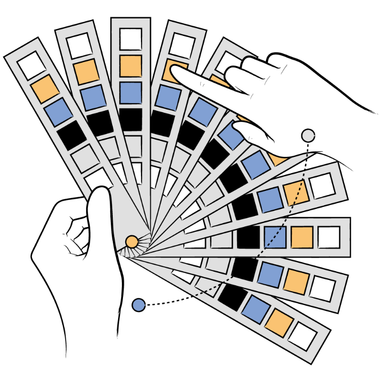
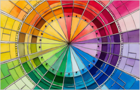
These colors create the first layer of complexity in the wheel and the drawing here shows how they are created.
3. Tertiary Colors
Take a primary color and blend it with a neighboring secondary color, and you'll create tertiary colors like red-orange, yellow-green, and blue-violet. These hues add depth and flexibility, filling out the gaps between primary and secondary colors.
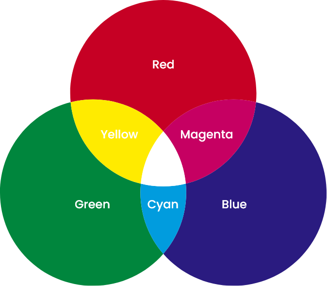
Three color wheels: RYB, RGB and CMYK
There is no single color theory wheel. The painter's wheel is RYB, with red, yellow and blue as its primaries, and on it the opposite of red is green. Screens mix light, so the wheel at the top of this page is RGB, with red, green and blue as primaries, and there the opposite of red is cyan. Print mixes ink, so printers work in CMYK, with cyan, magenta and yellow as primaries plus black. Pick the wheel that matches where the color will end up: RGB for anything on a screen, CMYK for anything on paper.
Where the color wheel came from
Isaac Newton drew the first color circle in his book Opticks in 1704, bending the spectrum from his prism experiments into a ring so that violet met red. Johann Wolfgang von Goethe published a six color wheel in his Theory of Colours in 1810, built on how colors look to the eye rather than on the physics of light. Johannes Itten, who taught at the Bauhaus, drew the twelve hue wheel most art classes still use in The Art of Color in 1961, with three primaries, three secondaries and six tertiaries, and set out seven kinds of color contrast, among them warm against cool and complementary pairs, that designers still work from.
Choosing Illustration Colors for
Your Brand Design
Applying Color Theory to Illustrations for a Cohesive Brand Identity
Color theory helps transform illustrations into powerful storytelling tools. By
understanding how
colors work together, you can evoke the right emotions and
communicate your
brand's message
effectively. Learn how to apply these
principles to make your illustrations
visually engaging and
harmonious.
Define Brand Colors
Define your brand's identity by selecting core colors that reflect its values and personality. Use primary, secondary, and accent colors to create a consistent visual language that resonates with your audience.

Choose Color Schemes
Try with complementary colors to add contrast and energy to your illustrations or use analogous colors for a softer, more cohesive look. This ensures that your designs capture attention while staying true to your branding.
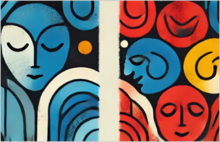
Evoke Brand Emotions
Every color conveys a specific emotion: blue for trust, yellow for positivity and red for excitement. Incorporate these emotions into your illustrations to reinforce your message and create a stronger connection with your users.

Refine Color Balance
Recolor illustrations to perfectly match your branding. Adjust hues, saturation and brightness to ensure your visuals are balanced and avoid overwhelming your design with too many competing tones and hues.

Tell a Visual Story
Illustrations are a powerful tool to tell your brand's story. By using color strategically, you can evoke emotions, guide attention, and create a cohesive visual experience that resonates with your audience

Maintain Color Harmony
When resizing or scaling illustrations, ensure that your color relationships remain intact. Consistency across different design formats from web design to print, reinforces brand vision , image and trust.

Enhance with Illustration
Illustrations bring your brand to life, blending creative visuals with color theory to ensure your designs stand out. They're versatile and impactful, helping you communicate ideas clearly and effectively.

Create Lasting Impact
With the right use of color, illustrations can make your designs unforgettable. They not only enhance the aesthetic appeal but also strengthen your brand identity and leave a meaningful impression.
Want to try these ideas on real artwork inside Figma?
Search the Figma community plugins for GetIllustrations, or install the
GetIllustrations Figma plugin from here.
Why Getillustrations?
It's that simple..
Illustrations
 Unlock All Access
270
Collections
8
Styles

Testimonials and reviews

Ana Martínez
Translator
Getillustrations helped me with a illustration for my future website and I am really happy with the result! They were nice and helpful from the beginning, and captured what I had in mind for the design.
I will be using Getillustrations for future projects!

Clau Marin
Co-founder & CEO @ Festivawl
I've worked with Getillustrations on a really big project - like, 180 illustrations big! I had all these specific ideas about how things should look, from characters to items, and even some tricky subjects to get just right. And guess what? Everything turned out perfect.
I only needed 2 items revised. Seriously, just 2! Can you believe it? I'm a designer too, so I know how crazy it is to have only two rounds of revisions. Highly recommend for any company, big or small - they deliver top-notch work every time.

Ankur Sinha
Content at Thrillax Private LTD
I have always been a fan of using illustrations. Get illustrations is one of the many packs that I am fond of. It's a nice product. Kudos to the developers.

Selecting the Right Color Pallet and
Theme for Your Illustrations
Choosing the perfect colors for your illustrations doesn't have to be overwhelming. The color wheel is your ultimate tool to craft harmonious, impactful designs that resonate with your audience. Whether you're looking for energy, calm, or sophistication, understanding how colors work together will guide you in creating the perfect palette.
Start by defining the mood of your illustration. Do you want vibrant energy? Use complementary colors like blue and orange. Need harmony? Try analogous shades like yellow, yellow-green, and green. Tools like the color wheel make it simple to experiment and find combinations that align with your vision.
Don't forget the emotional power of color. Red feels passionate, while blue evokes trust. Yellow brings optimism, and green signifies balance. Tailor your palette to the message you want to communicate.
Keep accessibility in mind, ensuring enough contrast for all viewers. With thoughtful choices, your illustrations will stand out and tell a compelling story. Start experimenting with color today using Getillustrations
How to Easily Edit Colors in selected
Illustrations and Icons
Customizing illustration and icon colors is simple with the right tools. Open your file in a vector editor like Figma or Adobe Illustrator. Select the element to change and use the color picker to adjust the fill or stroke. You can add gradients for depth or transparency for unique effects.
No design app at hand? Drop the SVG into our free online SVG color editor, click a colour, type the hex code from your palette and download the file. It changes only the colours, so the artwork stays a clean, editable vector.
Personalizing colors ensures your illustrations align perfectly with your design vision and stand out.

Everything a colour system needs, for free
The wheel is built for production, not for a demo: it works in HSV because that is how designers think about a shade, it applies the classical harmonies exactly, it checks accessibility on every pair, and it hands you the palette in the format your codebase already uses.
-
Seven colour harmonies
Complementary, analogous, triadic, split complementary, tetradic, square and monochromatic, worked out from your base colour by the geometry of the wheel, with the role of every colour labelled.
- HSV colour model
The outer ring picks the hue, the inner area the saturation and value: the way designers reach for a shade.
- Palette builder
Add colours from the wheel, give the palette a name and drag the swatches into the order you want.
- WCAG contrast checker
Every text and background pair rated against AA (4.5:1) and AAA (7:1), with previews at normal and large sizes.
- Start from a hex code
Type a brand colour as a hex code and the wheel, the harmonies and the shades all move to it.
-
Exports for the codebase
CSS custom properties, SCSS variables, a Tailwind config, JSON, a plain hex list, or a JASC or GIMP palette file, each downloaded in one click.
- Tints and shades
A row of lighter and darker steps for every colour you pick, each one a click from your palette.
- Live UI preview
Normal text, large bold text and a button drawn in your pair, so you judge it on real interface elements.
- Saved palettes
Every palette you save is kept in your browser's local storage, so it's still there tomorrow.
Illustrations that take any palette you build here
168K+ illustrations and icons with editable colours, all included with All Access. Build the palette on this wheel, then recolour the artwork in the SVG Color Editor or the Design Studio.
See the plans → Browse the library
One-time payment · instant access · 14-day money-back guarantee
- 7harmony modes
- AA, AAAcontrast checked live
- 7export formats
- $0no account, no limits
Questions about the colour wheel
What is a color theory wheel?
It's a circle of hues arranged so you can see how colours relate. Colours opposite each other contrast the most, colours next to each other blend, and colours spaced evenly around the circle balance each other. Designers use it to build palettes that work instead of guessing.
How do you use a color wheel to find colors that go together?
Pick one base colour, then choose a harmony: complementary for the colour opposite, analogous for its neighbours, triadic for three evenly spaced hues. On this page, set the base on the Color Wheel tab, then open the Harmonies tab to see the matching colours with their hex codes.
What color is opposite blue on the color wheel?
On this RGB wheel, the one your screen uses, the opposite of pure blue at 240 degrees is yellow at 60 degrees. On the painter's red, yellow and blue wheel, blue sits opposite orange. Both are right, they just describe different colour models.
Why is the opposite of red cyan here and not green?
This wheel is built on light, the RGB model of every screen, and in RGB the complement of red is cyan. The traditional painter's wheel uses red, yellow and blue as its primaries, and there the opposite of red is green. For anything that ends up on a screen, trust the RGB answer.
How many colors are on the color wheel?
The classic wheel has 12: three primaries, three secondaries and six tertiaries. This digital wheel draws its ring one degree at a time, so it holds 360 hues, and the triangle inside adds every lighter and darker version of each.
What are the seven color harmonies?
Complementary, analogous, triadic, split complementary, tetradic, square and monochromatic. Each one picks colours by a fixed angle on the wheel, from 180 degrees apart for complementary to 30 degrees either side for analogous. The Harmonies tab builds all seven from any base colour.
How do I check color contrast with the wheel?
Open the Contrast Checker tab and enter a text colour and a background colour. It shows the WCAG contrast ratio and whether the pair passes AA (4.5:1 for normal text, 3:1 for large text) and AAA (7:1). Large text means 18pt, or 14pt bold.
What is the difference between warm and cool colors?
Warm colours are the reds, oranges and yellows. Cool colours are the greens, blues and violets. Warm ones feel energetic and seem closer, cool ones feel calm and sit back, so a warm accent on a cool layout pulls the eye straight to it.
Is the color wheel free, and where are my palettes saved?
Yes, it's free and needs no account. When you click Save Palette, the palette is kept in your browser's local storage, so it's still there the next time you open the page in the same browser.
Which export formats can I download?
CSS custom properties, SCSS variables, a Tailwind config, JSON, a plain list of hex codes, a JASC palette and a GIMP palette. You can export the harmony you're looking at or the palette you built yourself.
How do I use the exported CSS variables?
Paste the file into your stylesheet. The colours sit in a :root block as numbered custom properties, one per colour in steps of 100, and you reference them with var() anywhere you'd type a hex code.
Made by the same team, all in the browser
SVG Color Editor
Drop an SVG, every colour becomes a swatch, swap them with a live preview and download the same file recoloured.
Open the editor →Vectorizer Lab
Turn a PNG or JPG into a clean, layered SVG with real strokes and editable colour layers.
Open Vectorizer Lab →Pixel Lab
Any image into pixel art, halftone or ASCII, with 15 dither modes and pixel-perfect SVG export.
Open Pixel Lab →Font Pairing
Curated Google Font pairings with a live preview and the CSS ready to copy.
Open Font Pairing →Design Studio
An online editor with 200,000+ icons, AI stock photos, illustrations and 1,600+ fonts; export PNG, SVG or PDF.
Open Design Studio →Figma plugin
Search the library and drag illustrations onto your Figma canvas without leaving the file.
Get the plugin →